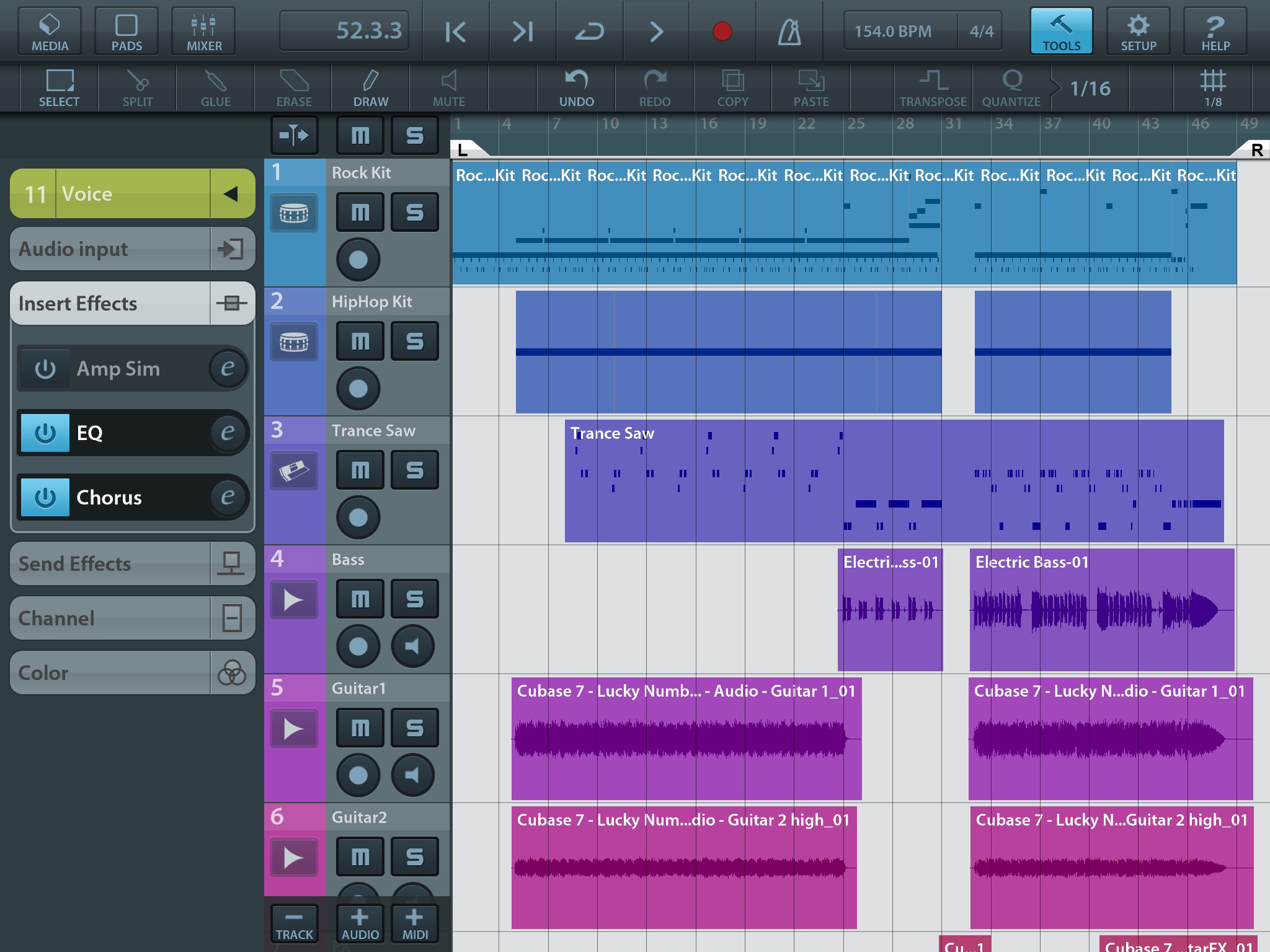
For those of you running Cubase 8 on a 4k display, how’s that working out? What size display are you using, and what resolution are you running? I’ve seen a few threads regarding the inability to adjust font size, other than that, any issues?
Thanks in advance!
Im running 2 monitors at the same time (windows 8.1)
#1 = 4k @ 28"
#2 = 1920x1200 @ 24"
yes It works, but cubase 8 is not high DPI monitor ready, as in you place the same cubase window in each display, both will look basically the same (the 4k window is even slightly more blurry than the 24" one!) i.e. the text / wigets / gfx in the 28" doesnt look any sharper than the 24" one.
Contrast this with how it should look if it was high DPI ready eg open google chrome at the same webpage now with #1 everything looks nice and sharp (cause of the high DPI) compared to #2
I can post screenshots if my description isn’t clear
This thread could possibly have every answer you’re looking for…
Thanks Jono. Somehow or another I missed that thread in my search. Very informative!
A picture is worth 1000 words so
mixer @ 28" 4k

mixer @ 24" 1920x1200

You can see what I mean, Cubase actually looks better on the lower DPI screen
NOTE: Both appear the same size onscreen, due to the differing DPI on each monitor, but you can see what I mean cubase is not high dpi ready yet as it doesnt support UI scaling
btw cakewalk sonar doesnt support it either
It really is. I have had and still have the same questions as you about 4K. I’m going for Multiple 2.5k (27 inch) monitors with a 48 -50 (Inch) 4k TV Screen wall mounted behind them. No point in becoming blind. 
Do you actually have the 4K set for 4K resolution, rather than using display scaling, which may be effectively turning your 4K into something like 3072x1728 or 2560x1440, and producing the fuzzy mapping of the fonts and edges?
If all screens are using the same 100% scaling, controls should occupy exactly the same number of pixels irrespective of the dpi of the display, so a display with higher dpi should show them smaller. The clarity should be exactly the same.
Be aware that Windows may have automatically altered the scaling for your 4K because of the high dpi. If so, the text will appear fuzzier, because it is a pixel map that is being stretched to fill not much more than the 1:1 that it was designed for.
If you go Control Panel → All Control Panel Items → Display, what does it show?
To really work, full text scaling needs to have resolutions several times that of pixel-optimised fixed-size fonts. You can see that scaling work well on the super-high-res (much higher than so-called retina) phone screens.
Programs that provide a lot of discrete fine detail (small text and clear edges and lines), like Cubase, would need to have cheap 8K screens available before it is feasible to go full font-scaling. Until then, it is more economical and better display optimisation to use screens with .2 to .25 mm pixel pitch to get the best balance of details and legibility. Any smaller, requires squinting or scaling the whole display, making everything look fuzzier and showing no more details than a cheaper lower-res display, thereby killing the advantage of having more pixels.
If you work with visual media, you are better off having a dedicated smaller super-res screen just for optimal display of that particular material, rather than expensively kitting your whole setup out with all smaller higher-res displays, most of which will produce sub-optimal display of details that are not designed for them.
Cheers Patanjali mate
If all screens are using the same 100% scaling, controls should occupy exactly the same number of pixels irrespective of the dpi of the display, so a display with higher dpi should show them smaller. The clarity should be exactly the same.
Yes this is correct
To really work, full text scaling needs to have resolutions several times that of pixel-optimised fixed-size fonts. You can see that scaling work well on the super-high-res (much higher than so-called retina) phone screens.
That is a possible solution, i.e do a bicubic lerp between 2 font sizes but its not ideal. ATM cubase just leaves everything up to windows whcih AFAIKS just does a straight linear lerp from the fixed size window → desired windows size, this is far from ideal as it blurs.
Ideal is to let cubase do the drawing, and to have everything stored as vectors ( i.e. the font’s & gfx ) which of course this is difficult/time consuming to do for artists. A more practical method is to implement what they do with webpages
eg heres a webbased simple DAW I just found, you will see it looks clear at both DPI’s (the fonts, the the widgets … the midi stuff looks crap though)
http://zedzeek.com/junk/a2k.png
http://zedzeek.com/junk/a4k.png
Cubase will go down this method sometime in the future, as they have already started, see cubasis for an idea how cubase will look in the future

but as yet they havent added this non fixed resolution graphics engine into cubase itself, fingers crossed cubase 8.5 sees its arrival (though with such a big rendering backend change I expect they will call it cubase 9.0)
BTW - my personal website zedzeek.com not the commercial stuff I’ve worked on. I have been a graphics engineer programmer for nearly 20 years, so I do have more than a cursory interest in the subject 
Actually, when the pictures are each made to map their pixels 1:1 with my display, the 2K version looks fuzzier, as to be expected with less pixels into which to render.
Looks great with Samsung 55" JU-8500/ HDMI2 from Geforce 960,4K@ 60Hz, 4:4:4 (UHD color)


