Working on a laptop everything is ok but using my 27" TB monitor the fonts in the menus are close to invisible from a meter. Many mastering people must have the same problem since their monitors are often far away - behind nearfilds to aviod reflections?
27" does not tell enough. What DPI setting? What operating system?
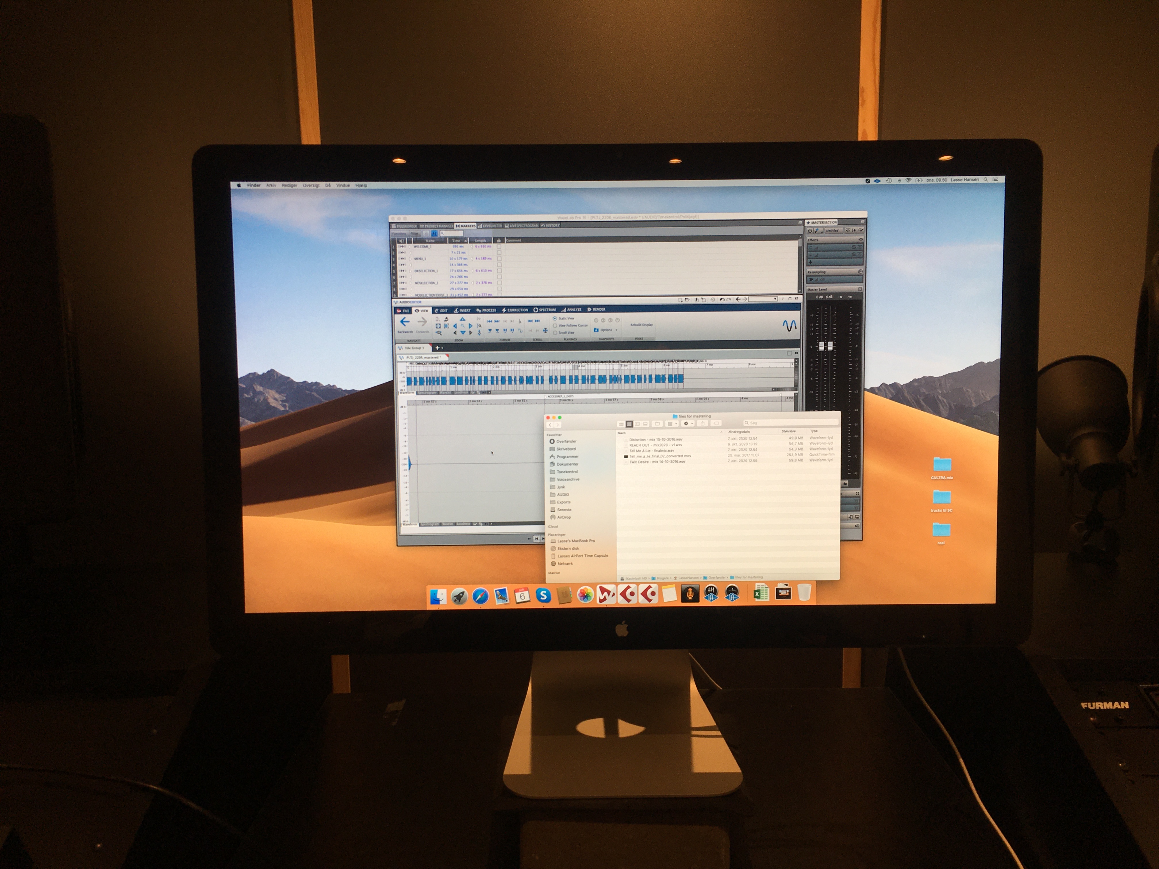
Sorry for that should’ve been more specific. It’s the 27” apple Thunderbolt Display running at its native resolution at 2560 x 1440. Stuff like text menus and markers are really hard to read I find. Maybe I need glasses ![]()
See this image. It’s taken from my chair. The OS fonts are just the right size for me at least byt Wavelabs smaller fonts - markers and file menus etc are too small. Imho ![]()
Don’t other apps have the same font size?
Well, in some areas, of course small fonts are used in other apps as well.
See my comparison here between WL and Cubase. Even the “small” fonts (inserts etc in the inspector - ins / outs in white bold are very easy to read) are clearly readable from a distance whereas the small, grey fonts in WL disappear - for me at least ![]() No problem on laptop but hard to read on a large monitor. Maybe I should just get a different monitor with larger pixels but I thought others might think is an “issue” as well
No problem on laptop but hard to read on a large monitor. Maybe I should just get a different monitor with larger pixels but I thought others might think is an “issue” as well ![]()
