Me too. I am using C12 (and finishing off some projects in C11)… Having C13 on hold, to see what direction they take the GUI. Sadly, so far I just can’t get used to it ![]()
3 Likes
It can be such a personal thing UI. I’ve been using C13 since the day it came out and to me it looks far more professional than C12. I hate going back to C12 now.
1 Like
Wow!
That is awesome!
Thank you for sharing, I am about to rediscover the DAW world, but I travel a lot so I will be trying to put together something that I partially can leave in Sweden and partially leave in Spain, and bring laptop with me (leaving screen(s), midi-keyboards, and some bulky stuff at two different locations).
But I’m not sure if I will succeed, maybe I will have to reduce my intentions…
Thats sound like an amazing problem to have.
Well once they finish (or swedish ![]() the mapping assistant…i can recommend the iconpad if you can find one…legacy…but they are the most compact powerhouse made for that.
the mapping assistant…i can recommend the iconpad if you can find one…legacy…but they are the most compact powerhouse made for that.
Cheers
This is interesting. Ive been on Studio One since version 2 and I have not nor never will do a subscription. You can buy it then upgrade your version when you feel like it. Im on 6.5.2 now
1 Like
Hey Shanabit. ![]() The point of my post was — and you know this as well — that the powers that be were pushing for “Sphere” to become the default. And they did that to the point where they were giving extra perks (videos, etc.) to Sphere subscribers while letting those of us who opted to pay full price go home with a lump of coal in our Xmas stocking.
The point of my post was — and you know this as well — that the powers that be were pushing for “Sphere” to become the default. And they did that to the point where they were giving extra perks (videos, etc.) to Sphere subscribers while letting those of us who opted to pay full price go home with a lump of coal in our Xmas stocking. ![]()
[And don’t get me started about BFD3 authorization. ![]() ]
]
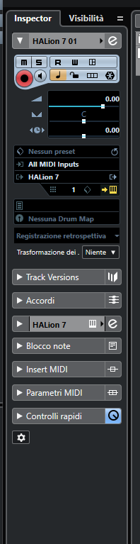
Here the crux of the matter are some aspects of the new GUI of C13. In my opinion, for example, this Inspector in C12 is clearer, intuitive and more readable…
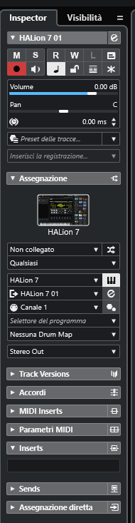
…than the following in C13, where are smaller font sizes and therefore more difficult to read:
A GUI must be not just aesthetically pleasing, but ergonomic and user friendly. It seems to me that not much attention was paid to ergonomics in new version. But I don’t want to think, in the button room, some new chief graphic designer has taken the place of someone more experienced and knowledgeable.
2 Likes
The kerning/tracking between letters in CB13 is too tight. Makes the words harder to read. As someone already alluded to (back in November)…it’s in part due to the letters being too bold, which makes them indistinct when they’re too close together.
Nothing a guillotine can’t solve. ![]()
1 Like
I much prefer to inspector in C13 - to me it looks slicker and more business-like. Again it’s a preference thing.
I’m saying this as a person with poor eyesight too. For reference - my monitors on 2K.
Michael
I note your opinion and respect it, as for me that C13 interface, rather than business-like, seems sad, cold, distant and “already seen”.
And by the way this one I might even like too, if the fonts are made more readable.
1 Like
It’s just so subjective, they need to add some kind of customisation as it’s not one shoe fits all. And personally I think that the readability of fonts and eye sights should be catered for in any modern software.
I say this as on my Mac and going through a 4k large screen C13 looks great. Yet on my windows machine it’s much harder to read.
I think it’s more down to how the O/S scales to the display I think, but if I change DPI on my windows machine it then starts to break other elements within Cubase or how certain plugins scale. On the Mac I can adjust the scale in realtime so it’s just not an issue.
IMO This is why it needs to be controllable by the user. I’d much rather they put time into that then repeatedly changing the interface every couple of versions.
The difference in end users resolutions, display quality and DPI settings is just too wide to hit anything other than a sweet spot for ‘most’. SB need to move further away from this closed garden and embrace more what the community can do to help in these areas, as we’re seeing happen with the MIDI remote the same would happen if they opened up the skin file for user edits - we’d put the hours in and suss it out.
1 Like
I tried this software “f.lux”. For my part, I found the experience very unpleasant. I’m still happy to have tried it. It must be said that what suits one person may not necessarily suit another. I hope you have a happy experience with Studio One. Good luck!
This has nothing to do with personal feelings - this software follows scientific findings (see homapage).
But anyone can ruin their eyes with the blue light, which (according to science) hardly ever occurs in nature…
But when they are young, they don’t care, but just wait until they get older, at the latest then they will begin to understand…
You only realize 30 years later what a mistake it may have been… but THEN it’s just too late…
It also took me a few days to get used to it, but since then (many years) it is beyond any discussion…
Translated with DeepL.com (free version)
1 Like