It may also be that the Text Frame on the First Page Template is insufficiently tall, or that its Vertical Alignment is set to Bottom and the underline is thus running outside the frame.
2 Likes
Sorry to ask this, Why you added ) and ]

All you need to do would be this : [Violon]
You’ll need to edit the text frame to adjust the spacing of your text(s) inside the frame.
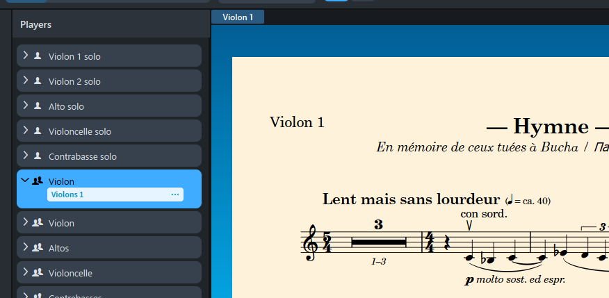
ok, I made a bit of room in that text frame, now I get both lines.
the font is still appearing bolded to me, and I can’t get the start/end parts to work.
I added them to show that none of those worked.
Don’t use Bold style, select Regular and that’s all.
it IS regular style.
here is an image of that same text with the default text, where you see it’s clearly regular.
if you look at my previous image and compare, the text is obviously bold, yet bold is not selected in the dialog.
Try to enter a simple text like Shift+x and type for example :
[Violon]
(ça marche)
{Enfin!}
C’est tout ![]()
The text looks bold because my font was based on a bold font.
oy ve ist mir!!!
ok, ok, ok, j’ai trouvé!!!
I had to change the text itself on the RIGHT side of my screen, in the “Layouts” section. I was trying to change the name on the LEFT side, under “Instruments”.
Now it’s working.
But it would look nicer in a less bold font, for my taste. Probably because I’m used to seeing my layout names as a non-bolded font.
Using Shift+x, I typed: (ça marche!) and voilà, it should work for you.

Désolé Michel, maybe another time will make a non-bold version. Content que ça marché pour toi ![]()
1 Like
merci milles fois.
c’est quand même très beau avec la boite autour du texte. je prefère ça plutôt que simplement le texte. ça le mets apart des autres textes sur la page.
encore, merci pour la police de caractères, ainsi que pour l’aide à la faire fonctionner.
1 Like
Amuse-toi cher Michel ![]()
—Nordine.
1 Like
I actually could really use this font for a project today. You mentioned revising to use some $ ligatures. Is that done? Or should I download the earlier one?
Great work as always!
1 Like
i believe the link was updated to the latest version
Thanks Dan!
I will be coming with v1.2 that features the $ ligatures, also a Light and Bold version are coming soon. Stay tuned.
3 Likes
One minor thing, not sure if this matters to you. I notice that at small magnification, the border appears uneven, due to a display issue:

It exports and prints correctly, so I don’t mind too much, just looks a little unsightly when in use.
Are you on Windows Dan? That’s very common issue with fonts on Windows even the font hinting are right.
I am, yes. I remember seeing this a little with MusAnalysis but not so noticeable. Anyways, it’s not a big deal to me.
1 Like
Below are the results of the font hinting in the browser: Font Testing Page (Requires Firefox 3.6+/Chrome 13+)

It might be surely an issue with Windows… I’m not sure the anomaly can be corrected for Windows or not, I need to test the font on my Parallel Desktop app running Win11.