I don’t mind the new undocked colour palette that floats, but the colour button docked at the top of cubase should still be the list!
The main reason is, the list showed the user entered titles for each colour and I’ve colour coded common instruments so that I and other people using my workstation all colour code the same way.
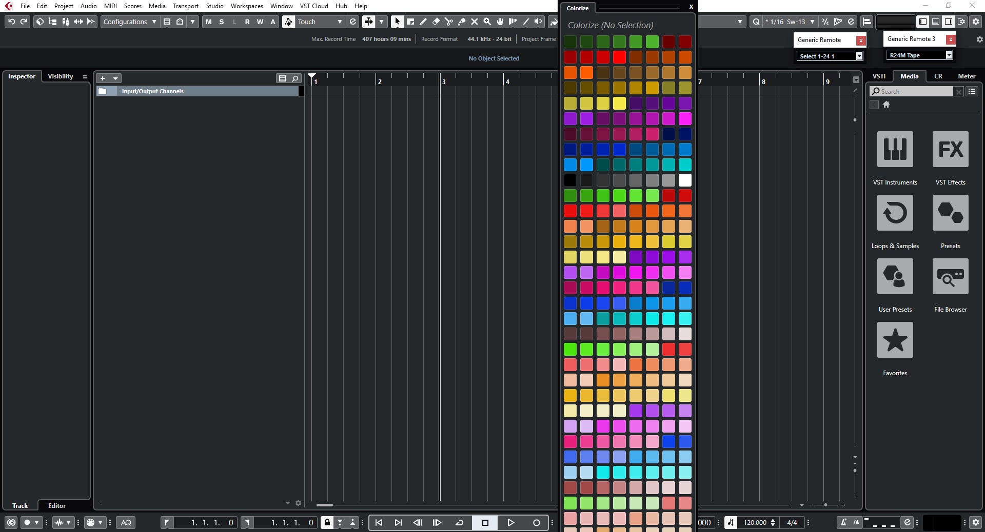
Better, would be to give us two different options for how the colours are displayed - condensed without words, or expanded with words. The only way to see what the colour titles are now, is to hold your mouse over a colour and wait for the title box to pop up - very very slow workflow.
Yes exactly. I pretty much exclusively choose the color based on its name not the actual color. If it is a guitar it gets the guitar color, if it is a lead vocal it gets that color. The old list made it quick & easy to select the desired color - the new color picker makes it substantially harder because you can’t readily see the names.
Too bad that v10 seems to be so full of these workflow changes that are only making life and work more difficult for us. This incessant need to change stuff for the hell of what, looking modern, keeping up with the Jones, leave it alone and fix and improve what really needs fixing and improving.
Really? Do we have to take everything to the extreme?
It is pretty apparent that many users are finding some of the new implementations and changes unnecessary, obtrusive, or arbitrary when maybe it just didn’t need to be that way.
Well, I keep my standpoint and v10 should have postponed. better had been a flawless 9.6 version with some nice workflow goodies. new channel strip design for instance is just a gui eye-catcher, snapshots are workflow enhancements, as audio align etc. pictures of plugins? well…who yelled for that? sample track still the same but now with gui issues, mixer view gui issues, complicated export and way more things which must not be in a v10 release.
perormance optimization well recognized, vari audio 3 may be really a step forward. but again, v10 was ecpected to become THE release and here it disapointed…now waiting as usually for bug fix releases way too long and also knowing there will only be 2-3 which makes it not possible to address all these little things and even leave some major bug behind…
The color select palette window has always bin missing in navigation, organization and ease of use. For me it dosent matter to much. I use a different tool to apply my colors. (given up a long time ago )
It has always bin a “beta” function.
I use color names and dont care to much about the colors. The names are the most important part, as I use them with PLE.
This beta version 2. Is worse then beta 1, since now there is no scrolling option and figuring out wich color is what PLE trigger, is some what more difficult. Not to mention I cant select them all, as the window goes out of screen.
I get the feeling that of all the peps Steinberg uses as feedback for improvements. Non of them are big users of the PLE.
I agree, the old way was better, now I have to wait until the tool tip displays the name before I know if I have the right color. Really dumb pointless change.