Cubase 10 Features

Although it’s not the C10 forum, nor a feature request, nor do I think Steinberg people are interested in this… I do agree.

I like the new GUI a lot better, it’s a great step in the right direction (to me). It seems they did some clever clickflow enhancements, which I really like and complained a lot about in my early posts on this forum. Those changes are really welcome. I also know it’s kind of a “signature” UI thing to have those sections expand and collapse in the track inspector, but to me it also looks cluttered.

I quickly put 3 inspectors side by side for comparison.
Left: Cubase 10 (scaled, I didn’t have my iLok with me so I took a screenshot from their promo video)
Mid: Reaper
Right: Logic


Of those, I like Reaper the least. It’s super tiny, hard to read, bad contrast, but takes the smallest space. Arguably, taking too little space prevents you from seeing and reading anything if you’re on a large screen and sitting a bit away. It also has the least amount of info.

Cubase 10 wastes a lot of space with its sections, lines around things, spaces between sections and all the expand/collapse mumbo jumbo. It looks nice but it has huge boxes that take space and don’t have any real informational value.

Of those, I like Logic the most. Although it doesn’t have all the adjustments Cubase (or Nuendo) have to offer, I think I see the most important stuff at a glance. I see technical adjustments (for MIDI in this case) at the top, which I still can expand to see more if I like. I see Hardware Input, Input Gain, Channel Config, EQ Curve, Plugin Inserts, Sends, Output Routing, Automation Mode, Pan, Meters, Fader AND the channel I’m routing audio to with its configuration all in one glance.

Sure, I could expand all section in Nuendo, but this would mean a lot of scrolling. Or I would need to click a lot to open the sections I want and Nuendo auto-closes the others. Or I could have the mixer open to look at some info, but this uses even more space.

Anyway, just an observation. Not that it would impact what you can do with the software of course (I could hear Fredo’s annoyed sighing all the way down here in Switzerland :smiley: ), but the eyes have to travel a lot more to see the things I would like to keep an eye on.

Nevertheless I’m really excited for those UI and workflow features finding their way into Nuendo.

@oliver I’m pretty sure you’ll be fine after a couple days with pro tools. It’s a great software, if pro tools performance was good with virtual instruments I would never leave pro tools to be honest.

I see what you mean and I don’t disagree.

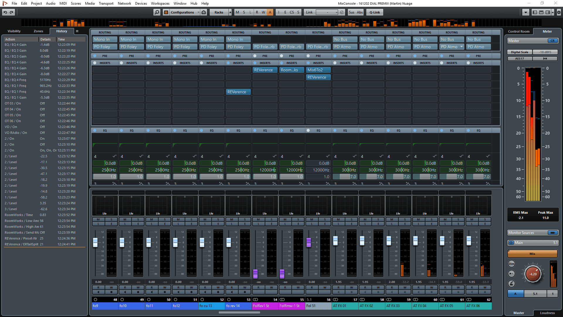
I was actually talking about the borders between the different sections however. So, the borders between the inspector and the main window, and the right pane, the lower panel etc… You can see it in your screenshot in the upper right corner where the white outline curves below the word “Visibility”.

I found the following photo:

It’s the same thing where between the panes on the left/right and the top/bottom sections there’s a bit of space and the edges between them are rounded. To me it looks a bit like a loss of space, but more importantly (to me) it makes the whole software look “disjointed” and less integrated.

If I’m looking at the “History” pane to the left for example and then count the amount of lines on its right side until I actually get to the insert slots I count a total of five ‘lines’;

  • the bright edge of the “History” pane’s rightmost edge
  • a dark area
  • another bright edge
  • then the same color as in the “History” window’s background
  • another bright edge…

And then the exact same thing on the right side of the insert section.

To me that’s just too much.

@mattias you know what else is annoying? We’ll at least annoying to me, I can’t hide the tool bar in the Mixconsole.

ok, now i get what you mean and I agree here, too. it’s potentially useful space that makes the UI unsteady and irritates the eyes. It doesn’t guide the eyes well. And one could tighten it up and see more useful stuff. Yep.

If you take a look at Cubase 10 Forum Cubase 10 seems to be pretty buggy and to have some ill redisgned features like missing most of the options from the old right-click menue.
I hope Steinberg will get some valueble input from Cubase 10 Launch and decide how to deal with it in terms of applying that to Nuendo. So it#s not the bad thing that C10 Users get these things first.

I would prefer Steinberg to iron out the bugs in Nuendo first (there is an track selection in the folder issue Track selection issue (since 9.5) - Cubase - Steinberg Forums in Nuendo and Cubase, which bothering me specifically) and implement new features from Cubase afterwards. Which would be HDPI Compatibility, redesigned Dialogs and UI and ARA which at the moment is not more than an announcement.

Apart from that GUI-wise (Nuendo and Cubase) Steinberg Software is far from perfect. There are still some asthetical rather strange choices in both programs.

For those with Cubase envy, I came here to tell you that I switched back to Nuendo. The new changes really slowed down my workflow. Cubase is back in my home studio.

What exactly slowed you down? The way Nuendo features were integrated in Cubase, the missing of Nuendo features, or the new Cubase features (Channelstrip / GUI etc.)?

I loved the new channel strip and new features but the way the graphics look when selecting audio for editing were driving me crazy. I’m used to just a red outline when audio is selected, in Cubase, selection turns the audio black and it’s hard for me to see the edit points. The auto align has a new gui but works about the same as the one in nuendo. The pitch shift and envelope function isn’t working properly. It’s more of a collection of little things that made me appreciate Nuendo more when I went back to it.