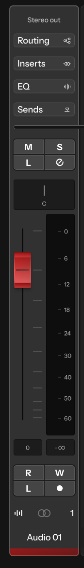
Thank you for the feedback! Yes agree there should probably be a little more prominence to the section headers for the Routing, Inserts and so on. Eventually it would be good to rationalize those with the same/similar interactions for the Inspector panel.
Adding a bit more shading around the 4 button layouts totally helps them feel more like primary commands while still being fairly subtle, here’s that with a few other updates: