It definitely wont even get noticed if it’s buried in a giant thread about the GUI design. Its definitely not normal behavior, so it would be wise to post a separate thread on it so us Mac folks can chime in and possibly help..
4 Likes
It is and sounds like a subject for a different topic, no?
3 Likes
Agreed!
00’s style highlights and drop shadows on buttons is, in 2025, an aesthetic choice. Industry trends in UI/UX have, for many years now, moved past that, making the reasoning behind that keeping such a design element less about clarity and more about aesthetics. I think as a whole there could be some refinements, mainly with regards to contrast for certain elements, but I would say 90% of the mockups earlier in this thread is simply a rehash of Cubase 12 and I for one was sick of looking at Cubase 12’s UI it felt dated and inefficient. Lo and behold 14 is the opposite of that and still very easy to get around. If many laws are broken, I suppose I am a broken user who ironically can speed past most others still bemoaning the loss of their glossy highlights and drop shadows.
1 Like
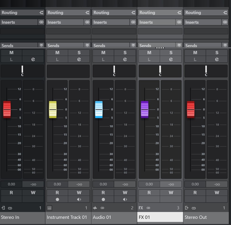
The mixer area with the effects tab is definitely a huge downgrade. In C12 everything was so clear. Now i have to focus and squint my eyes to visually separate the mess in there. And I even didn’thave the C12. Just bought C14 and this issue striked me first.
5 Likes
Totally agree with you
1 Like
I don’t follow trends and I’m not a graphics expert. And it’s not about the beauty of the graphical interface. I can only say that even though I have Cubase 14 installed, I can’t work in it. The graphics are bad to say the least, a big step in the wrong direction. The mixer view is a particular disaster.
5 Likes
I liked the cubase look till version 12. it was spaced and was giving the feel like i am actually touching the hardware tools. But from cubase 13, 14, I dont want to open cubase, GUI looks so bad, My eyes cant tolerate for long sessions. After purchasing the license for cubase 14, it became more worse.
I want to use cubase 12 by downgrading it, but i dont know how longer it will support on my mac. I am thinking of shifting to another daw like logic, which has good looking UI, and I hope it will not go completely flat like cubase. This cubase is not the cubase which I was loving it.
Please allow to change the themes, previous rounded corners and all. Cubase users in this thread which are paying steinberg, are designing and giving way much better suggestions on GUI.
Scaling the fader window in mix console, stretches the fader heads, which looks so bad.
1 Like
I’m on CB 12 on M2 Pro /Sequoia. Works brilliantly. Just don’t update the OS.
2 Likes
Totally agree with the worse “flat” and “no contrast” GUI on the new Cubase 14 Pro.
Upgraded from C12 for the great new features, esp the new vol curves function but got a shock from the “new look”.
On C12, faders look more 3D and has a shadow underneath it:

I enlarge to take a closer look at the faders in C14.
They color it more pixelated, instead of a solid colour.
Hence the “fuzzy” effect when you look at the faders, esp the top and bottom, where I think they’re trying to imitate the slope of a fader:
On the Mac, title bar and menu items seems to be in the same bar (better).
On PC, title bar is top bar followed by another row of menu items.
The best I can do to correct this is:
Go to Personalization > Colors > Choose your default app mode > Light.
Then choose an Accent color > check the box for Title bars and windows borders.
But no white color and only applies to the current window you’re working on.
Here’s what it looks like (PC):

Unfortunately, in short, seems like we can’t do much about it.
Only Steinberg can improve this.
Steinberg, PLEASE HELP!
3 Likes
For the first toolbar example, did you managed to highlight the menu items in white as well?
If so, how do you do it?
This is the bewst I can do (PC):

I’m not exactly sure but I would guess that it probably has something to do with my Windows 10 color / theme settings.
1 Like
ABLETONS design is probably because its a DAW designed for LIVE use ! it was not meant to be used sitting in a bedroom making music with, that’s why its called ABLETON LIVE. So a fancy GUI is not important when you are focusing on the crowd not the application.
ABLETON is designed to have no style, blank, bland, unchanging in appearance, like a empty canvas, so you don’t get distracted with visuals and only zone in on sounds.
ABLETON was signed by 3 guys, 2 of them were studying programming and engineering.
Like Steinberg Abletons is also German, very well engineered, but I have often found Cubase to be massively powerful & complex but lacking in style (but since Cubase 10 things have become very styled)
I wish Steinberg would completely go through Cubendo and rebuild it style wise from the ground up, minimalize it, just expose a clean interface that allows you to focus on the engineering not the face paint.
Cubase should be about what it can do, not what it looks like, let the fans decide its looks, hand over GUI modding to the users, just focus on making the DAW the best under the hood.
2 Likes
Seeing C12 mixer window again after some time, makes the view of C14 even more painful.
C12 looks like the final version and C14 looks like an early prototype.
Ableton Live has different style but it still looks like the final polished version. C14 doesn’t.
If Steinberg really wants to gain more users then they really need to redesign the GUI.
4 Likes
The new GUI in C14 sadly has made me go back to C12. Ex. Im used to having a bright track highlight color in the arrange window, but not i n the mixer. In C14 it seems that the color you choose for track highlight, becomes the same in the mixer area. This makes the inserts appear washed out and blurry. I do hope Steinberg takes this serious. I was adjusting the brightness on my screen to make up for the flat (grey vs grey vs grey) new GUI.
One more detail that was bugging me.. lines between tracks in arrange window are black.
That can’t be right can it?
3 Likes
I like just the faders - left one up PRE - right one up POST
Another GUI change that I do not particularly like is how the record enable buttons on the MIDI Inserts has been replaced with a inconspicuous line. This is un-intuitive and a user may not know that MIDI Inserts are able to be recorded if they do not hover the mouse cursor on top of the line to get the pop out text box tool tip, or dig into the user manual.
Now only MIDI Inserts that are above the line are able to be recorded, this leads to possible potential issues such as:
- Having to re-order the MIDI Inserts to get the desired recording.
I find this change to be an issue both practical and visual.

4 Likes
Flat design is so old that it’s already out of fashion again, and I don’t understand why Steinberg is so keen to use this design in Cubase.
Ableton Live and Bitwig pursue slightly different concepts and a different workflow.
Instead of investing so much time in changing the GUI, they should rather work on stability, bug fixes and performance.
5 Likes
First, I agree that there is plenty that could be done to make Cubase easier to see, but I’m not sure that ‘flatness’ has much to do with that.
Isn’t the point of a ‘flat design’ to make it possible for more data to be on display (and manipulatable), as opposed to having to wade 18 menus deep to do things?
Is ‘flat’ about the ‘look’ of the windows/gadgets? Or is it more about the philosophy in how much or little is displayed and useable at any given moment?
Maybe I’m wrong as GUI design isn’t something I know much about, but I’ve always thought that it’s not as much about ‘look’ of the interface (shadows, colors, etc) as it is about avoiding needing to go 32 menus/popups deep to get things done.
Example:
When I think ‘flat’, I think of the Cubase Drum Map. It’s all laid out right here in one easy to see/use spreadsheet-like format. Triggering, Output Path, Note Shapes on the Score, and more. I don’t have to wade through a dozen different popups, windows, and dialogues to get something done. I click a simple field in what looks like a simple XML style spreadsheet and presto, it’s done!
From a developer perspective, if more features/abilities/data-types/etc. are added to the program, all they have to do is add another column. From a user perspective, until people start demanding changes to ‘be like DAW X, Y, or Z’, I know if it has to do with Drum Kit Mapping, it’ll always be ‘here’, and work like it always has.

Something ‘less flat’ in my mind, is the drum mapping GUI in Dorico. It’s not ‘flat’ at all psychologically! Instead, it’s like a 8 story building complete with dungeons and catacombs for the dead. I have to go through dozens of different windows and dialogs to accomplish what I can do for Drum Mapping (both acoustically, and how it shows up on a stave) in one rather simple Cubase window.
All this space, and it still doesn’t take care of the note shapes/styles! That’s yet another 18 levels deep into the program. Why not ‘flatten’ it so I can go ahead and dial up what note shapes I want these instruments to use right here in this same UI without first clicking this, then scrolling that, then popping up yet something else?
This GUI shows me a bunch of what I already know, but doesn’t give me any cues at all on how to make this kit actually make any sounds! It’s kind of WYSIWYG, but then again it’s not anything close to WYSIWYG….hence, the ‘flat’ Cubase approach of one big spread sheet with a few graphical hints in the fields seems like it’d be easier for both the users, and the developers.

I finally teach Dorico how I want it on the page, and still have to go through another 14 levels of GUI to get around to ‘mapping out’ the kits to go with whatever percussion instruments/plugins I’ll be using.
Screens are bigger these days too, both in physical size and resolution. Might as well take advantage of the real estate, and not have user having to navigate the Tower of Babble (side step through menus to more windows and dialogues) to get at everything.
While I agree that plenty can be done with fonts, colors, and shadows to make things easier to see….give users more ‘customization’ on how much/little to show, the sizes, etc, I actually LIKE that I can do more straight from the Track Inspector.
HALion is one of my faves, and I’d like to see more of that approach extended into Cubase. How so? The part where a user can instantly make scrollable panes in a window (Vertical or Horizontal Window Splits) on demand, pop panes out of the main window if needed, pop it back when the larger view isn’t needed anymore, keep presets for any GUI arrangement we like, etc. (The whole thing reminds me of Blender).
Currently Cubase has a few preset ‘zones’, but the HALion approach would allow users to make and remove any kind of display zone we like, on demand, and as needed pop it in and out of later dedicated windows.
Just my two cents….
For the most part I’ve liked all of the Cubase GUI’s over the years, and when it comes to visibility I’ve had a pet peeve or three with all of them as well. I’ve NEVER like the default color schemes out of the box, but I do like the dark skins, and can usually fiddle about with the colors a bit until I get something that pops out for me across my workstation desk/table/console/whatever.
If I stopped to think about it, I could probably write a book on stuff I’d like to see done a little differently with the GUI, but my rant books tend to be about functional aspects of the app (squashing bugs, or wish lists for time saving workflow enhancements).
1 Like
Hi Brian,
I understand your point of view.
Cubase is a complex programme with different levels and functions.
This makes it all the more difficult to implement a single concept.
In the case of the list editor, I would also prefer the Cubase version to the Dorico version.
However, I do not see any reason to apply this concept to the entire programme.
Unfortunately, I only know a little about web design, and depending on the device, flat design can be very helpful there.
But even in this area, it’s important not to overdo it. I can confirm this from my own experience. With flat design in particular, there is a tendency to make everything even simpler, which then leads to a certain degree of confusion.
There are now two types of flat design.
Minimalism and the new neuphormism. So it once again contains elements of skeuphorism design.
Neuphormism also includes 3D elements and is the answer to the criticism that flat design is too boring.
When implemented well, this type also contributes to clarity. The emphasis is on ‘implemented well’.
Finally, here are a few disadvantages to consider:
Lack of depth and visual cues can make user interfaces less intuitive.
Reduced intuitiveness: The absence of shadows, depth, and other realistic visual cues (called affordances) makes it difficult for users to understand what is clickable or interactive.
Lowered efficiency: Users may need to guess which elements are interactive or search for hidden features, which slows down navigation and decreases overall efficiency.
Difficulty with complex interfaces: Conveying a complex message or intricate app flow can be challenging with a heavily simplified design, as there are fewer visual cues to guide the user.
Lack of distinctiveness: Using a limited set of principles and minimalist visual styles can lead to designs that are generic and easily confused with one another.
Over-reliance on trends: Flat design’s nature as a trend can lead to designs becoming outdated, as more innovative styles like neumorphism and glassmorphism emerge.
Focus on aesthetics over function: Designers can become so focused on achieving a clean aesthetic that they neglect crucial usability aspects, leading to a poor user experience.
Over-simplification: While flat design aims for simplicity, it can sometimes lead to an over-simplification of visual hierarchies, making it harder for users to prioritize information.
4 Likes