I wish users could choose which UI design Cubase uses in the settings. All users being given the options “Classic Mode” or “Modern Mode”. Classic would load the GUI from Cubase 12, while Modern would load the current CB14+ GUI. I realize so much is integrated with the GUI that it would be a lot of work to add this feature, but I think it would be the best way to resolve this issue.
Since the CB13 release, I’ve noticed a few times the term “boomer” has been thrown around in the forums while discussing the GUI. Some believe that older users just don’t like change and they’re unwilling to accept progress. That’s not what this is about at all. The CB13 GUI changes aren’t progress; they’re a huge step down.
For reference, I’m 29. I started on Pro Tools when I was 16. At 21 began using Logic. At 23 switched to Cubase Pro 10. I immediately fell in love with the look and feel of Cubase. I loved the GUI way more than PT or Logic. Later upgraded from CB10 to CB12 and I truly believed CB12 felt and looked perfect. CB12 is the pinnacle of a comfortable DAW to work in.
Last year, when I “upgraded” from CB12 to CB13 I didn’t like the new GUI from the start, but I thought I would get used to it. I didn’t. I found myself feeling oddly stressed out within the first 10 minutes of work as if I had been working for hours. I took more breaks and I began procrastinating opening Cubase. I hate the flat look. I hate the lack of contrast and color. I hate the buttons towards the top of the inspector all being perfect squares. I don’t like the font style. I really hate the feel of the mix window. Overall, it feels very corporate, like a zombie accountant who hates his life doomed to work on a never ending Excel spreadsheet for eternity. That’s the feeling I get from the CB13 GUI.
I ended up deleting CB13 and going back to CB12. I need to be able to work in Cubase ranging from 6-12 hours a day. I can’t work in a DAW that has such an uncomfortable feel to it.
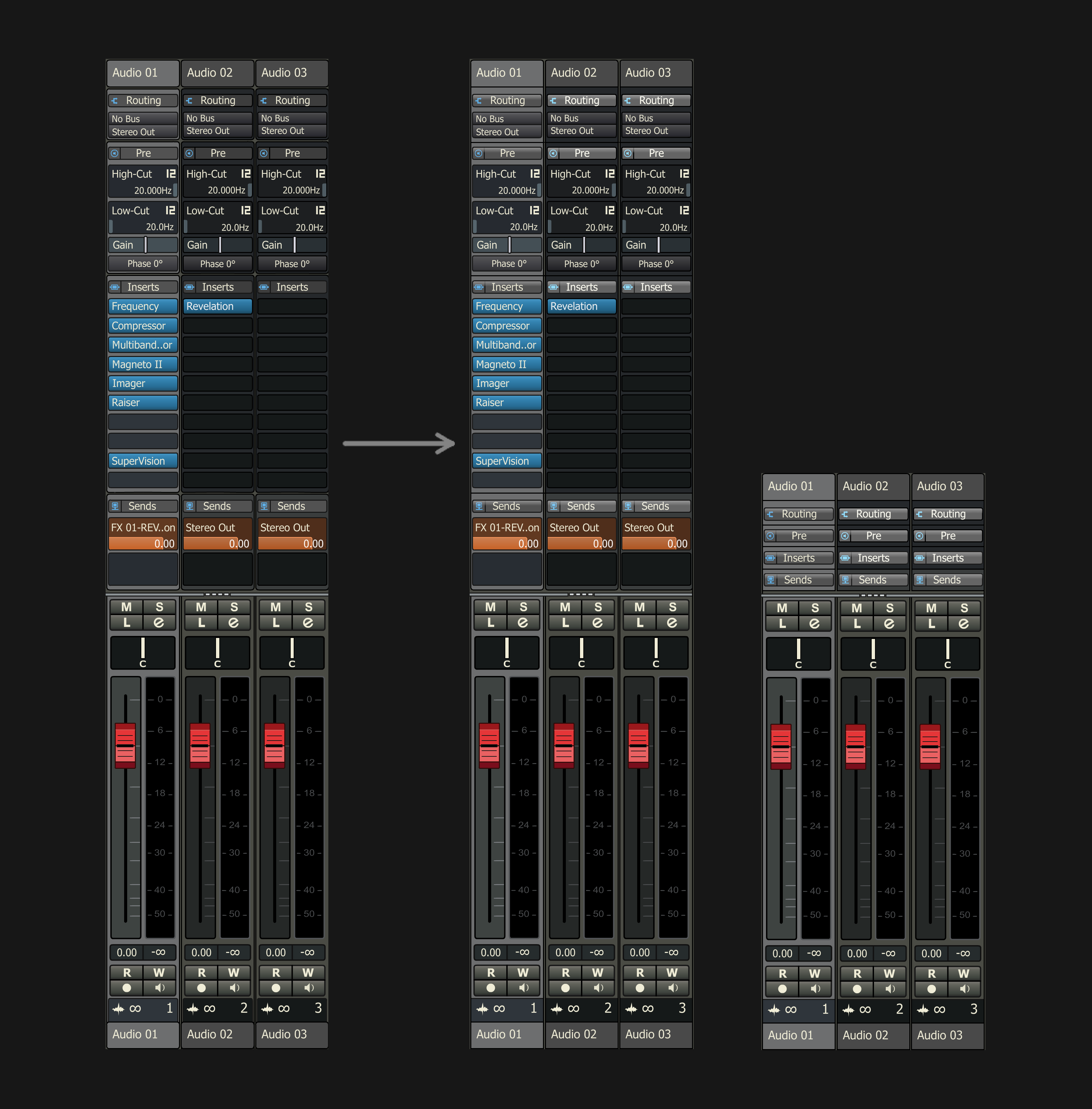
I don’t understand how anyone can compare the mix windows between CB12 and CB13/14 side by side and not agree that CB12 is obviously superior in every way. The CB12 mix window is so much better. It’s undeniable.
I’m really excited by the new features in CB14, but I haven’t upgraded yet. The GUI is a major concern. I want all the new features of CB14 but I want it to look like CB12. A “Classic Mode” GUI setting option to toggle between CB12 GUI and CB14 GUI would resolve this issue entirely.
Again, I realize this would be a lot of work and a very time consuming project, but I would love you forever if you did this.
I don’t know, it’s a struggle to get those colors right of the selected and unselected tracks. I’ve been staring at it for so long, I’ve became blind to what is good and what is not. Maybe someone could give some fresh, unbiased feedback? Does this work? What could be changed, improved, etc.?
I personally wouldn’t mind working with the mixer like this
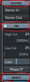
The only thing that could change, which is a design issue, would be in the short texts, which are aligned in the center. for example in the routing section. Where it would be best appreciated would be with a mixer with many channels involved. But I think your design is great. It’s like a mix of V12 and V13+14
I appreciate your feedback. Yes, I consciously changed that to make it resemble the older version, where the text is centered and the blue on/off “light” is on the left side, which is why I also placed the icons on the left, as well. Btw, I just noticed that the old text is also in caps, so maybe I could try that as well. The reason I thought it was good to center the text is because every other text is on the left and I wanted to create a visual separation. “Routing”, “Pre”, “Inserts” are main categories and they should be easy to spot, imo, and not blend in with their own content, if that makes sense.
They may not be the most current or “modern” colors but at least they are readable. It would even be easier for Steiny to change them. I’m sure it is more difficult to do what you are doing than Steinberg to use the previous GUI in v14 (I have tried it manually and it doesn’t work)
I remember asking ChatGPT to help me with something Cubase related, and I asked it to provide me a screenshot from Cubase, to make it easier to troubleshoot. And it ended up rendering a creepy version of “FL Studio” GUI, and it looked like something that was made by H.R. Giger.