While the Dorico team is in the planning stages of 2.0, I’d like to add my requests for the next update, and they’re big ones for my line of work. In the interest of being more digestible than, say, the 95 Theses on the door at Wittenburg, I’m doing this one post at a time.
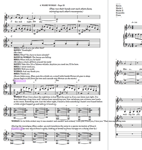
Text and lyric improvements. I think text entry in Dorico is a bit of a mixed bag. There is genius there, but also some clunkiness. Here are some ideas from this user, who also spends a great deal of time in apps like Adobe CC:
-
Keyboard shortcuts for bold, italic, etc.
-
The option to set alternate text styles for elements like lyrics in different flows or layouts. When I compose a new liturgical piece, Dorico gives me the flexibility to keep the full score, parts, and the congregational reprint in the same file. (Yay!) However, it’s best to keep reprint lyrics set to a safe font like Times New Roman, so I’d love to be able to make that happen separately.
-
A two-column format for text styles in Engrave, like we have for paragraph styles and so many other options screens. It’s so frustrating to have to close and open that dialogue for every style I want to edit, especially when setting up a new doc. I’ve saved template docs for my main work, but, of course, that is not always relevant to a project.
-
Lyric cut and paste. I miss this from Sibelius and Finale.
-
Lyrics in Galley View: PLEASE adjust the justification of lyrics in galley view from “Unyielding Absolute” to “Bottoms Up,” i.e., justify verses closest to staves. In my work, I do multiple choral arrangements for a single piece, usually for groups of verses. Having a verse 6 in the middle of the next staff down, especially because each syllable can be accidentally selected, is supremely annoying.

