I’m not able to get Dorico to space neatly like it normally does, when I’ve got chord symbols and mini-tabs above the staff in the guitar part.
Can anyone help? I’ve greatly expanded the vertical spacing and lowered the justification percents to no effect.
I’ve attached zipped up the project below.
2020-06-12 21-39-45_Bridge Over Troubled Water (reggae).dorico.zip (802 KB)
The full score layout looks OK to me. It’s a bit tight on the first page, but switching off flow headings on the Page Setup page of Layout Options gets you pretty close.
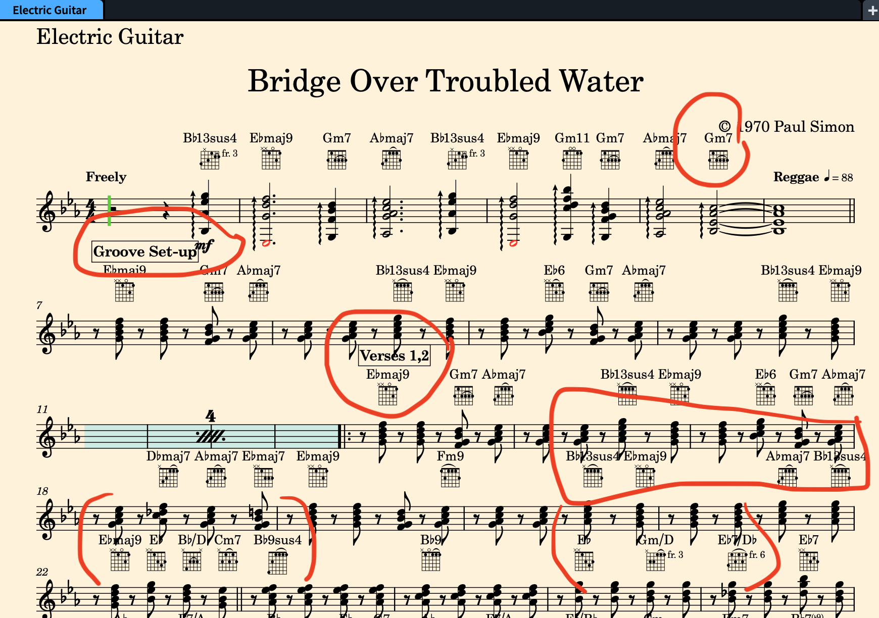
I was just talking about the guitar part by itself. There are overlapping items. Please see attached pic. Usually Dorico is good about making sure items don’t overlap…
In layout options for the guitar part set the inter-system gap (vertical spacing) to 15 spaces, the top music frame margin (page setup) to 14 or 15 mm. Move the tempo indication to the left in the rythmic grid, or insert a system break at bar 7 so the tempo indication does not appear above the system text.
Thanks for the tips, rafaelv! That “inter-system gap” was the ticket! I never would have figured that out.