Equidistant Tool strip Buttons in Cubase 10.5

Hi,
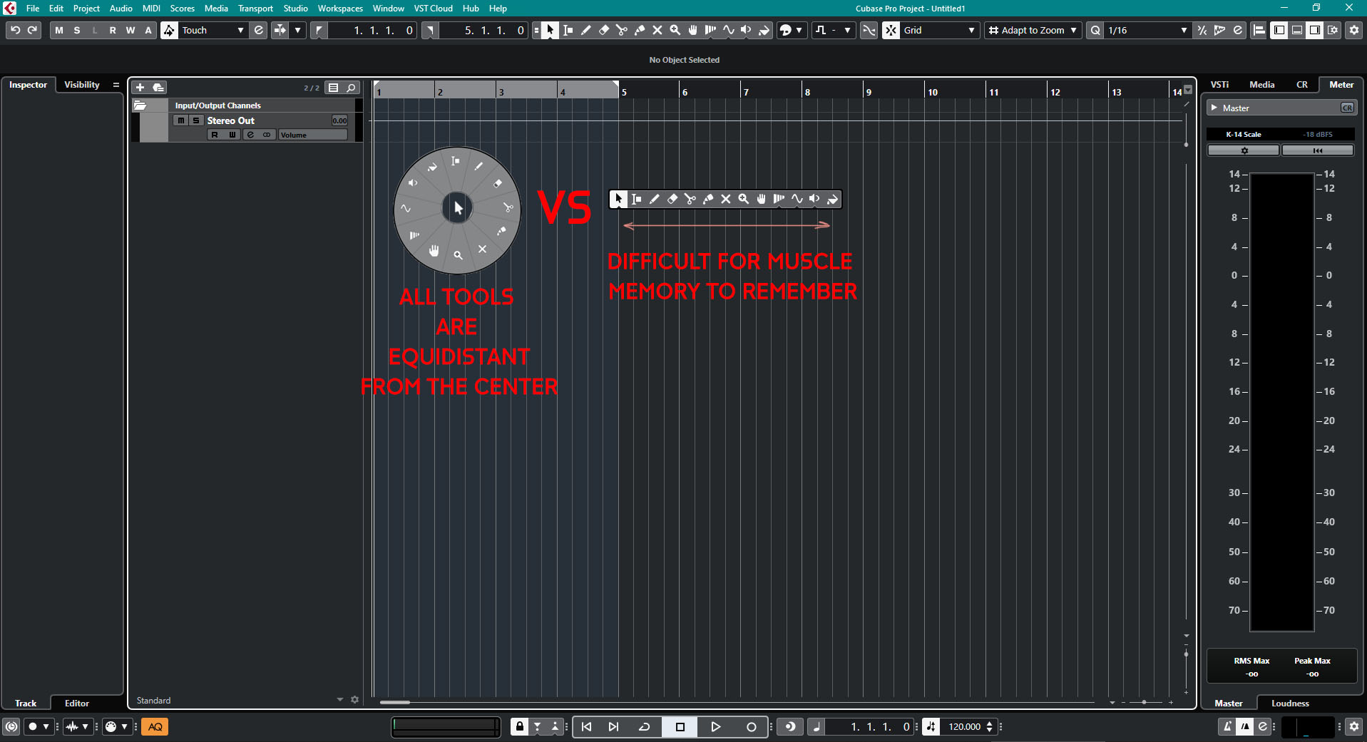
I have a suggestion regarding the buttons on the tool-strip (when you hold right click) in Cubase Pro 10.5.
EDIT: This won’t remove the Right-click release behavior to get back to the selection tool from previously selected tool. It will act the same it’s just arranged differently to reduce mouse traveling distance.

When I’m editing I find myself using the tool-strip a lot - it’s a very fast tool - by making all the buttons equidistant from the center by arranging them in a circular way, it would make them all accessible within the same traveling distance from the center when you right click.

Please check my design in the picture attached below.
Excuse the bad looks of the circle I’m sure Steinberg designers will do a better job than me but you get the idea.

I hope you like my idea,

Sincerely,
Simon

This would be awesome to use together with the Microsoft surface dail microsoft surface dail - Bing video

+1!
Great idea !

+1
Why not, can’t think of any negatives by doing that ?

+1

you missed the selection tool though, perhaps it could be a center ring.

dont do this, i dont personally want it and this would cost resources on things i want

i actually think this would be great @thebabegrand just processing the fact that ^ this is something people actually post on here

This is your take on this? :open_mouth:

I think it’s a great idea. Many modern software uses this kind of menu (most Autodesk applications for all I know) and there’ve been a lot of threads on getting back the old 2-line toolstrip. This would be even better. Could also get rid of the “hold for more options for this tool” action and just expand the ring.

nah i actually think it’s an awesome idea. just saw someone ITT post that on a different feature i liked and had a laugh

Yes that’s what I intended the center for the selection tool and the combined selection tool. Thanks for 1up this!

Thanks everyone!

Cool idea. But let there be an option to the old way–I like this but it feels like a horoscope chart :slight_smile:

+1 looks really good

It’s a good idea. +1

Definitely would like to see this in the future. Very good idea

Fantastic idea! I’ve always just used the number keys, but this might actually get me using the right click menu!

I agree. This would be extra convenient tool. And perhaps to add a transparecy to it.

Yes transparency will definitely help thanks for the great suggestion!

+1

Also, the ability to switch in Cubase’s Preferences between new vs old tool strip would be great for those who are a little more conservative.

I think this is a great idea!

This will be more accessible without really looking which eventually would speedup the process.