I hope in the future there will be chance to switch off the note spacing grid and just move the notes with mouse cursor.
Now I can only move the notes by clicking on a square and then spot and move a little bit with the option+arrow or a little bit further with the option+cmnd+arrow.
But in the more complex score the note spacing grid could be problem itself.
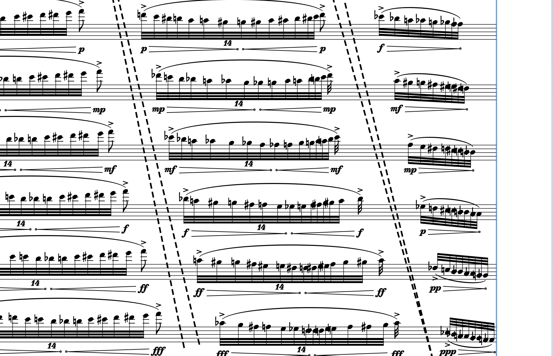
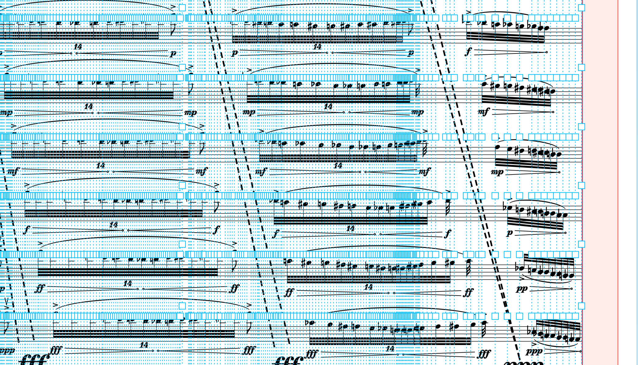
See the example. This is my score:
Are you manually moving those entire phrases so that they become “offset” by one note each time?
Wouldn’t it be easier to actually put them in the correct rhythmic positions and then adjust the beaming accordingly?
I’ve had similar situations, maybe not as extreme as this. Navigating with the arrow keys works well for me, though. Arrow forward to get to the next box, and if that box has a note in its staff, the circle for that note will appear; you can quickly see which grid positions have a note in an individual staff.
It’s a little bit slower than just clicking on a note directly, but I feel like I have a better sense of what exactly is happening, metrically. And if I do want to make adjustments later based on the meter (i.e. adjusting every player’s note position, not just one), it’s very clear what the difference is between individual and group adjustments.
Judging by the mess of note positions in the second attachment, I guess they are rhythmically offset, but not by an amount that is consistent with the note length in the tuplets. So there is a new set of rhythmic positions for the notes on every staff.
It might be easier to enter the notes in “wrong” rhythmic positions which do line up on each staff, and then adjust the positions of whole groups of notes - and possibly fake some of the notation which is outside the attached images.
This is a part of much bigger score, where I mix aleatoric spatial notation with traditional notation. Due to get optimal note spacing with rest of the instruments – and because manually moving would be very time consuming – I decided to shift each part – relative to the previous one – by one 32nd and hide the rests. The result is satisfactory, but when I need to correct some notes, it is very hard to do it.
Anyway, this was just an example, but I had a lot of hard work with the changing note spacing in other situations.
And thanks, Stephen Taylor, for advise, I will use it.
I’ve never dealt with anything this extreme, but I have had issues with handles covering things up more than once. This is particularly true when you want to move certain notes really close together and then the handles can cover up the gaps. Hopefully they will think of a method of improving this.
On the whole, I actually like the system they’ve given us; square handles to move columns, circle handles to move individual notes relative to those columns… I think it offers a lot of precise control. I hated, for instance, how in Sibelius you had to stretch a note before it would allow you to tweak its position; then it would cause everything to lurch and you’d have to move it back. It was unfortunate and disorienting. I think this way is much superior, but it admittedly causes issues in a case like the OP. Perhaps there could be an alternate mode where the note heads themselves change color as you move around. I don’t think the columns should go away though.
I was suggesting you shift by one note of your tuplets, rather than one 32nd, so the rhythmic positions of the notes on each stave are aligned. You could then “unalign” them by dragging if you want to.
It’s hard to be more specific since your attachments don’t show the complete bar, or the complete system.
Thank you, Rob Tuley, for Your advise. Indeed, in this particular case it would be much easier, but there are a lot of that kind situations, so for now I don’t have time to change all my score. But this is not a big problem. I just have a hope, that the future will bring better note spacing solution in general.
But why not to have both options? Note spacing grid can exist, but I would like, in particular situations, to switch off the gird and move the notes with mouse cursor. And when I switch on the grid, my changes will appear in the same way, like there is now.
That’s actually what I meant. I don’t think we should get rid of the column view as it is now, but perhaps there could be an alternate mode where just the notes are highlighted.
I just started to work with the note spacing tool and I had a panic attack looking at the UI.
It was lees horrifying than Del_gesu’s case but nonetheless.
My request at this point (apart from an alternate mode with no grid lines) would be at least to make the blue dashed lines and squares much thinner so they may look less “foreground”…
This seems the most appropriate thread for this request, but I would like to ask for a different improvement: an update to behavior when staves include ossias. I was thrown in this example when I was quickly trying to move through the score and Dorico defaults to selecting the ossia stave as you right arrow through the piece. That’s no problem, but what happens is when you get to the end of an ossia, it jumps directly to the end of the stave like so:
I was very confused for a moment as I thought I’d lost my selection. I would find it helpful if once an ossia stave runs out, some logic made the right arrow select the next note below on the main stave, to continue advancing like so:
Obviously, now that I know what to look out for, I can arrow down; the problem is when you are trying to quickly advance through a score and then all of the sudden the selected handle jumps a bunch of spaces and your eye can’t follow.