Can you supply a small example document that has this problem?
(Just one flow; and just a few bars.)
Can you supply a small example document that has this problem?
(Just one flow; and just a few bars.)
sure!
test.dorico (711.7 KB)
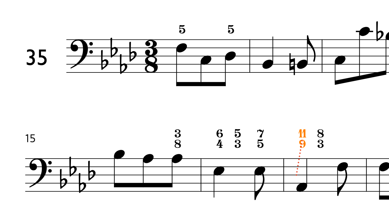
When I “back-open” your project in 5.1.60, I also do not see the property for showing compound intervals as simple.
Hmm…
interesting ![]()
“Grasping at straws” here:
it was made from scratch
Ah yes, it might be the font…! Academico Regular
This is indeed caused by the fact that the Engraving Option for “Figured bass appearance” is set to “Plain font” rather than “Bold font”. I’m not sure at the moment why this might be, though I will see if I can find out.
And why must one use bold fonts to allow these simple - compound functions? Doesn’t it look quite ugly in bold style? It would be far better to have people customize their house style regardless the font they would like to use. I’d be happy to get an explanation for why this is coded in this way.
They are not actually “bold” fonts – they are actually music fonts. “Plain” fonts are text fonts.
There are other music fonts you can use for Figured Bass, if you don’t like Bravura, such as GoFigure, which can be used to replace the ‘normal’ Bravura glyphs; and you can also use it in lyrics to create additional kinds of figures.
Make sure you’ve reset the Engraving Options to use “Bold” font. That way, you can use slash figures, if you need them.
What are slash-figures?
Aha… I’m using Italian thoroughbass so I would write #6 there.
I never use them ![]()