Obviously there’s not the slightest chance that they will do a manual for WL7 this far down the road. It remains to be seen whether they are having a rethink for WL8 (which we now know will be the next significant version).
Paul
Obviously there’s not the slightest chance that they will do a manual for WL7 this far down the road. It remains to be seen whether they are having a rethink for WL8 (which we now know will be the next significant version).
Paul
As a casual user,I only use it after Protools and Cubase, I find it far too busy compared to WL6 which was the last incremental version that you could feel at home with. It’s a bit of a headache frankly. I bought Ableton Live as a different approach to things and I was producing things in no time but to be frank WL7 is a mess, hopefully WL 8 will return to some user friendly, easily worked software. I reckon PG who has been on the ball up the this point apart from the chunky graphics, that I don’t mind anyway, will be sorting this out as we speak.
I am WL user since version 3.
I am using it professionally on a daily basis, sometimes for 8 hours a day.
My tasks are recording, editing, restoration, CD mastering, batch processes…, in short: I am a hardcore user and nearly use all functions of Wavelab. My learning curve for WL7 was short. My first action in WL7 was to assign all shortcuts I was used from WL6 to the correct keyboard commands. I was feeling much more comfortable then already. Next was to setup the control window on my second screen in a similar way I was used from my WL6 control tools setup. Then I closed all workspace specific tools and the look of Wavelab was quite similar to WL6. I created new keyboard commands for regularly used workspace specific tools, so now I can open and close these tools, when needed, with one push of a button - one thing which I still find extremely elegant.
I was able to do my tasks then. The more I used the program, the less I wanted to go back to WL6. I still have WL6 on my computer, but I never use it anymore. Why should I?
I think, what confuses many people are all these workspace specific tools when they open WL7 for the first time. I have said this before in a nother thread: I recommend to close them all and only open those that are needed right then. This will take away a lot of the confusion for many people.
I wonder what the significant losses are that you are speaking of? Please tell us some more details.
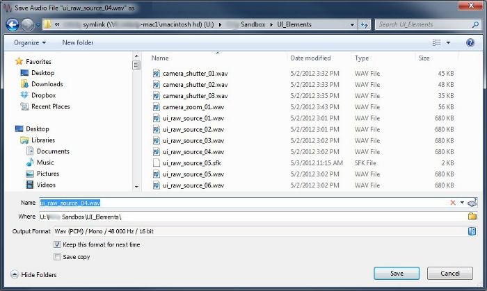
I came to the forum to find the answer to another problem and saw this thread. I have to agree with the OP that the transition from W6 to W7 was quite rough. It seems some things took a big step backwards. For the most part, I’ve adapted, but the holdout flaw for me is the behavior of the Open and Save dialog boxes. I really miss the way they were in W6 and I cannot figure out how to get the audio file Open/Save dialogs to function the same way, nor do they even follow the standard Windows behavior. Maybe I’m just missing something that should be obvious, but it takes me too many clicks just to choose a destination directory and save a file into it. I do not like that there is a separate “Name” and “Where” field when specifying filename and destination, instead of the standard view of a current directory with a Name field at the bottom. Sure, I can click a menu in the “Where” field to choose a “Standard File Selector,” but all that does is make it more convenient to fill in the two aforementioned fields that shouldn’t have been presented in the first place, in my opinion. I can check the box at the bottom to “Open standard file selector before this dialog,” too, but my goal is to not have to deal with that Save as dialog at all.
The Open file dialog is a standard file selector (good!), but it lacks features I come to expect in an audio application, such as showing a selected file’s metadata and the ability to audition in place.
Again, I hope I am just simply “doing it wrong” and there is a way to get these features to behave as I wish. I use WaveLab daily as part of my work as a sound designer, but, even after months of working to adapt, I still find my workflow hindered by some of the changes, especially the ones I’ve described above.
For me - the biggest “loss” with WL7 was the presumption that different is better. That the core processes (batch, montage etc) were moved in a thousand windows scattered everywhere when pretty much the entire audio world is moving the other way - where a tight, task based, singular interface (ala Logic, Studio One, Audition) allows a user to remain focused on the task with maximum efficiency and minimal effort (or clutter).
Instead WL7 went into this interface that no one ever asked for and certainly no one has experienced before and turned the app from a racehorse into jumbled, window filled mess that has all but the most seasoned vets running for the Close button on every window or panel to clear the clutter.
And to echo BluenioseMF - the non-standard file dialogs, button placements and other stuff that has been discussed here ad-nauseum continue to frustrate me. This is definitely an app with a mind and design of it’s own - 20 year old standard Windows UI conventions be damned ![]()
Those are some of the biggies for me. But - as mentioned earlier - now that I have finally given up hope that anything is going to change (and with no manual ever) my WL days are numbered for all but the most esoteric audio tasks.
VP
I tend to agree that the file selector dialog is overly complex and causes confusion.
Another things that causes confusion is the Master panel which works for both the Wave editing window and Montage window. One false click to highlight the wrong window and you end up Rendering the wrong file. The Master window should have a label to state which part of the program it is refering to.
The Record dialog is also very confusing as to where it is recording to. This window is common to Recording to either a track of the Montage or into the Wave Edit window. However there is no way of telling which one, unless you close it and reopen it from the place you want the file to go. This should also be labelled, or else a selector installed in this window to choose where you wish to record to. Either ‘To Wavefile’ or ‘To selected track of Montage’.
There are a few other inconveniences that were not in previous versions of Wavelab, but maybe they will be improved in WL8
Wavelab has become complexer with the years, because more and more features have been integrated. This is good and it has often been a reaction to user requests. I doubt that many other apps have integrated so many user requests as Wavelab. I personally have profited many times by these improvements and updates.
But of course: The more complex Wavelab becomes, the more it has to be structured. I think that the new structures in Wavelab 7 are the effort to structure the different elements into logical subgroups and not so many “historical” subgroups. This should be an advantage for new users and maybe causes some confusion with old users. But in general I find these subgroups well chosen and helpful.
You can call it intuitive to put everything together into one window - I call it confusing.
I love the file browser in WL7 (I mean the workspace specific tool).
I have also come to appreciate the new save as dialog. I like it better than the one in WL6. It is faster for me.
Is this different to WL6? The master section was always working for montage and wave window, whatever was on focus. In the contrary: It should be easier to now what is on focus in WL7, as montage and wave window are different workspaces.
Again: Was this different in previous Wavelab versions? I don’t think so.
The main difference is that now, I have both Edit and Montage window open at the same time on two monitors. WL6 had them stacked so you could not sepparate them. Therefore the Master and Record were only active to the workspace you could see.
I realize that it’s up to me to develop a new layout scheme that will be less confusing. However it’s very convenient to have them both open and work simultaniously.
So, you are using a new option, that was not there in WL6, and that you find very convenient. Obviously this has not been possible with the old Wavelab layout. However, you could as well work in the same way as with WL6 (i.e. have both workspaces on the same monitor and hence only see the one with the focus on it).
To me this does not sound like something that has become worse, but something that has been improved and maybe could be improved further. With your current layout (wave window and montage window on two different screens) it is now possible to get confused about which workspace has the focus, I understand that. I am sure PG understands that, too. Maybe he could do something like you asked for, a flag in the master section which shows which workspace is active (or maybe the master section could change the colour or whatever…).
The main difference is that now, I have both Edit and Montage window open at the same time on two monitors. WL6 had them stacked so you could not sepparate them. Therefore the Master and Record were only active to the workspace you could see.
If you have the Master Section auto-docked, it would be easier to know the active workspace.
Philippe
Yes! I think this would be really helpful. Not only to have the master section showing for which workspace it is active (with an icon or so), but also - and more inportantly to me - whether it is being bypassed or not. A lighter colour shade would be perfect for that, I think. I know we have the tiny icon in the wave screen (the filled Y, whatever it is) but this is too easy to miss.
As for the general subject of this thread: It took me a long time to get used to WL7, and I can more or less find my way around now. However, I disagree about things being in logical places now. After all this time, I’m still searching for the most basic things - well, the ones that I don’t use that much - because to me it’s impossible to predict whether they are in one of the main menus (‘edit’, ‘options’, ‘tools’, ‘process’), or in some panel or tab that I should have gotten in view… What’s wrong with right clicking anyway? And yes, I’ll bring it up again: the lack of a manual has not been very helpful.
Can you give examples for features you find placed not logically?
I think nobody will disagree here…
Each to their own I suppose ![]()
However a program like Studio One is easily 100 times more complex than WL will ever be - yet using that application with it’s sleek, single window interface is a breeze - for me - practically everyone else who has used the app. The interface is universally praised for it’s design and how it seems to “drive” itself once you get comfy.
Not once have I had to post on their forums on how to find something, or clear clutter or even learn my workflow. It just “happened” . And I haven’t yet needed to consult my manual either.
VP
I don’t know Studio One… But do you really want to tell me that his program is 100 times more complex but by some miracle this complexity does not confuse but you can find anything without looking into the manual? Then why do you even bother to waste time talking about Wavelab anymore?
Come on, let’s leave away these mystic and cloudy descriptions and let us talk about concrete things and details that other people can follow.
My main point is that there is no fundamental difference between WL6 and WL7 and even more WL7 is no step backwards but forward. Some things are organized a bit differently but overall I can understand why these changes were made and I still love working with Wavelab.
The only thing I really don’t understand is, why there is no manual anymore. This clearly is a mistake.
I suggest that look into Studio One before commenting on what it can (or cannot) do. And then - once you have a clear understanding - go to the Presonus forums and compare how many folks there are complaining about their UI or general confusion on how to operate the program - vs the endless debate on UI here in this forum.
Because after 18 months of struggling - I was hoping things would get better - and they have not. Sure V8 is mystically being rumored but that could be years away given the 4 year timeframe it took to get WL7 stable.
The real question you should consider is this - if WL is so well designed - why do these threads show up again and again and again? You would think that if the interface was clear, intuitive and concise and people “got” the program - this type of chatter would eventually tone down - but does not. User after user, month after month - the same concerns and questions persist…always about the weird interface, confusing layout and general “I’m lost - where’s the manual?” vibe.
To me - that a constant reminder that something is just not right.
Apologies - but if you really believe there is “no” fundamental difference between WL6 and 7 - you are definitely in a class by yourself. I used v4 and then v6 for years and thought of myself as a pretty seasoned WL user. But when 7 landed - it was back to square one. And honestly - even after 18 months of daily usage - I have never ever felt comfortable or confident in my abilities in this version.
So I stumble around using the cobbled together workspaces that I was forced to create - while at every moment - scared to click here or there for fear I will either make something disappear that I need or that I mess up these two workspaces to the point of having to recreate them.
What 7 has taught me is - once you get something that is usable - never touch it. At least I can get some work done. But that’s no way to operate.
Anyhoo - my time with WL is slowly winding down - but if you find it to be to your liking - that’s great. User experience is a very personal thing - while WL has served me well over the years - my patience say it’s time to move on to other things.
VP
Would you please describe your typical workflow and how the new Save As dialog has made it faster? I could really use some pointers as it’s generally an obstacle to rapid workflow for my purposes.
Would you please describe your typical workflow and how the new Save As dialog has made it faster? I could really use some pointers as it’s generally an obstacle to rapid workflow for my purposes.
In the “Save as” dialog:
What can you suggest faster?
I like those features, but I’d like the traditional file selector to also be shown. In other words, what if the Save As dialog was just like it is in other apps, but had the W7 Save As dialog’s contents appended to the bottom? There are many times when I’d like to see the contents of the target directory when saving a new file. I might want to rename an existing file or delete it before saving the new one. Currently, I get around this by keeping the target window open in the Explorer, but other applications allow me to do that on-the-fly in the Save As dialog.
I appreciate the history popup, but it only is useful when I’ve been in that directory before. If I’m working on multiple projects, it can be handy for switching between them. However, that’s two clicks to get to another directory (click to open list, click to select directory). In the standard Save As dialog, it’s a single click to a “Favorite” shown to the left of the current directory’s contents. I can manage the Favorites list, but I haven’t found a way to manage what appears in the History list.
Here is a mock-up that I think would help a lot. Maybe others would agree. It’s a visual representation of what I’ve described above.