In Henle or Bärenreiter editions, suggestions such as fingerings from the editor are printed in light grey, while the notation from the composer is in regular black. I’m working on a project in which I’d like to differentiate between suggestions and necessities in a similar way. Is this possible in Dorico (Pro), and if so, how is it done?


Are they? I’ve not seen that in either publisher’s works.
Normally, editorial marks are distinguished by using Italics or brackets, or dashed slurs. Grey will be harder to read, or hard to distinguish, depending on the exact shade and how it’s printed.
I have a memory of seeing this done in Alfred publishing’s Masterwork classics, a series designed to supplement piano lessons. I can’t put my hands on a copy right now to confirm.
Maybe this is what I’m thinking of. I’ve seen the Italics or brackets, which makes sense for an occasional marking; in the piece I’m editing there might be a lot of editorial markings so I wouldn’t want brackets for all of those. I’m trying to indicate player suggestions (mostly fingerings and bowings) added to the composition, rather than distinguish between authentic and added markings. I’d like to give the player suggestions less weight than the compositional prescriptions, without adding a lot of additional notations.
Thank you, this looks really helpful and I’ll try it!
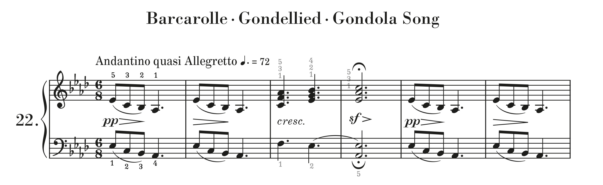
Henle do use grey fingerings in their newer editions:
You can read about it in their blog (worth signing up for, by the way):
In case it helps, here is how you can create grey fingerings as playing techniques (and how to enter them with the popover or the right panel). Example with just 1 and 2:
And in case playback matters for you, it can also be useful to apply this process to the fingerings:
Happy Cake Day (Forum Anniversary), @Julietta .
Yes, these editions are quite lovely! And well-researched.