Hi,
I believe that if channel’s icons & numbers in the mixer, would be set closer to the center of the channel’s stripe, the perception will be much better. Perhaps, numbers should stand at the 1st place. Maybe, icons could be color coded.
What do you think?

Yup, I like your idea. Or, icon and number could be aligned left, under buttons. In any case, they ahould be together.
Now icon is left, and number is right, and that’s opposite from what eye expects. Eye is drawn towards number from left channel, and icon from right, which is not right. Number and icoun for each channel would be better together.

or like this
Did you manipulate it?!? Or it’s possible …?
Or just simply return it to the way channel classes were defined in C5. And this time…make it a Preference.

Hi, cubawak.
Sure it’s “handmade” ![]()
Weasel. Yea, preferences is the proper way for GUI. Albeit, I like C6 more than C5, because I think that icons are more informative and the color button is unnecessary.
studiodaz I don’t think that “icons under buttons” is a good idea. If the icon is right under the name, so when you look at the name of a channel, you can catch it’s type, but in your case you must move your eyes up to see the type.
BTW I’d like the names of the channels are centered as well, when possible (if they’re shorter than the name field). I’ve tried to do that manually with extra spaces, but then the names of the tracks are not aligned.
i sure prefer your Fader knobs Winter. they are from Nuendo. i always thought the Nuendo slider knobs looked better than the rounded ones on Cubase. Cubase fader knobs look like plastic push-on ones…the more Square Nuendo ones look like more professional metal.
would be nice to be able to choose to have square fader knobs in the preferences alongside other mixer gui settings.
I like the idea. On big projects we’ve to have more visual info about different tracks…
Don’t like your ideas, sorry. C6 mixer is more functional for me. (imho).
The feature i hope for mixer is the automatic name scrolling when pointing mouse on track name (in the same way is on project window).
- 1 !
yup, this is so urgly! And I hate the toyish bubblegumish colors in SX3!
I also like the C6 coloring method. Absolutely.
By the way, Steinberg (!) had built in “color code the fader caps” years ago in V-Stack:
= not too colorful, professional, very slick, great clear view!
And that would be my personal favorite.I choose this one. With user adjustments in the preferences.
Also the channel type symbols having matching colors. Many ‘real’ mixers have colored fader caps for different channel types.
The most important thing, is a clearly visible difference.
![]()
very useful suggestion!
+1 for the fader color caps
Hi, Centralmusic.
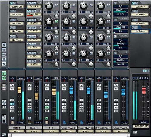
What’s urgly, man? Have you read my post? Have you seen it? Take a look at the bottoms of the channel stripes at your picture. See the channels names and numbers of the buses are centered? That’s all I want in C6’s mixer to be changed.
Hi Winter,
yes, I have seen that. Sorry, I mean the urgly SX3 GUI.
For me I prefer fader color caps, because it´s clearer for the eyes than your version.
But i like centered names and numbers! And that was also a long-cherished wish of me.
Centralmusic, frankly saying, whether the colored caps or colored horizontal stripes (we have now) is not a big deal for me, but all the rest must be centered ![]()
you win!
![]()
As much as I like C6 mixer’s design, I find the icons too small to identify channel types. V stack’s design is nice with those caps matching the Icon color at the bottom left of the channel. It’s neat and useful.
More color options is the way to go in my opinion.
Slightly off topic but I love the way you can navigate in the current mixer by ctrl-clicking in the busses name, this is genius idea, please SB do not remove this behaviour ever. Thanks.
Yes - perfect idea, and Steinberg have the code for that already, so easily done
+1
If someone’s good with p/shop, a mock-up (with the C6 mixer and coloured fader-caps/tracktype icons) would be fun to see… Although the whole V-Stack aesthetic I’ll agree does seem to work (albeit in a dated ‘3D look’ kind of way), needs to be seen with the C6 mixer for me to be convinced.
Also, +1 for center-justifying the labels - nice.
What would be a compromise solution?
Colored fader caps with centered (scrolling) text and channel numbers, watermarked channels with channel icons under the button strip.
Come to think of it, does there really need to be 2 rows of information for each channel?