Large font on Tracks

Hello,

that big, bold, ugly, bright track(-name) font makes me feel like i’m thrown 15 years back in time design-wise…
I liked the decent style of Cubase 7…is there a way to change the size and the color or even the font itself ?
It’s really not a minor issue for me…having to look all day at this interface brings me down :cry:

1 Like

On a 4k monitor it looks much better to me. I agree with others that ther should be options to change it or keep it as is.

Does anyone know if this is by design or if i can change the size of this awful font? Its super annoying :confused:

It’s been brought up several times now. We’ll see what happens as they continue to tweak things.

It’s by design.

I also found it off-putting.

It’s the wrong font (too bold) to use at that size even for all caps, but for mixed case it’s even harder to read (it almost completely fills in the negative spaces of the “a” and “e” characters, for example).

Then I realized it’s presumably supposed to match, for consistency (a good thing), the font used in the Instrument Rack … but it doesn’t, not exactly.

Hey guys

Arg. I did a search but didn’t show me anything on the subject. Apologize if the issue was already mentioned. Lets hope they fix these little annoying things. Not sure how does that slip through. Its obviously super fugly and im sure a super super easy fix. Maybe give us a font type and size option in the pref. That would make everyone happy. :ugeek:

We can customize the colors and now we want to customize the fonts!!!

Yeah it is a horrible font, very child like. I know it’s not a huge deal but please replace this font, it’s more at home on a Peppa pig FREE to play online game than on a £448 DAW.

+1
In C8 Arrange Window: trackname fonts too big.
Also, the shortening with the dots … doesn’t make it more clear. I need to make the tracklist broader to read them, compared to C7 and before.
In Mix console: fonts in tracknames are okay, fonts for plugins, routingsettings, inserts, sends are too small.
In 7.5.3 all fonts were okay to me (they changed in mixconsole several times since C7.0.0)

i’ve got small fonts that is hard to read especially in the inspector section and mixer, hmmmm pretty sure this should not be the norm. :frowning:


+1

There is a perfect font size for track names, I think :wink:
Cubase Font.jpg

Yes, folder tracks still have the normal fontsize without the abbrevations, which I prefer.

I prefer the font from c7. Sounds petty, but it makes a big difference.

This is why we need more customizability and for Steinaha to stop making these decisions for us.

I myself prefer larger fonts but because my setup is in a tiny font 4k environment.
To me the larger the better…

But we need this to be customizeable by the user

:nerd:

On 2560x1440 27" they are too bold. But plugin names in mixer are so small now for me. Anyone have that ?

Agreed… On my 4k it is much better. Options to please all sound like the way to go.

+1 to that!

I have a combo of both in my projects! see pic att

I prefer the previous smaller font size too.
cubase8 fonts.jpg

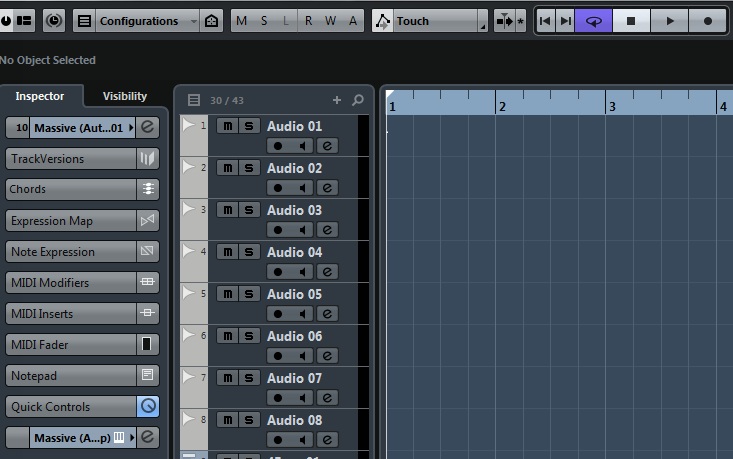
Yeah, the Console Mixer has very small text now.

I’m on the fence about it, conceptually. I like being able to see more of the insert titles.

But again, it’s all about failed execution.

The really small fonts need to be crisp. And, if required, forced to UPPER CASE on each letter. When it can scale larger (or is on a higher PPI display, then it can drop back down to title case).

The Cubase team have really lost the art of the “crisp readable font” thing that was always in their DNA.

There are ways to do true crisp (or nearly true crisp) fonts and also support resolution independence / high density displays. It’s just a lot more work. Especially for cross-platform.

They need a font snob on their design team. Specifically, one from the “pixel-perfect” design camp.

It takes the kind of person that wants a pixel perfect font, is told by development they can’t have that, and then a workaround or suitable compromise is struggled for.

It really looks like a developer without this very specific 2000 to 2006 skill set is being let loose on the design.

I came from a design crucible in this area and these new Cubase 8 fonts wouldn’t have survived a single internal review.

I once had to take a 7 point crisp font, created by an expert in small, readable fonts, and place a single pixel of anti-aliased curbing, manually, by hand, in the 90 degree corners of the entire character set, so that a balance between crispness and scintillating could be achieved. :exclamation:

These are the lengths we used to go to before the Retina display changed everything.

So, to me, this is unacceptable. An eyeful of awful. :open_mouth:

Sorry, just need to drive this home.

Fonts, fonts, font are a big deal and matter. They’re not something to be left to scaling engines, alone.

I really hope these fonts are an arbitrary result of a scaling engine, because if they’re hand-chosen, we’re in trouble. The blind leading the blind.