Hi guys.
First: SB team, Thank you for new features.
But…
Let me introduce a kind of comparison. Something like “What we had” and “What we’ve got”.
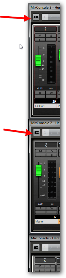
I’ve set the smallest size of the mixer channels. So, take a look at this

you see that everything is OK.
But let me show you the “old mixer”

Do you see that “Inserts”, “EQ’s” & “Sends” are bypassed? I do too.

So, what do we have with New Mixer Channel? - A Nice, Big! fader cap; bigger! meter strip and mediocre panner. (as for me - I hate this white, fat dot or line). Can you read channels name at the bottom of the strip? I can’t read too. SB team had to put the channels names to the bottom, to divide “Record” & “Monitor” colors from the channel’s color. And channel’s font is almost unreadable.
Do you need all those numbers in the meter strip area? - I don’t. Because there’s no matter how much you zoom it in, the size of the numbers remains the same.

So, when you lean back in your chair, you won’t be able to read the numbers.
So, let me show how I see it

Well… Numbers of “Volume” and actual peaks are much more bigger and therefore much more better. Fader caps are bigger, than the old ones(scale 1:1). Panners are blue color and it makes them better. The “Instrument button” can be placed over here:

This placement will help us to distinguish Instrument channels…
BTW, this button could be placed on the MIDI channels as well. Because now we have to go to Edit Channel Settings, then “Go to Input” and then click to edit VSTi! 
“L” button can be placed somewhere…

So, anyway… Left hand side located buttons are better, than… the stuff we have now. IMHO
And the panner!!!  …
…

So, I think that the old mixer view was thought over much better and it was the CUBASE Mixer, and SB team must take the best of it.