YUCK
Even this is a problem for this userbase, eh? I guess that’s why absolutely no one ever seems happy with anything new here.
I guess I am in the minority but I like it
I like it.
Ugly colour. And worse: wasted space left and right on 26’ monitors.
Why all these steps backwards ? Why can’t a forum have variable width to fit the monitor as it should ?
Why do we buy large monitors ? To have unused space left and right ?. Combined this space is nearly as wide as the actual forum space.
Beyond belief
I’ve got as much unused space but I prefer it that way… Otherwise lines would become way too long. I don’t know why you bought a large monitor, but I certainly didn’t in order to read forum posts from left to right…
It’s a bit scary and harsh on the eyes when reading whilst having one’s breakfast…
The color scheme is old-fashioned, with no relation to the company’s usual colors.
It would have been better if it matched the colors of the Steinberg main site, or the default colors of their programs user interface: mainly dark and light gray.
I don’t know too. Everybody are using mobiles to read internet but you are complaining that ur 26" is too big for that.
Strophoid answered you xD
I don’t know why you bought a large monitor, but I certainly didn’t in order to read forum posts from left to right…
Did you ever tried to read a lot of text on a dack background? Why books doesn’t have black pages and white text than?
New features
- notification area
- improved quotes
- new messages more visible
- mobile responsive
- more clean and tidy
Whishlist:
- disable signatures
- more cute smiles
All those great “has thanked” and “been thanked” tallies gone. I am crushed ![]() Whilst hardly a necessity, it was nice to know that you’d helped someone in some way.
Whilst hardly a necessity, it was nice to know that you’d helped someone in some way.
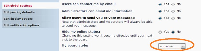
For those less familiar, if you go to your user control panel, choose Board Preferences, and change the board style, subsliver is mostly gray which some are pining for. you Do have options!
Yeah, I chose prosilver SE, looks awesome to me.
Sorry, I do not like it. Hard on my old eyes.
But why does it change the size of the whole darn thing, too…? I’d like the ‘subsilver’ look but not the overblown size that goes with it… ‘prosilver SE’ looks nice too, BUT, its too small and cramped…! The ‘prosilver’ default is a good size wise but colour scheme is dated looking…
You can’t compare paper with pixels on a screen.
Paper doesn’t emit light like a computer display where a white background is more likely to cause eye strain.
A dark background is more comfortable and relaxing.
Personally I don’t have any problem reading long texts on a an even black background.
That being said, even on paper I’d prefer black pages and white text.
“Why books doesn’t have black pages and white text than?” > ink waste and costs! ![]()
Thanks for the info. At least better than that bright blue. ![]()
I have to agree with soundpeaks there… bright text on dark backgrounds, especially white text on black pages, is something I hate.
My problem with this forum now though is it just doesn’t look nice, and on top of that it looks very “standard” in the sense that the colors chosen are the same on a million forums on the net. I’d have preferred something closer to Steinberg’s actual logos etc… or the way it was…
A note on functionality on mobile:
Right now I can no longer see when the last post was posted in a sub-forum if I’m in a ‘wider’ view. So if I choose “English forums” or even “Nuendo”, under which there are several sub-forums, I can no longer see when the latest post was made, so I have to navigate into those sub-forums to see it. To me that’s a clear step backwards on mobile.
So it’s one step forward on mobile for me because it runs smoother and it’s easier to select things on my phone, but on the other hand I now have to go more places to see if there are any new posts I want to read… so one step back again…
Cheers Soundpeaks,
I can live with this setting!
Paul
Adding my 2cents… most of the other forums I have read use this style. So likely used to it. Contrast is a big key in reading anything and mobile users can tone down the brightness if needed
So, I’m ok with it
+1 Gearsluz does it right.
This Steinberg forum now looks terrible. Hard to read and ugly.
Hi
I don’t care that much on the “blue” - “light blue” colour.
What’s missing now is the possibility of “unread” and “new”.
Did I overlooked that somewhere on the screen? ![]()
Cheers
–>> found it - left upper corner // like in a phone app ![]()