I don’t get reading the manual if Halion requires 6 instances of a switch in a single stacked image or I must load it frame by frame in Bitmap section of Properties (On. Off, Down and Hover fields)? So far I’ve tried adding to Resources tab a pre-made 6 frames stacked image of a button, indicated 6 frames in its properties, but it’s not working (doesn’t get animated). I’ve assigned the same image with 6 frames to all button’s states like On. Off, Down and Hover. Is it correct?
However, it all gets working when I’ve exploded my stacked button image into single frames and assigned them one by one to On. Off, Down and Hover fields. So does Halion work with a single stacked image or requires separate frames?
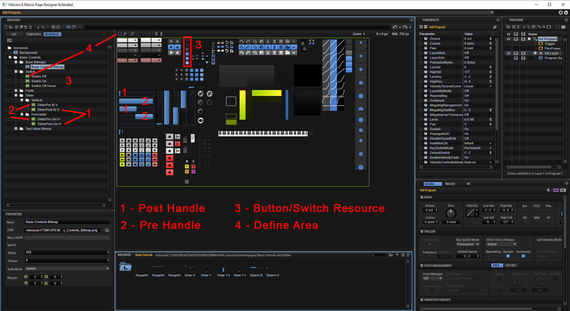
You need a resource image for every field that you like to use. You don’t need a Picture Stack with more than one Frame. You have to load it one by one but you don’t need a picture for every field. Thats for display if you klick the button you see a different color as if it’s on or off or if you hover over the Button. If you take a normal HALion Button and you take a look at the Template and at the Resource, you will see how it is used.
Knobs must be stacked png and in the resource you have to set the framerate to the framerate of the stacked png. So if you have a Knob with 65 Frames stacked, you have to set it to 65.
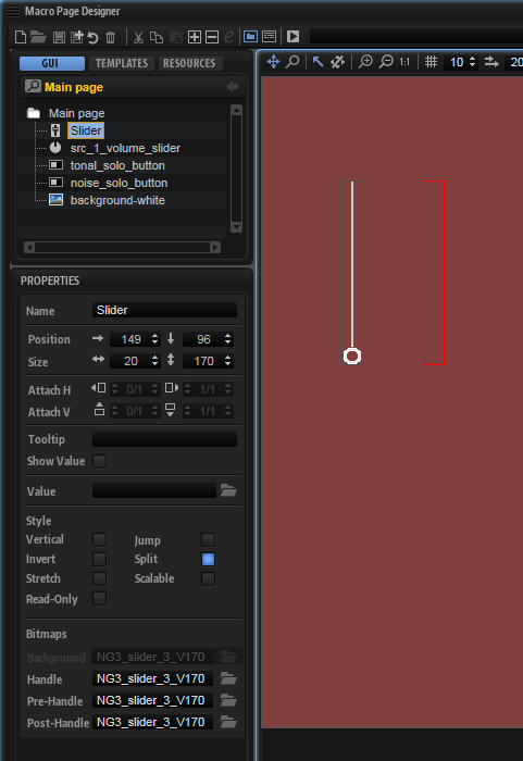
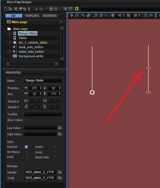
Sliders use 2 different pictures - Pre-Handle and Post-Handle.
You can also use one Picture with all elements in it as it is in the Halion Basic Controls Bitmap. If you do this, you have to define the area.
In the template View you have to choose the slider/switch and load the picture from the resource.
Yes, because you can’t use a Knob for a Slider. A Knob Element works like a Knob. If you put the courser in the middle and to the left or the right of the Slider and you move it from one side to the other like a Knob it could work. Use a Knobelement for a Knob.
As I said - you need different Pictures for the Handle. Take a look at the Sliders in Halion how they are build and at my Pictures.
For a Slider you need different Single Frames.
It takes some Time to understand that, I need hours to find it out on my own.
Just to say thanks to you guys @olmerk for bringing this up and for @born_001 once again no cape still a hero lol…I’ve been trying to work this out for days banging my head against a brick wall but now I’ve managed to design some great-looking sliders that work. Just a tip if you have some kinda screen grab as in the Windows snipping tool then go into the resource tab bring up the resource template with all the graphics and grab it save the capture as this will be at the actual size of the buttons switches sliders etc and use it as a reference in your design program either Affinity Designer, Photoshop or whatever else your using to design your own GUI’s I just found it really handy to have it there.
Hi Klef,
I also start with a screenshot from the resources. Thats a good way to find out how it works and what you need. The only thing I have problems with is the Attach Option. So I build my graphics and templates in the size that I need and that is a lot of work. There is also a nice function since 6.4.2. Thats the “Decor” There you can create for example quick backgrounds.
Some weeks ago I try to find out how the “Animation” will work. I use After Effects for this. You also need stacked images. I try to find out for what kind of functions this can be useful to have some nice design elements. One of it is the LFO Monitor. This you can see for example in “Anima” The light of the LFO. It changes the speed if you change the frequency.
Ok, it’s no problem to load 6 images for a button, but how do knobs and sliders use custom graphics? Must it be a stacked bitmaps or not?
Knobs are typically framed. It is common to use either 101 frames or 128 frames for smooth animations. 101 works well for parameters that range in value from 0 to 100. This gives a frame per value. 128 frames work well when creating knobs that connect to MIDI parameters because there are 128 MIDI values with standard MIDI CC’s (0-127).
Sliders can be both/either frames or stacked bitmaps. If a framed bitmap is used as the background it will follow the animation. You can instead, choose to use a single image for the background or handles. You can even attempt to do both simultaneously, although I have not personally tried it.
BTW I believe Steinberg typically does 64 frame knobs to keep file size down while having one frame per 2 values since 64 multiplied by 2 equals 128.