In an orchestral score, I have several bars of quavers on D in the middle of the bass clef, and they all have tails down. That is the convention. But when I change the last bar to C naturals, the tails of the Ds all reverse. Out of interest – Why?
 David
David
Check Engraving Options > Notes > Stems > Stem Directions. The explanation is included there.
I often prefer “Use default direction” because sometimes I disagree with the contextual algorithm.
Lillie: may I make a request?
would you consider taking pity on us poor colourblind people? at least as far as the documentation is concerned.
blue and purple… a nightmare for some of us. I see no difference between the two.
the same goes for red and green.
Even within Dorico, I have trouble with voices because of the default colour choices. I am always leery (actually terrified) of changing the colour of an item because it might cause me more confusion down the line.
maybe never have two similar colours (as in colours that are contentious for colourblind people) on the same staff?
While working with a piano reduction recently I had the worst time trying to differentiate which notes belonged to which voice or which staff (on a grand staff) because some of the choices were too similar for my eyes to see.
3 Likes
Sure I can take another look – I did change these fairly recently and tried to find two colours that were noticeably (to me at least) different from each other whilst not being too garish against staff lines. But it’s possible the current choice could well be improved.
let me give you some hints for someone like myself, who suffers from the more common form of colourblindness:
reds are always a problem. consider that any other colour contains a portion of red in it.
for example, purple is blue with red. if someone can’t see the red, then all that’s left is the blue portion. so putting a blue and a purple with the same density of blue together is guaranteed to cause problems.
on the other hand, a purple that has a very light blue content, will contrast well with a dark blue other voice. we can see two different shades of blue no problem.
avoid browns and greens.
Green is a basic colour that we can’t see (doesn’t register).
Brown contains green, and if I recall, some red as well.
so those two are best avoided one against the other. but brown in one voice, with blue in another is fine.
for red/green colourblind people, yellows are never an issue, BUT, oranges CAN be, as they are (again, if I recall correctly) simply yellow with a quantity of red in them.
This means that orange CAN become an issue when contrasted with a beige colour.
Ugh! I know, this is all very annoying and complicated.
I guess the important thing to remember is to at least use colours that have contrasting colour densities. light blue against dark blue. light brown against very dark brown. etc…
2 Likes
Checking one’s choice of colours with the Colour Contrast Analyser utility is very useful to see how people with various visual problems see a text.
“We have heard it said that when the noteheads are above the third line, the stems are turned down, and when below the third line, the steps are turned up; also that when notes are on the third line, the stems are turned up if the stem of the following note is up, or down if the next note is down. But really such rules cannot be consistently followed.”
William Gamble, “Music Engraving & Printing”, 1923.
1 Like
I think I’m more aligned with Boosey’s house style on this issue.

I much prefer to ‘pair’ the stems in situations like this:
As Gamble suggests, it’s something to be done ‘by eye’, rather than by a set of rules.
3 Likes
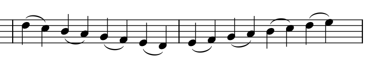
Aesthetically I don’t mind the first bar, but when I read through it, my eye doesn’t pass cleanly left to right through the bar. I notice something is different with the upstem on the middle line and my eye returns to it. The second bar my eye tracks cleanly from left to right as I read the bar. As a performer I want the notation itself to be as invisible as possible, so I generally dislike anything that disrupts the left to right flow. Of course my own eye is influenced by years of notation proofreading so I fully acknowledge this may not be a universal experience, but I still prefer stems down on the middle line in this case.
I’m out of town so don’t have access to all my notation books, but I had a few excerpts saved on Flickr (probably for the Notat.io forum). Schirmer is in the stems down camp too.
Gould is context dependent IIRC.
Gardner Read is ambivalent, but says it’s more common to stem down; Ted Ross says some engravers go both ways but they should only go down. (If you’ll pardon the expression…)
And yet I still feel that sometimes it works better according to context. I’m sure I’ve seen more defences of variety.
I recall that we went into this one years ago and were told by someone at Sibelius (and I honestly cannot remember who) that stems of middle line notes always point down in instrumental music, and up in vocal music (presumably to avoid poking the lyrics in the eye!).
David
I observe the latter (vocal music) to be an Oxford house style, but not widely adopted.