let’s assume I have say a dozen systems, distributed across several pages. I’d like to have each system (a ‘line’ so to say) as an individual image file. All should be in the same format, or at least close, at least at a consistent width, with minimal padding.
One approach is printing each page as image files, and using an image program, to cut and paste all systems in, say, a dozen individual image files. That will work, but due to manual selection, width will vary more than necessary.
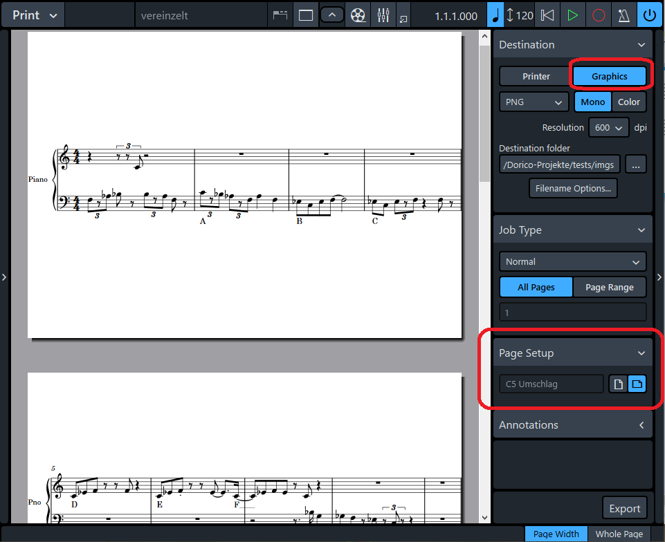
A second approach is: defining a dedicated layout (DL), set its Page Size (Layout Options), do some rework on the Masterpages in Engrave for DL, especially delete all textframes, tokens etc., and finally print those. The result is the right amount of image files.
HOWEVER, there is too much padding left to all 4 sides. I tried adjusting Paddings (Layout Options), but results are somewhat unpredictable to me. In other words, I expected a kind of paper strip per system, but it’s more like the format of a postcard from the padding.
I recognized both margins and got a little lost. Do you think you can send me an extract of one of your files, so I can have a closer look at how you did it? I’d appreciate
Page margins define the area around the edge of the page where nothing will ever be printed.
Staff margins define the distance between the edge of the music frame and the top and bottom staff lines on the page, to leave a consistent amount of space for things that extend beyond the staff (stems, beams, text, etc). In a “conventional” document the idea is to put the top and bottom staff at the same vertical positions on every page, even though the amount of notation above and below those staves varies on different pages.
I would try setting the page margins all zero, and define a master page layout that has one music frame covering the entire page and nothing else.
Then set the page height to a (small) value that will hold one system, set the page width to the width you want your images, and change the staff margins if you want depending how much notation is above and below the staves in your examples.
If you want every graphic to have the minimum possible vertical height, I think the only way to do that is crop them after you export them.
You may want to change the staff size as well. The default 7mm is probably too big for examples in a book, but it might be OK for examples on a web site.
I want to use theses images within a website with responsive design, so the images will be scaled anyway, as display sizes are unpredictable. For flexibility it’s probably best to have the images “without” margins or padding, and to introduce padding via HTML where useful.
thanks again for sharing these basics on layouts. In hindsight I came close to your proposal, while the idea of staff margins was new to me.
However, I still face a problem with my test data. For some reason the systems position seem to differ from all other pages for the first page: I probably missed some other dialog?
Some irritation came from the Print mode for me. When I export via Print mode as Graphics, the view shows the single Staff centered on a page, i.e. in the “wrong” page format, while the exports have the format, as entered in the Layout dialogs. (May be this behavior should be adjusted in some way ?)
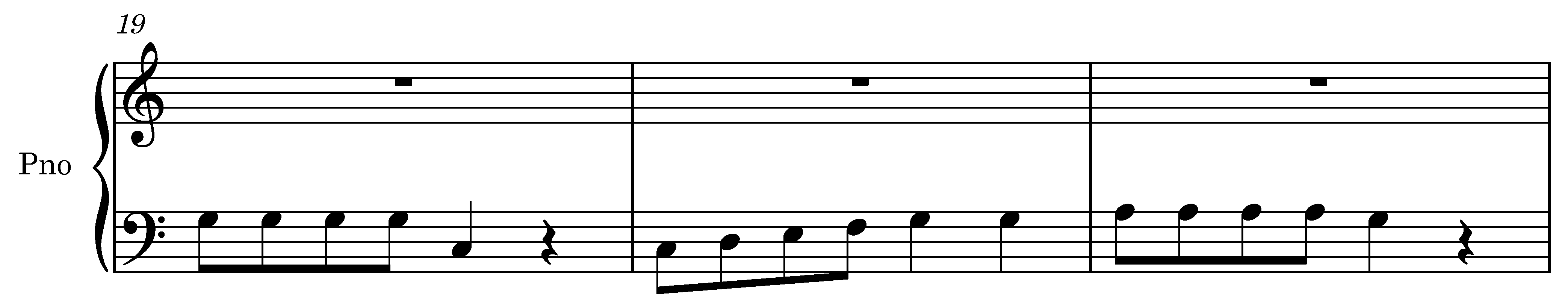
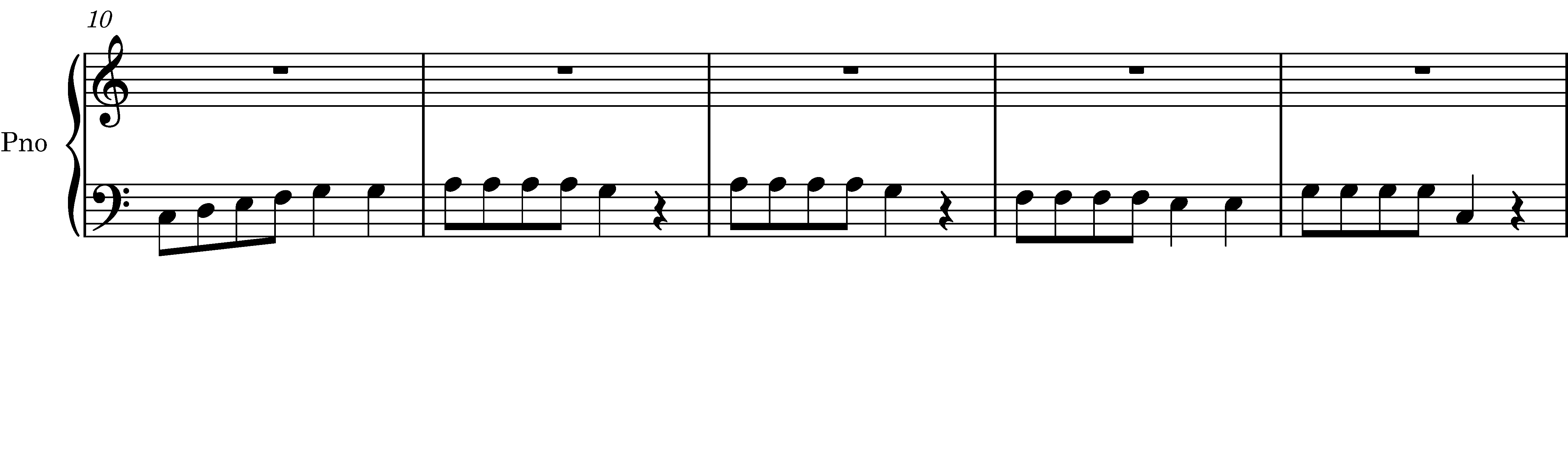
I’ll guess that the system on the first page is a bit taller than the others, because of the letters A B C below the bottom staff, and the page has just passed threshold where Dorico justifies the staves vertically to fill up the page.
In Setup Mode / Layout Options / Vertical Spacing / Vertical justification, either change both two “justify distance between staves and systems…” values to 100%, to switch justification off for everything, or set them to a small number (like 10%) to always switch justification on.
Having justification always switched on, and reducing the page height more, may give you more consistent visual height of the image for different pages compared with always switching it off. But try both options and see which works best for you.