Sometimes when I view a Dorico-generated PDF in Acrobat, the staff lines have erratic thickness.
This is an on-screen issue only, the problem doesn’t appear in print.
I think that the issue might be that the staff lines have no hinting information ( Font hinting - Wikipedia)
Has anyone else come across this? Is it something that might be improved?
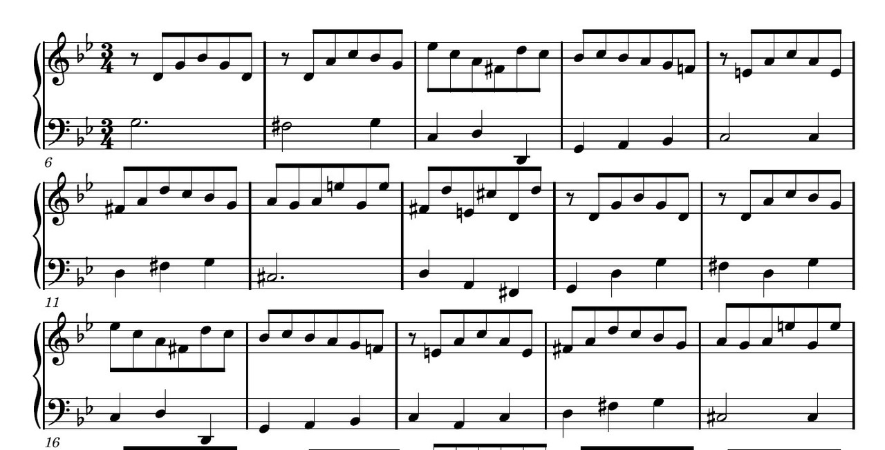
Here’s a screenshot of what I’m seeing on a 32-inch Dell monitor. Notice the varying thickness of the staff lines. This is how it appears in Acrobat as well, and I think some hinting could fix this.
Sometimes when I view a Dorico-generated PDF in Acrobat, the staff lines have erratic thickness.
This is an on-screen issue only, the problem doesn’t appear in print.
I think that the issue might be that the staff lines have no hinting information ( Font hinting - Wikipedia)
Has anyone else come across this? Is it something that might be improved?
Here’s a screenshot of what I’m seeing on a 32-inch Dell monitor:

Staff lines aren’t font glyphs, therefore it’s nothing to do with font hinting; but down to how your OS deals with graphics that aren’t integer-pixel widths.
There is a preference in Acrobat to Enhance Thin Lines which may improve things.
Enhance Thin Lines was on. Turning it off improves things somewhat.
There are also options to Smooth Lines and Text, which may want toggling.
Maybe try another PDF reader.
Foxit Reader is very good.
This is a decidedly acrobat issue (and you’re not the first to notice this and mention it on the forum). My PDFs (music and non-music alike) tend to preview slightly odd at certain zoom levels. Zooming in a little usually fixes the problem. And the same PDFs render just fine in preview or web browsers.
I’m still searching to see if vector lines (which is what the staff lines are?) don’t have anything similar to font hinting that could be implemented in PDF output. I would have thought they do, maybe not. I know that recent versions of Adobe Illustrator have something called “align to pixel grid”.
If they do, it should be implemented for staff lines in Dorico.
If not, so be it!
If I find anything, I’ll post back…
There’s nothing wrong with Dorico’s PDF output, and it doesn’t make sense to align lines in a document intended for printing rather than on-screen display to any kind of “pixel grid”.
Adobe is generally great, but this issue in Acrobat has always been one of those head-scratchers to me. Come on guys, this is what you do…
Well, it’s quite common to read and study scores on screen these days, and they would normally be distributed via PDF, so if anything can be done to reduce screen artefacts with Dorico-generated PDFs, that would be a Good Thing!
However, it may well be the case that they are as good as can be and the fault lies solely with Acrobat…
This is an acrobat issue, as previously stated. The same pdf that looks weird in adobe looks fine in every other program. It happens to me all the time. Preview and adobe (and safari, for that matter) render PDFs differently, which proves it’s the rendering engine which is to blame, since they are all interpreting the same data set.
I understand. However, it’s not necessarily the case that Acrobat is to blame (although it may well be, as you say).
The fact that other PDF viewers display the lines correctly may be because they are not standards-compliant.
In other words, if I were to give Acrobat the benefit of the doubt (which is tempting to do, as Adobe are the ones who invented PDF, and have been involved in all Ghent workgroups setting the PDF standards since it has been open-sourced, and so presumably their implementation is at the highest level), it could be that the PDF is not correctly written re. on-screen viewing, and, ironically, the viewers that display the PDF correctly are actually not behaving properly, whereas with Acrobat we are actually seeing the correct, standards-compliant, on-screen display of this PDF. In which case the PDF output should be fixed.
The consensus in this thread is that this is not the case, and I’m happy to accept that, but I’m still trying to do a little extra research to see if I can find anything else on this subject…
It’s nothing to do with the PDF standard implementation, but simply about how the data is rendered on-screen. There’s nothing in the standard that says you have to make thin lines look crappy.
Well, it can’t be both of those things.
Ben’s observation is an interesting one: namely that it is possible that Adobe is interpreting the data just fine, but the rendering engine (at least on macs) may not be up to snuff. While the two things go hand in hand, they are not the same. And much of adobe’s software has a very high technical debt because it’s so old, so it’s conceivable that they’ve bodged their way to their present state, and are not fully optimized for modern systems with high dpi displays.