This issue has been mentioned several times in this forum.
With Windows and Dorico you can only use fonts with 4 styles: regular, bold, italic, italic bold.
As soon as you use a font with more than these 4 styles (and Minion has a lot of styles!) there will be a missmatch and you can almost never know what will be used.
The solution is to choose the styles you use and group them in 4 styles under a a specific “Font Family Name” and take care that each of the style you use correspond to the four basic styles: regular, italic, bold, bold italic.
For example group these 4 styles:
Minion Pro Regular
Minion Pro Italic
Minion Pro Bold
Minion Pro Bold Italic
under the Font Family Name: DK Minion
Then these 4 styles:
Minion Pro Medium
Minion Pro Medium Italic
Minion Pro Semibold
Minion Pro Semibold Italic
under the Font Family Name: DK Minion Medium
When you then choose these fonts in Dorico you will be sure that after installing these font Dorico will choose exactly what you want.
Be aware that to achieve this you need a Font editor (like FontForge) to be able to internally rename the fonts.
I believe there is no other solution
Yes it’s related, but it still doesn’t explain this behavior. All I had ever installed were the four “base” styles you listed. I hadn’t used other font weights like Medium.
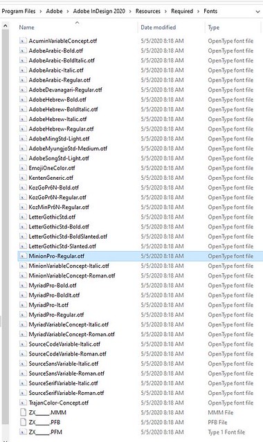
The official Adobe Minion Pro is a required font for InDesign and lives at Program Files/Adobe/Adobe InDesign 2020/Resources/Required/Fonts. InDesign is probably using this font instead of the older knockoff one. As you can see the version #s are different:
What if you remove the older version and manually install the required version so all Windows programs can access it?
I just noticed something else very weird with this too. When I export PDFs from 3.5, all of the embedded fonts get converted to TrueType, when exporting from InDesign they are PS Type 1.
I don’t know enough about font rendering and embedding to know if that makes a visual difference or not, but there clearly is some sort of difference there.
There are plenty of possibilities for differences, since TrueType represents curves as quadratics (with the end points and one intermediate control point) but Type 1 cubic curves with two intermediate points. The differences in font hinting are another big can of worms, if they are still being used.
In theory the conversion from quadratic to cubic curves can be exact (but not from cubic to quadratic, in general.) But in practice, who knows?
But hey, why am I not surprised that InDesign is doing something that used to be Adobe proprietary technology, and which is now pretty much obsolete.
Just wondering, can you really say it’s obsolete if Adobe is still doing it? I mean, from what I hear their software is still used by a big part of the industry, no matter how successful Affinity and others claim to be.
CID encoding means that the font glyphs are given an arbitrary id number; Type 1 means that the encoding represents them using the names of the glyphs in a Type 1 font.
There’s nothing obsolete about using a Type 1 encoding.
Ah, ok, so the embedded font still is whatever it is, and the “Type 1” just means all the glyphs are in the same location they would be in a Type 1 font?
Todd, unfortunately uninstalling the bootleg Minion version will mess up my bazillion or so Dorico files that are using the old version. Its leading is slightly different, and its kerning may be as well.
Then what about the opposite? Delete the required version (or move to a safe place) and copy the old version to that location so InDesign uses it. That way InDesign and Dorico are then using the same font.
If you actually need the “real” Minion in InDesign you could always just use Minion Variable Concept. It’s kind of a cool font anyway as it will automatically scale for optical size.
Well…, no. The encoding may change the numerical value (e.g. MacRoman and Ansi have different characters at different numbers), but the reference is the same.
Font embedding is one of those things like colour management, that no one actually understands. Either it works or it doesn’t, and there’s not a lot you can do about it.
The screen shot doesn’t say “Type 1 encoding”, it says “Ansi Encoding” - which makes sense, since Type 1 fonts can only contain 256 glyphs, and therefore don’t support Unicode.
Adobe’s business model used to be based on a “complete” family of software using proprietary standards with no published technical documentation. They have been forced to back off from that to some extent, but why would they have any interest in letting their captive customer base migrate to other software? When the customers started thinking for themselves and stopped buying upgrades, Adobe’s response was to change to subscription pricing so they had to keep paying even without upgrades
You just discovered what “technical debt” means. In the long term, either you pay it off, or it kills you.
I would have thought the strategic way to pay it off in your case would be to freeze all your existing products in a format that can’t change (e.g. PDFs with embedded fonts) and then update your individual hymn files as you need them, for new customers.
You hope that the amount of updating required is small, of course.
Conceptually, this isn’t any different to deciding what to do about Dorico’s new improved slurs in V3.5 for example - you can’t mix them with old style slurs, and the updating may have side effects.
There’s no way I’m changing fonts, come hell or high water. I just did some checking, and I figure I have about 2500 Dorico files that use this bootleg Minion Pro. 1,000 of them are hymnal scores, which involve countless hours of nudging lyrics. I already spent months switching from Garamond to Minion Pro three years ago, and another couple months transferring everything from Finale to Dorico last year (and redoing all the manual adjustments). The slightest change now would probably drive me to the bottle.
Todd: that’s the thing though. I had all “official” Adobe fonts disabled through the Toolkit. InDesign was pulling from the same font file as Dorico. Hence the head scratching.
It’s not though. Any font in this folder is a required font for InDesign.
I can deactivate Minion Pro Regular in Adobe Type and/or uninstall it from Windows, and it will still be available to use in InDesign as InDesign is retrieving it from this folder. Other variations like Minion Pro Italic are not in that folder so I’d be curious if your results differ with that.
Just looked at this again. For me, if I overlay text from a Dorico PDF slice into InDesign, the fonts look exactly the same.
Dorico is using your bootleg font and InDesign is using the font from the Required font folder. I bet if you do the same test with Minion Pro Italic it will work. Minion Pro Italic is not in InDesign’s required font folder, so it will use the one you have installed.