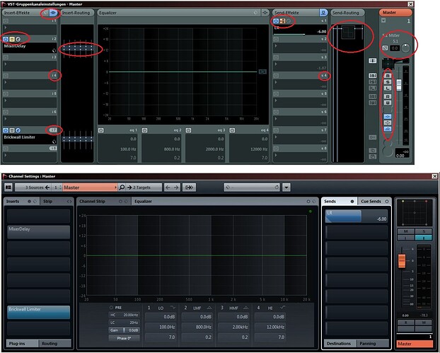
The new style is just not very intuitive imo.
I’d really like to have back dedicated buttons for the status of a plugin or send-effect. Not that all-in-one-mouseover-darkend-italic-thing. A button can be lightened clearly and brings a professional visibility for everybody.
I don’t see the red line in design. On the one hand we got a channel strip with lots of analog looking rotary knobs (which are on their part not very suitable in a DAW imo since the actual value just cannot be identified) and on the other hand this kind of modern style with inserts and sends, where all buttons were kicked.
I agree 100%.
Sucks that your other thread was closed.
Here’s the comparison if anyone is interested. Very telling:
+1
@ Domilik - In your pic attachment where did you get the upper screenshot from? - I’ve never seen those Routing sections in any version of Nuendo on my system.
Well I live and learn! - N5.5.5 is becoming more attractive by the minute.
Yesterday I had to change several plugin-routings.
It feels strange when you do not see the plugin itself next to the routing matrix like before. click. click.
Hi all, +100 for the feature.
The “new” 6.05 insert …with little white dots … really. … Where’s the on/off button in the inspector ?
Come on guys please use SIMPLE DISCRETE BUTTONS !!!
Thanx !
I’ve just installed N6.0.5 Trial and thought I should have another go at using the new MixConsole (I went back to N5.5.5 a few weeks ago), but I can not get used to N6. It is good to see that the resizing of the Rack sections is now saved with the Channel & Rack Configuration Functions, but why does so much have to be hidden from view? - Why no visible Plugin Bypass button? - we have to somehow find it in the pile of bricks that is the Rack display section above the faders or click on [ E ] (which looks very much like [ L ] now) and bypass the plugins on the Edit Channel Settings screen.
On the subject of the Edit Channel Settings screen, what is the logic behind removing all of the buttons and labels that were visible in N5 ?, and what is the logic behind not being able to change Strip settings even though Inserts, Sends and EQ can be changed? … and this whole business of hovering over and mouse-scrolling to get other options to appear is a disaster in my view - I also find it sometimes unclear as to whether I have turned something on or not. The tiny yellow and blue identical circles on the rack slots are not nearly as good as the proper buttons used in N5, and they do not work for the colour-blind.
Dear Steinberg - Please return to a logical presentation that is as clear and intuitive as N5 - At the moment the MixConsole is an unprofessional, retrograde, creativity killer.
