I’ve been working on my newest music font called Scherzo for a very long time, I hope you like the vintage design.
SCHERZO FOR DORICO & FINALE V27 FEATURE 2 SMUFL COMPLIANT MUSIC FONTS: “SCHERZO” &“SCHERZO STD”.
(Emulation of traditional German Urtext Notation)
Scherzo fonts are elegant engraver music fonts with a Standard (SCHERZO STD) and a Lighter Appearance (SCHERZO), yet more robust than some other music fonts, but more accurately representing the look of smooth VINTAGE music notation style featuring almost 2667 glyphs each. Scherzo & Scherzo Stdcan be used for modern sophisticated Pop or Rock, Jazz Bands, Piano and Vocals, Choirs, Marching Bands, and all types of musical ensembles even Symphonies! Scherzocomes with a unique subtle individuality, but with a softer and fatter look which makes it a great use for school manuals and education materials. Both fonts look fun and easy, and will not scare your students! Scherzo& Scherzo Std work with Finale v27 and Dorico™ Pro version as an alternative to Finale Maestro and Bravura font or any other SMuFL font.
Nice looking fonts - great work! It might be worth updating your instructions for Dorico - as of Dorico 4 these options are on the Library menu (which is available in all modes).
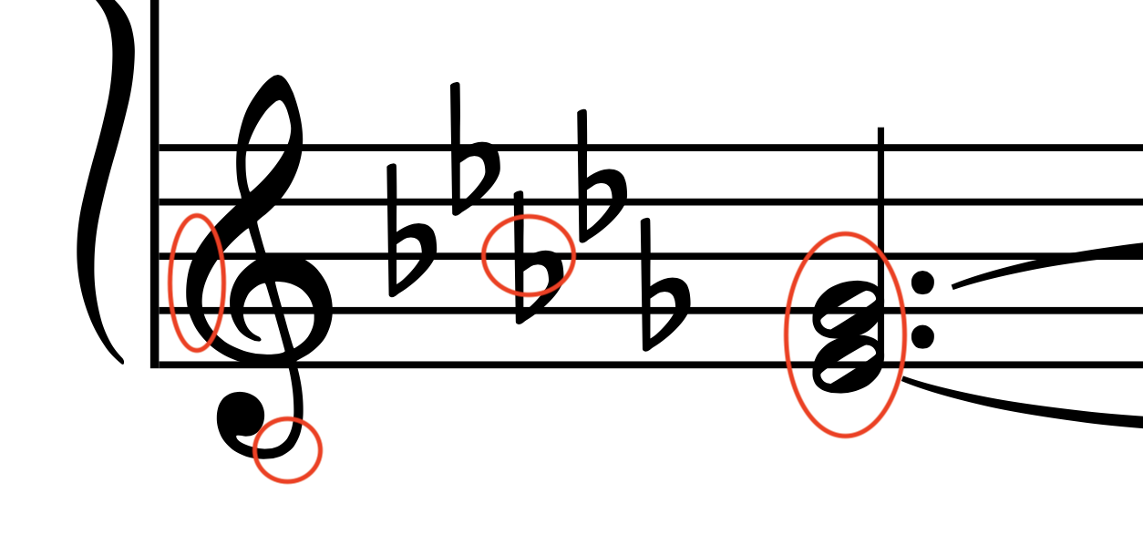
If I may be super (super) nitpicky, there’s only one thing that jumps out at me in a negative way: the treble clef seems like it’s tilting left in an unnatural way.
Everything else seems very nice and legible and well-designed.
You probably know this, but in case anyone isn’t aware: it’s very easy to swap out any individual glyphs using the Music Symbols Editor, allowing you to combine this music font with any treble clef you wish.
I love your other engraver fonts, but I also find the new treble clef off balance.
The first of the marked sections feels underweight, which makes the whole clef look like it’s leaning both to the left and to the right at the same time. Very confusing.
The second section has this strange curvature at the bottom, which is almost like a rounded square, inconsistent with the rest of the design.
The flat glyph meeting a staff-line doesn’t look clean.
The half-note noteheads are almost half-black. This is strange.
Number four doesn’t have enough space between its vertical stem and the slanted arm. This looks messy, especially in combination with a staff line.
A reason for a historical practice of tilting a treble clef to the right (rather than too the left) is that it helps save vertical spacing in tight orchestral scores. This new design doesn’t support close stacking of staves (the clefs would collide).