I’m looking for a way to select all events on an audio track from the cursor until project end. There is “Select From Cursor to End” but it selects everything, meaning all events on the selected AND all other tracks.
The thing is, when I edit narrartion, I sometimes want to move an event to close a gap, or to add a pause. When I move one event on that track, I want all other narration afterwards to move, too. Otherwise I just move the gap to another place. I could remove a gap by using the range tool and “delete time”. But sometimes I want to add a pause and would need the opposite. I find the range tool to be inappropriate for that. It would be great if there was either a tool that automatically selects the ecent under the mouse + all following events to the end so I could move everything as a block, or at least a key command to extend the selection from the currently selected event to the end of the track. And only on that track.
Do I look in the wrong place in the commands or does this not exist?
Hi, …
I remember an old Makro for that.
I just can’t say if it was for Cubase or Nuendo, if that matters.
Since I am on the road I can’t check it right now, if it is still valid.
Might be worth a try…
You’re welcome,
I experienced this omission in Nuendo after working some time with Logic. Logic has this “select all following” key-command, which makes a lot of (music-) editing very easy…Still I prefer to use Nuendo to edit and mix for picture, but I keep on hoping that applications like Logic and Pro Tools can be an inspiration for the programming-people at Steinberg…
In German we say “Your word into the ear of God…” I think all DAW manufacturers should look more closely at what the competition does well and what not. For example, I think the most elegant way for this was implemented in Reaper. See here:
Basically it works like normal. But when you enable the Ripple Editing toggle, it selects following events automatically so you can move all of them with a single click, no additional UI interaction necessary. And if you have dependencies on other tracks, you can toggle Ripple Editing Multitrack so you move events in all tracks from the current selection position on. Shift-Doubleclick is not a lot of work but when you’re editing and moving stuff a lot, especially in voice-over, saving those extra clicks really adds up. Anyway, I appreciate the Shift-Dblclick a LOT already
And regarding Logic, I think Logic looks a lot more elegant and “calm” in its design. I see a lot more information in a more cohesive interface. I have the impression that Nuendo is much more brutally segmented with popping buttons, hard lines, separators, segments, sections and so on. It costs a lot of space and is distracting. That’s my personal opinion. I’m sure other people like the popping lines and separators so it’s better visible what’s where. I’m not in that group.
Logic’s calmer interface. No popping distracting colors. I can see a lot of information in the mixer with faders, meters, all inserts, all sends. They dynamically scale. When there’s no send, there’s only 1 slot. If there are 3 sends, slots get added so visually I only see what’s really there and not 10 empty lines. I don’t have to manage the visibility of that section myself and slide sections open, close other sections and scroll on the screen the whole time like in Nuendo’s mixer or Inspector. Logic’s interface totally goes out of the way and lets me concentrate on the content, not on the interface. Again, my personal pfreference.
Nuendo somehow uses that much space for faders that it can only show a panner. To switch to inserts, I have to switch the view. Another click lost. To switch to sends, I again need to click on a view button. It’s much more brutal and in your face visually. Like it screams in my ear. HERE is a SEPARATOR! HERE’s another section! HERE is a BUTTON! Little stuff like that is what I really don’t like about Nuendo.
But it’s my best tool for film mixing and game audio because of its ability of having multiple marker lanes, the ability to export based on regions, with the region name. It’s absolutely essential for me. I like the intelligent routing where you can route a 5.1 channel into a stereo channel and it automatically mixes the channels. Stuff like that I LOVE! Nuendo should have more “intelligent” features like this instead of rigid UI where the user has to micro manage all sorts of settings and visibility stuff with sliding sections open, closing them. I feel like I constantly fiddle with the UI and have to manage what I have to see for a particular task instead of just seeing the things I have to at a glance.
But Chris, although I understand what you say and partially agree with you, I suggest you stop using screaming colours in Nuendo to make at least one issue go away.
Just stop using garish green or angry reds and you will get a more calmer looking UI.
If you choose strong colours you get strong colours.
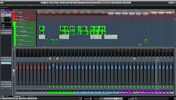
My Color palette is more of a pastel with calm hues. So my project page looks quite a bit calmer than yours.
I agree with Erik. Not only do the event colors look calmer, but things like the bright yellow mute or bright red record are more easy to deal with against a muted background instead of bright green for example.
Sure, colors can be customized and I have to find some colors that work well at some point. Have tried a lot and nothing really felt fitting. But of course, colors of the events are only one part of the broader “UI topic”. But thanks for calling me out. Yeah, I need to spend some more hours on my color setup.