I think both the ♭ and ♮ signs are positioned too low. It’s probably a matter of defining the baseline exactly through the middle, not of adjusting the inner space. The s and z in sfz could be a tiny bit bigger. I really like the long f and p, it’s very characteristic, although there is a small risk of more vertical collisions. Noteheads are quite good now.
I was doing several tweaks and corrections with my NorMusicSMFL font, so I tried to generate 3 weights of the font: Light, Regular andMedium. But from an optical point of view, Light, Regular, Medium are my favorite weights maybe I won’t go for the thick version. Please let me know what you think, any remark is welcome.
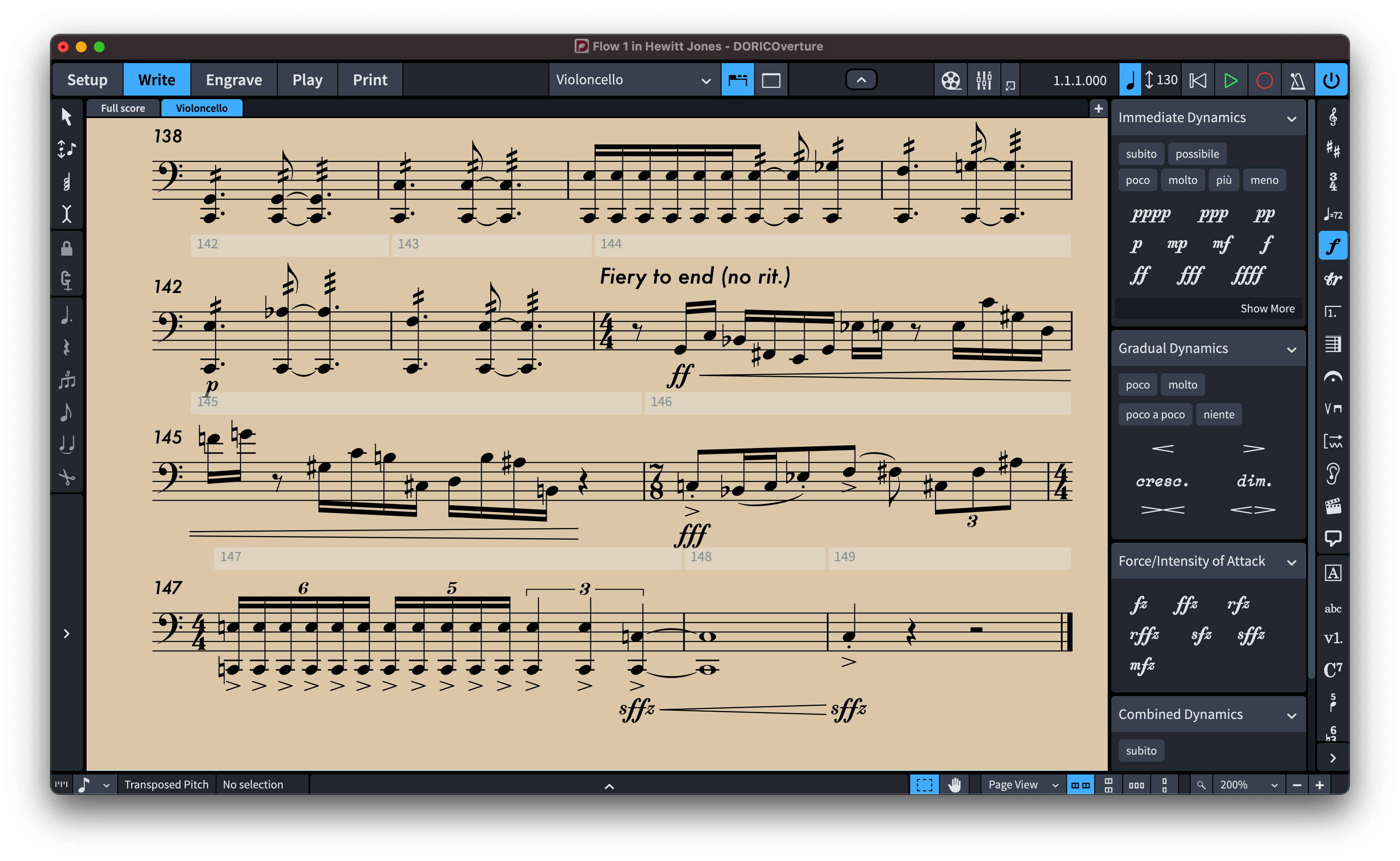
A huge thanks to Stave Taylor who engraved all the examples featured in this discussion.
Here’s a new sample of “NorMusicSMFL Light” music font, I’m expanding it to more than 1300 glyphs, so designing many glyphs from scratch again and again, the font is still under development, I hope you like this light music page layout it fits nicely NorMusicSMFL Light font:
However, I discovered that making a Regular weight class of 400 and a Medium weight class of 500 gives me some very consistent results.
A huge thanks to Stave Taylor who engraved all the examples featured in this discussion.
Cher Marc, Merci beaucoup pour tes compliments ca m’encourage bcp mon ami! Et oui! je passe presque 6 heures par jours travaillant sur ça since last August. Glad that you like my modest design.
I just come to finish editing my new engraver music font NorMusicSMFL. I changed its name from NorMusicSMFL Light to just NorMusicSMFL, now it features more than 1400 glyphs, all designed from scratch. The font will be soon available on my website. I’m so glad that I made it! I actually started this project since last august, the editing was in daily process during 5 months and half… Enfin, je suis super content Thanks all for your feedbacks.
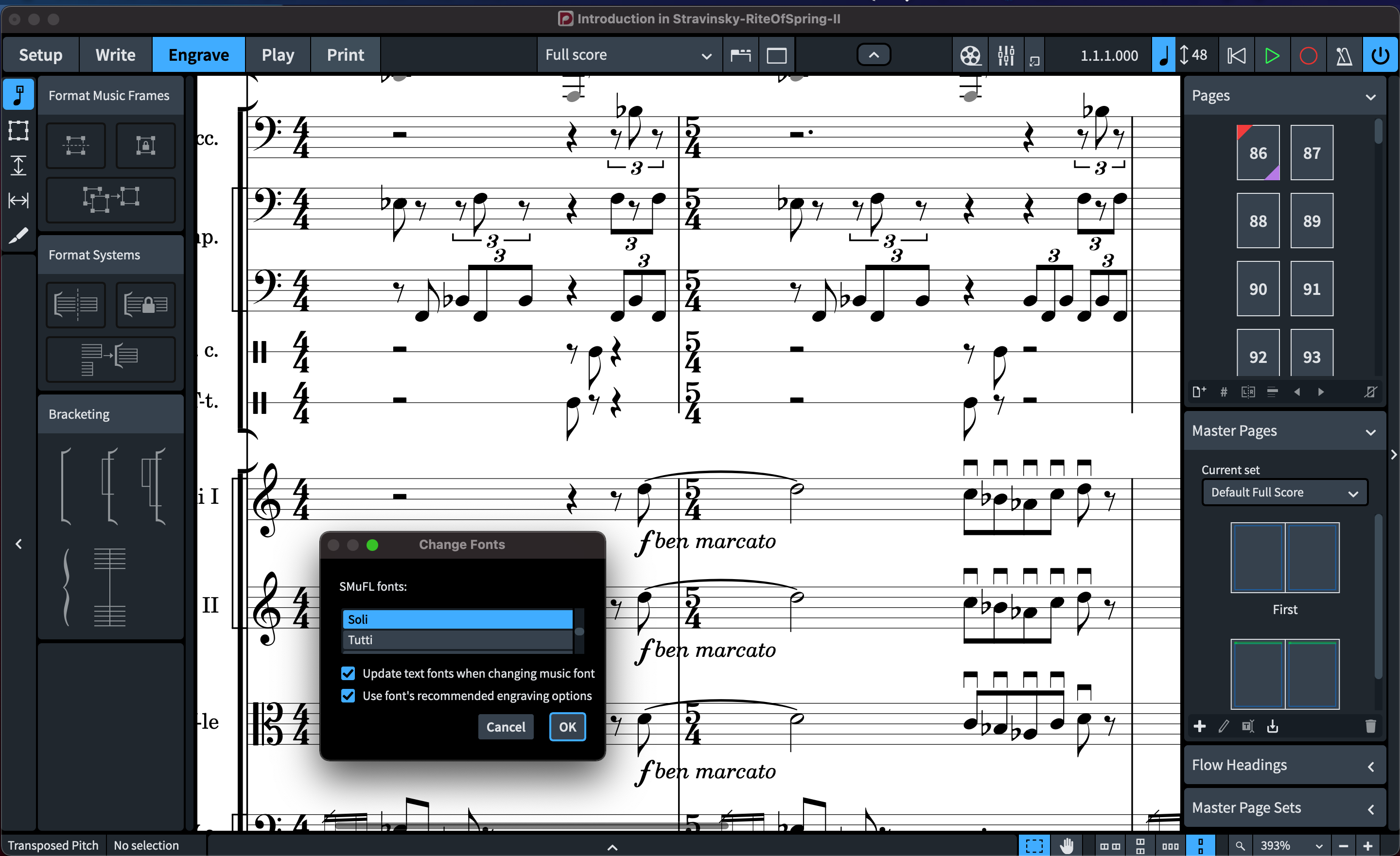
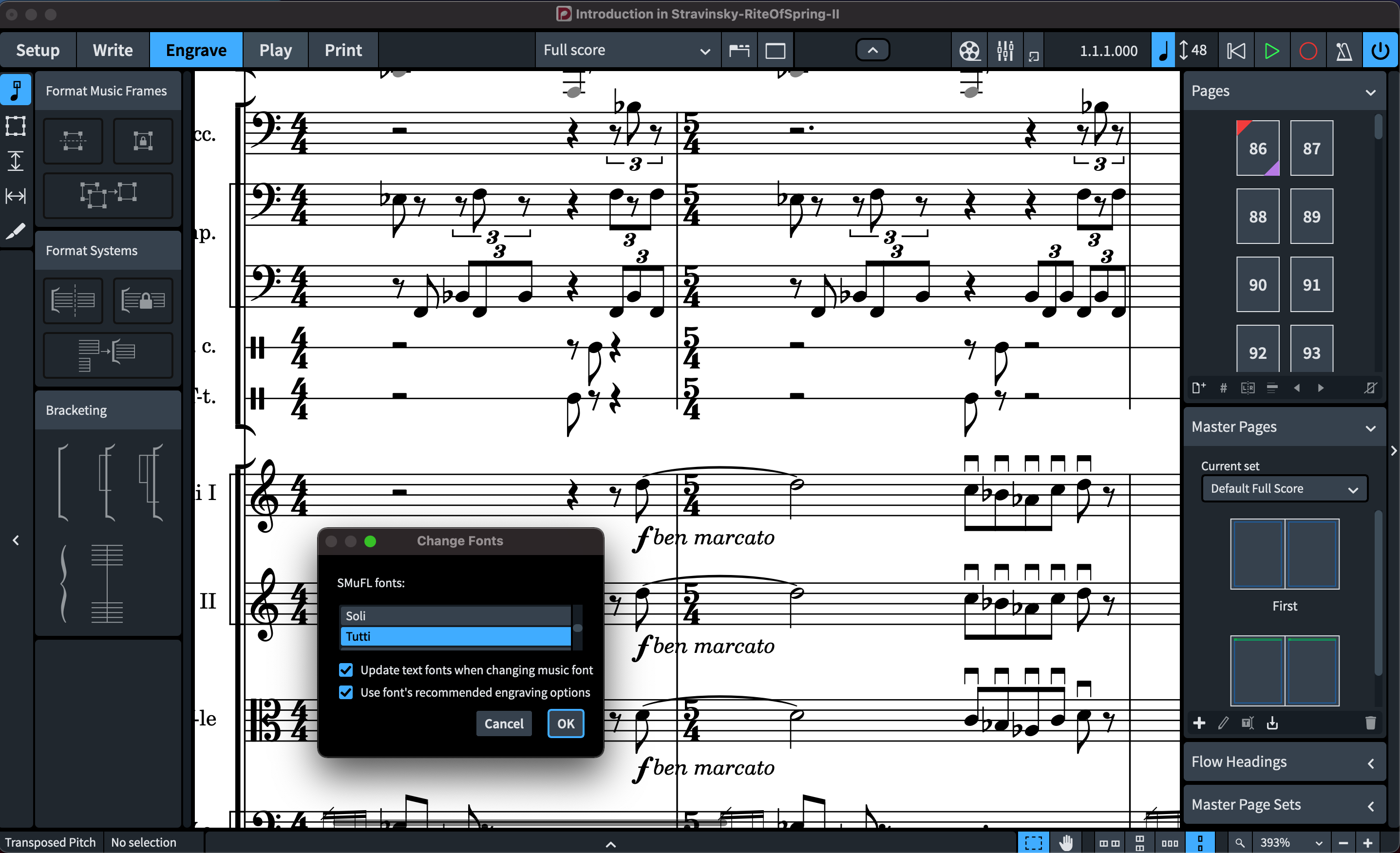
I wanted to keep you informed about the progress of my NorMusicSMFL font. Well, I’ve tried recently to clean up and remaster again my NorMusicSMFL, However I decided to change its name from NorMusicSMFL to something that deal with Classical Music practice, so I renamed the font as: “SOLI” (a light version font) instead of NorMusicSMFL. I then generated two font instances: Light and Medium (little thick appearance); the light version is SOLI while the medium sister version is called TUTTI. Below are two PDF samples using my latest improved fonts SOLI and TUTTI:
SOLI music font:
TUTTI music font:
A huge thanks again to Stave Taylor who engraved all the examples featured in this discussion.
I will soon put the two fonts on my website for purchase once I finish making some pdf samples. Soli and Tutti are sister fonts made from scratch,( both fonts work with Dorico 3.5, Sibelius and Finale and can be used on both macOS and Windows). The fonts will be available online by this weekend, I hope!