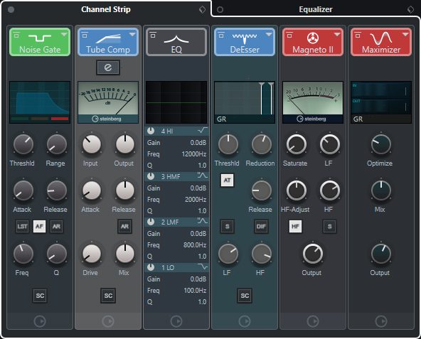
Workflow-wise it would be more than great if there would be a sort of 500-rack as a new alternative plugin view. Like Cubase already with its own Channelstrip, just for all other plugins.
Maybe add a button on the track inspector for “all plugins 500 slot view” and by clicking on it it pops up like a plugin window where the complete plugin chain is visible.
The inspector plugin view should/could remain as it is.
By 1 click you have all plugins opened side by side and can adjust them, move the position by drag and drop, copy settings, ecc. everything fast and easy in one window.
The Size of each slot is dependent on the size of the plugin, or to save space it shows only a minimzed version of the plugin GUI in each slot and by clicking on it, it pops out and gets maximized to its normal size (but always insied the slot view).
I have stopped counting how many times I reopen and close again single plugin windows when adjusting the sound of a track.
And sometimes I try to fix things at the end of the plugin chain, lets say add more bass, but completely forgot that at the beginning of the plugin chain I have cut bass.
With an “all in 1, accessible and adjustable plugin view” per track I would immediately see whats going on.
This idea sounds good in theory, but I doubt all of the plug-in developers are going to redesign new GUIs to accommodate this approach. The examples you used are racks designed by one developer. The only thing I have that seen that is close to a standard is the Reason rack extensions, but there is not that many developers that even develop in that standard in comparison to the VST format. Plus, as you mentioned, some plug-ins (like Fab Filter’s Q3) would still need quite a bit of space to be usable.
Because of this, I think a tabbed VST window (see Studio One) would work better because it allows you to stay in one window to make all of your adjustments without the need to constantly open and close each individual VST. It is one of the feature requests in the recent polls and is probably a solution that may limit your frustration with the individual floating VST windows in Cubase.
With that being said, I would love for all the 3rd party developers to follow some standards in regards to their GUI design that would allow for things like this, a 500 series rack (horizontal), or even a more traditional fx rack approach where the full GUIs would be stacked vertically. The chances of all of the 3rd party developers agreeing on a standard, redesigning their GUI formats and making them scalable is going to be slim to none. Of course, I would be happy to be wrong on this one.
Imho, there is no need to redesign the GUI to fit the specific format.
Cubase already has the ability to make screenshots of all 3rd party plugin GUIs in the media bay if I’m correct?
Lets take a tabbed plugin view approach, (like studio one)
and add a downsized screenshot of the plugins last state underneath each tab and violà.
Next step would be a downsized live view of the plugin underneath each tab, but that seems to be a lot more work and a “screenshot of the last state”-solution would already be very nice.
It would be nice. However I dont think it will happen for very long time. First it will require a significant changes of VST-SDK that would imply very specific graphical that do not exist today, or it will not be generic enough for many plugins UI functions. However with some clever remote control functionality it can maybe a control panel in the same way as any other remote controller. Unfortunately current cubase lags about 20 year in remote function technology. It would require a huge leap for Steinberg and Yamaha for this.
To support the OPs request of a 500-series style rack, the GUIs would have to be re-designed because most plugins aren’t sized and laid out properly to make them useful in that type of format.
To your second point, Steinberg is already considering a tabbed VST window (like S1), so that is why I mentioned it in my post. In S1, the tabs open the full plugin editor while keeping everything within the single VST edit window which is much better than Cubase’s floating windows, in my opinion. It is a solution more likely to be implemented because it has been in the last few feature request polls. If Steinberg adds the tabbed edit window, I personally don’t see an advantage of downsized screenshots. If I click on a tab, I would want to see the full VST editor just like in S1.
Well if you’d click on a tab you would see the full VST GUI, it’s just that you’d also see a little picture of the not opened tabs. So you dont only immediately see that on position 1 is a EQ i.e., but in addition you would see on the screenshot that it is a low cut. Or on position 2 you know that there is a gate, but with the screenshot you can immediately see the range and ratio.
I see your point, but I would be happy with just the plugin names on each tab like in S1. Of course, it would be nice if Cubase added plugin aliasing (renaming) so that the names displayed were easier to identify.
I’m not saying I am against your idea of screenshots on the tabs, but it wouldn’t be a priority for me. Again, I may confusing your original post (500 series rack) with the idea of a tabbed VST window (like S1). They are two different ideas in my mind, but maybe you are looking for some combination of the two ideas. The tabbed VST window idea could leverage the existing GUIs of each plugin where the 500 series rack would need GUIs to be customized to be usable, in my opinion. Just a simple screenshot of the GUI downsized would likely be too small to be of any real use to me personally.
Maybe if you mock up the idea and post a screenshot, it may click as to what you really want it to look like.
isn’t there an option to swap plugin GUIs for just sliders? cubase maps out each parameter (like for automation). it can’t be that hard to let users design their own channel strip (with the cubase look) by placing knobs where they want, for the parameters that matter, maybe with an “e” button for more detail work. I’d love to have the RND portico as a default on every track for example. the original plugin’s GUI isn’t necessary if you always have the same channel strip; you’d just get used to your own personal console. imagine mapping that to midi hardware…