I am honestly considering going back to 9.5, just because of the interface. I really like the new features, but I’m getting headaches looking at this mess of a design.
What in the world was the thought process behind this high contrast stuff that can’t be changed? No matter the colors I choose, the toolbar icons are waaaay too bright. I’d need to turn down the brightness by about 50% to make them not distracting. Selected lanes are also way too bright. Why can some things be changed and some not? I can’t even look at the toolbars without the icons blending into each other. It’s seriously hurting my eyes.
Before I loved working with Cubase, but now I don’t even want to open it. I really can’t be the only one who’s getting headaches from this. It looks so, so bad and I have no idea how people are even praising this. For god’s sake, just let me change the icon color to a darker shade of grey. White is likely the worst color you could’ve chosen for this.
And by the way - the entire program now looks cheap as hell when before it felt like most premium DAW you could buy. Good job.
I find it easier on the eyes actually, when comparing going back to 9.5. The contrast is better, in the sense that what you want to see - audio regions, faders, etc, pop out because they are the brightest thing.
It takes a bit getting used to, but I think Steinberg actually put thought into this whereas other DAWs have not. My vision feels so dispersed and unfocused when going back to 9.5.
I must agree that I too thought that the right-click toolbar had too much contrast and brightness… Like a hazy glow eminating from the icons
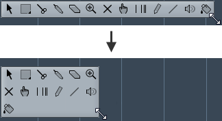
That alongside the new tool-icon pics and the new(fixed) one line order makes me hickup too… is this the glue? is this the paint ?
Would be nice if one could resize it again / put it in a order that makes sense for quick switches… / select our own icons / adjust contrast / have a “legacy mode” and so on:P
maybe some devs monitors were set too dark and some others too bright:P
The old resizeable toolbox was wonderful btw… symbols were a lot easier to read and identify as well;) (subjectively speaking)
I guess that some improvement will come to this part too though, so I think I’m gonna hang in there and hope that it happens sooner rather than later;)
Had the “way too bright” problem at the beginning but then i realized that the brightness and contrast settings on my monitor was at max.
Just put these setting at 60-65 % and now all are wonderful. Now the colors are more natural.
Before , might was impressive but was unnatural and sometimes hard on the eyes.
I’m all for giving users the option of customizing the interface. Cubase is more customizable than most DAWs but I agree that it would be nice if more things were customizable. The first thing I did was disable almost every color I could find and made it grey or as dark as possible. I don’t know why I can’t change the insert color to black like in 9.5 and I don’t like the blue highlight around the icons on each channel in the far left on arrange window as I was able to make them black in 9.5
I also want to be able to customize the interface more. We actually had more customization possibilities in 9.5 for some reason. The ability to Save and Load Presets to a file as well would make them shareable online. Here is an example of what could be done, this is a 3rd party app for Logic Pro X that hacks the program and allows users to change the color of everything: https://www.creationauts.com/products/logic-pro-colorizer/ something like this inside of Cubase would keep everyone happy.
Agree on the problem with excessive contrast. My eyes have also been feeling strained by v10 in a weird way; I can feel all of the contrasting ‘pop’ of the toolbars and hard white highlights and heavy text around the periphery distracting from what I’m working on in the central arrange window. This is bad UI design and needs some fine-tuning. It seems to me that really pro UI designers only use harsh whites & blacks very sparingly, and only for active / critical elements.
I’ve found the best way to deal with it if you still prefer a dark UI, is to select a custom global background colour that’s just a touch lighter. It’s a much better contrast and easier on the eyes - on a Mac anyway.
because everything else , literally everything else is perfect… every program, every app, the os, everything… for me the toolbox was too bright. - and- I now think i know why… (i work a lot at night, and today was my first “daylight” experience with c10 and it is not as bad during the day… but when its night, and you are working in a relatively dark gui, and all of a sudden this super glowy toolbox pops up- it kinda clashes…)
the reason why i felt that the for the toolbox contrast clashes is:
The tools are semi-blurry around the edges… this comes from the low resolution icons (I am not talking about that hidpi thing, I am talking about normal resolution - its like a 360p video compared to a 720p…
These icons are white on grey - and the edges of the icons are not sharp.
The old wonderful , resizable toolbox had a black border around the icons. this made them seem/look sharp…
its not really too bright, its just the low res blurry edged white icons on the light grey toolbox backdrop… - to be fair- they look really sharp when selected
-that was the only gripe that I had with the gui color actually…
the old paint icon, the comping finger/hand and range selection icons were much better looking pre-10 too btw:P
my biggest gripe is the 1 second delay when right+left clicking to get to the object selection menu though…
The first thing I thought when starting C10 for the first time was that it was some Halloween prank? The new gui is indeed horrible and damaging to your eyes! It’s actually been proven that white letters on a black background is damaging for your eyes. The first thing I did was lighten up the background. But still the ‘hub’ looks like Haloween every time I startup C10. It’s also kinda lame that the menu’s in the studio menu have not yet been invaded by Darth Vader? Which actually looks like breath of fresh air when I open them. Who ever thought and approved of this new Darth Vader look should seriously consider a new challenge in the marketing industry but should definitely stay away from the DAW industry or any other area’s where people actually need to look at their screens for a prolonged period of time!
Seriously? It’s by far the most horrible interface I’ve seen in a long time from any vendor! It looks like an inverted Atari 1.0 interface!
Generally I don’t mind the more 2D direction but the contrast is way too much… It’s so hard to look at when working all day, especially at night when the Tools and selected Track is just a completely white background. Agree that this is not a good design decision at all for a DAW.
Although I don’t use Cubase as much as I like due to work commitments and being a hobby.
I have noticed that the contrast is kind of hard, to the eyes,in certain areas,such as text,(speaking of which) is not as crisp as 9.5,maybe I need to adjust my resolution?
But managed to fiddle about with my monitor contrast control and its better.I been working a bit with Cubase 10 and I like the overall look
As a relative newcomer to Cubase,since June this year,I haven’t got enough experience to add anything further.
Here’s hoping for future improvements to Cubase 10 and onwards
I really wonder if there is anyone that would prefer a completely White Background for the Tool and Track Selection over a slight darker grey It would be so much easier on the eyes, especially at night…
I’m a new cubase user; I liked 9.5 AI I got w/yamaha keyboard, so upgraded to elements 9.5
I installed cubase elements 10 and it is HORRIBLE.
Look at the transport control in 9.5 - beautiful.
Look at the transport control in 10 - WTF?
Colors & GUI in 10 is an epic Fail.
Please bring back look & feel of 9.5, or at least add function to revert w/‘classic’ gui 9,5 look
There is no way I’ll upgrade to pro with the awful gui in 10; I’ll just run elements 9.5
Were you guys drinking or something when you made awful v10 gui? Bring back 9.5 lookor u get no more $ from me
I have to agree with everyone else. After about a few weeks of using Cubase 10, the only thing that is really hard to cope with is the GUI. It’s very uncomfortable to stare at CB for long periods of time. It so difficult that I have started using another DAW for the moment.
Steinberg, please get this adjusted within the next update. My eyes would appreciate it!