Does Steinberg want to annoy his users with a blurred menu-font? But WHY???
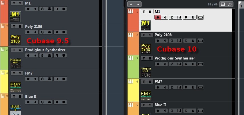
Please compare the screenshots. Left: v9.5, right: v10

What you can see in the following screenshots:
Cubase 9.5 uses the coulored pixels, v.10 doesn’t. I don’t know, if that’s intended to be like that or if this a bug. I consider the latter, because trying to read v10’s menu gives me a headache, what v9.5 doesn’t.

Same here!! Very bad font!
Any chance to change it???
I’m actually still running Windows 7…
bbking, Thanks for your feedback! Meanwhile I saw, that the phenomenon is independent of if one is running Windows 7 or Windows 10. It’s the same under both OSs.
Could you, folks, please load up screenshots, too? That would make it a lot more evident, showing that we are not the only “unlucky people” having those troubles… THANKS!
Still no solution for this issue???
It’s just the coloured pixels in the writing…!!!
C O M E O N , S T E I N B E R G ! ! !
So do i
Just bought v 10 . I have ein 7.
And i cant read from the meneu list .
The font is un clear .
Yes it’s slightly thinner/lighter and a bit harder to read on a large monitor. Not a big deal, but probably C9 font would be better. Maybe in one of the next updates?
I have the same issue on my win7 PC. I also see differences with the trackpictures, see attachment. Is it some kind of font or videosetting in windows?
There is more not as it should be.
It looks like if Cubase uses less colours than before, like it used to be in the old windows days, for example 256 colours in stead of thousands of colours.
The new Menu font is a joke. It’s annoyingly thin and kerning is well off. The 9.5 one is way better for navigation. Win7 here.

I think it has to do with Cubase 10 (limited) HighDPI awareness. Heres a MS blog entry with infos about font kerning issues:


+1000000000
+1
same here. reported this multiple times to SB support ever since the issue got introduced with Cub10.
and this was raised in multiple threads without any acknowledgement of SB. see here:
all fonts still looking crisp and clean in any pre-Cub10 version btw.
i will raise this with support again. would be good if all you guys joined in to be taken more seriously.
Same here in both Win 7 and 10