Bumpity bump! Even “not a chance” would be nice to hear! ![]()
(though not as good as “we’re on it”!) ![]()
Bumpity bump! Even “not a chance” would be nice to hear! ![]()
(though not as good as “we’re on it”!) ![]()
Sigh… bump ![]()
all a matter of taste. as in the whole life…
I don’t agree. Taste is the choice of colour - not having any choice at all is functional IMO.
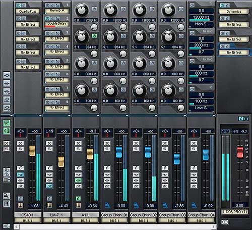
If I have groups and FX channels side by side it really helps to have them designated by colour. If you choose to have them all the same colour, that’s fine, but I’d like to change them. All I want is the choice!
yes, I understand, I philosophize only.
maybe an additional graphic fader in the preferences: adjustable transparent colourcoding for track types e.g.
But personally, I hate the colorful color scheme in PT9 (because the entire (ugly, but quite clearly) complete channelstrip can be colored)
I like the idea of being able to colour code the fader cap. That’s a good idea.
The real question here is one of user choice and flexibility though. What we really want is the option to be able to colour code the channel strip or the fader cap etc. Then everyone would be happy ![]()
not really …
+1 here…please give us some channel display choices that can suit everyone’s requirements.
Hmmm… horses for courses I guess, but I could see the colour-coded fader cap idea, making the mixer look pig ugly to be honest… (something from Toy ‘R’ Us or ‘My Mum’s First Mixer’…?!! Nah…! Not for me…)
So, +1 to having choices. ![]()
Personally…? I’d like just that ‘beading’ or piping around the buttons next to the fader (currently a subtle ‘grey’) to be able to be coloured - you know, subtly…
My statement was to understand with a pinch of sarcasm.
Absolutely.
By the way, Steinberg (!) had built in “color code the fader caps” years ago in V-Stack!
…perhaps anyone can still remember?
= not too colorful, professional, very slick, great clear view!
And that would be my personal favorite.
I choose this one. With user adjustments in the preferences.
![]()
Opinions?
That looks pretty good !
Also the channel type symbols having matching colors, is a good idea.
I don’t think it’s looking too toyish.
Many ‘real’ mixers have colored fader caps for different channel types.
I also like the pre V6 coloring method.
The most important thing, is a clearly visible difference.
Just my 2 € cent …
bye, Jan
yep!
just like the YAMAHA desk i have sat just a few feet away
So should this be a feature request in a separate thread? It’s a good idea, and they’ve done it before.
I agree, I hope Steinberg will find a way to redesign the mixer with better channel identification. I find colors to be a tool that is simple and effective to use. I don’t want to read or look at the mixer to figure the channels out, I want it to jump at my face, making mixing works easier and clearer.
I don’t think that is needed, since they have shown to actively read the forum.
BTW, +1 on the fader caps and the channel types. Shown topic images shows the advantage, IMO.
Great looking program … but you need to see the mixer channels without trying. It’s that simple!
We already have a thread about this and Steinberg said they will think about a way to better identify the channel types, again.
They also said they like the new uniform_grey_relaxing mixer look …
Seem like some of the VIUs like to fall asleep in front of their DAW ![]()
Thread is here :
bye, Jan
I think it looks really good!
Me too…