Reaper, for example.
Afaik StudioOne, Samplitude, Pro Tools, Cakewalk and I am sure others too.
Your tone is uncalled for and no, I am afraid you don’t get it.
I don’t know why I even bothered, I guess I was hoping I won’t have to duel too many fanboys.
I was wrong, so I’m out.
Hover in the mixer GUI has failed the most important usability test – with loyal users. Time to fix it.
The vast majority of these posts are anti, and here’s another.
The new mixer is SO difficult to use I have altered my workflow and almost never use it. I use the channel windows for EQ and the inspector for routing. And even then I regularly hate the insert slots and sends in the channel window.
The hidden/hover thing has nearly ruined the best thing about the main page, which is direct manipulation of gain, fades and crossfades of clips.
I use Cubase and Nuendo every day in a professional environment, and I haven’t got used to these changes. I sincerely hope Steinberg have the wit to listen and change.
this quote made me laugh!:)… it’s exactly what i was thinking, the mixer reminds me of this video!
![]()
+1. Very frustrating.
-Tom
My thoughts exactly even though I never use the control room.
Yeah, the whole reason I’m told for the new mix console was Nuage. How many Cubase users currently use that? ![]() Oh yeah…I’m sure somewhere in the future it will become affordable. In the meantime lets all love mouse-clicking, hovering, and holding a second over buttons for different results.
Oh yeah…I’m sure somewhere in the future it will become affordable. In the meantime lets all love mouse-clicking, hovering, and holding a second over buttons for different results. ![]()
How about something I think a lot of users could take advantage of which has just been mentioned is in other DAW’s but not Cubase…undo’s for mix settings? I thought this was possible using “save selected/load selected” in the mix console. But nope, that won’t work with instrument tracks.
(Disclaimer: someone wrote that the work-around is to not route it to stereo out, but I have not been able to make that work with my 2nd stereo out. Someone else suggested I use “save selected/load selected” on the project page instead of the mix console, but I haven’t figured how to do that either.)
I found a perfect solution for this mess:
Console 1. I don’t need that Steinberg Mixer-Toy anymore. Mixing is done completely within console 1 and I f I have to insert a vst outside of console 1 I use the inspector on the project page, although there is now mouse-over nonsense, too.
I agree very much that it’s dissappointing to see the disastrous “hover” buttons still not being taken care of. I rearranged most of my mix window workflow over to hardware controllers for this very reason. The whole Hover concept was flawed from the start.
My thoughts exactly. As much as I love the new impressive features of both C7 and C8, the new mixer paradigm is still a dissappointment. The old 6.5 mixer was lightning fast. Take for instance those of us who do a lot of gain staging work, it’s now impossible with the new mixconsole paradigm to quickly glance your exact pre-gain channel trim input values as you could back on the classic 6.5 mixer. Those functional trim values have now been replaced with totally meaningless row of buttons all labeled “gain”. You have to, yes you guessed it, HOVER over the trim buttons to see the ACTUAL db VALUE. Same with with the HC/LC filters. Instead of accurate numeric values we can actually USE, we now get these graphic grey rectangles. I guess we’re supposed to GUESS the exact settings if we don’t want to HOVER over the buttons …
As it stands right now, these sort of faulty design decisions are at best counter-productive, at worst embarrassing.
Steinberg are aware of this but for some reason they don’t want to make the change.
This gif animation clearly shows one of the downsides/issues with hover buttons:
Here’s a poll:
I also made a Feature Request when Cubase 7.0.x was still the latest version and its commented by Steinberg:

I really hope this is not a lost battle. If it is, 8 was the last update for me. I did update to 7, 7.5 and now 8, in the hope that things have changed, but I am starting to feel like I’m being ripped off.
6.5 is still an awesome DAW, I can still get a lot of mileage out of it.
Yes, these hover buttons are absolutely the worst thing I´ve seen in the new mixer. Really cumbersome, slow and tacky. I can´t even turn OFF a plugin properly without first opening the damn GUI. ![]()
I´ve dealt with this **** since 7.0, but it really starts to get annoying. I hoped 8.0 would had a better solutions.
I guess it is. And it’s getting worse !
E.g.: Instead of bringing back differently shaped buttons to the mixer, we now have the same sized same looking hard to distinguish buttons in the project window, too !
![]()
Holding off the 8 update and re evaluating the switch to Samplitude X2 or the upcoming StudioOne 3.
The current mixer design is definitely one of the biggest workslow enhancements, Steinberg ever released !
Yes, we may adapt, but I ( and obviously many others ) will not accept !
The only reason, Steinberg is still not losing the vast majority of it’s customers is,
that the competition is still catching up.
With Steinberg going sideways, since yeears, the gap is narrowing …
I really wish, Steinberg will find a way out of this mess !!
Jan
Not here.
I always open the plugin menu, when I want to open the GUI !
Which is even worse, cause to get to the GUI, I then have to click 4 times ! ( Well, in 7.5 )
And don’t get me started about fine tuning headphone mixes, for a band.
Hover here, wait, hover there, wait, hover here, wait, etc. etc. etc. etc. …
And constantly switch back to pre fader, as you accidentally switched to post …
Not good.
Jan
I absolutely hate these hover buttons and hovering things in Cubase!
Now I have to even hover over the crossfades to be able to see them, which is ridiculous! Pro Tools is looking really tempting right about now.
I’m adding my dislike for the hover buttons. +1
cubase 6 was better in that regard. no hover made for a very fast workflow in the mixer! click on insert → open insert. and I am not a machione but an old human that doesnt see every pixel and can aim them perfectly. hover - i dont like you.
So a good description of my situation!!
Well, I hate the hovering. When mixing it is … well… not a showstopper but really really annoying. I can put out good mixes… but I would like to switch of that hovering, having regular buttons again.
I would be fine holding down a key to disable hovering temporarily…
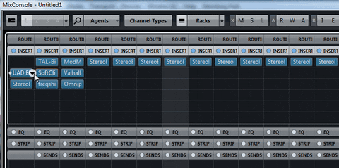
Oh - when we are here - I had high hopes to have some kind of a “this plugin GUI is active now” indicator implemented… but sadly nothing happened… In a big mixer with lets say 12 tracks of vox with all the same plugins it is quite un-intuitive to find out WHICH plugin you are tweaking - I always have to close the plugin and reopen it from the channel I want to tweak to be sure to tweak the right one.
It would be enough to select a slightly different color for an “active gui” plugin in the prefs… We can choose colors for almost everything… why not for the plugins? GUI open/closed similar to aux send pre/post…
yeah, something like a “bring active track plugins to front”, or some focusy type thing that makes it obvious which plugin is on the active track. I use 24 tracks of UAD SSL E all the time as an example. I’ve kind of got the clickity, clickity, clickity thing figure out to open/close. But jesus what a waste of time … and of course I have hand problems, so it is actually painful.