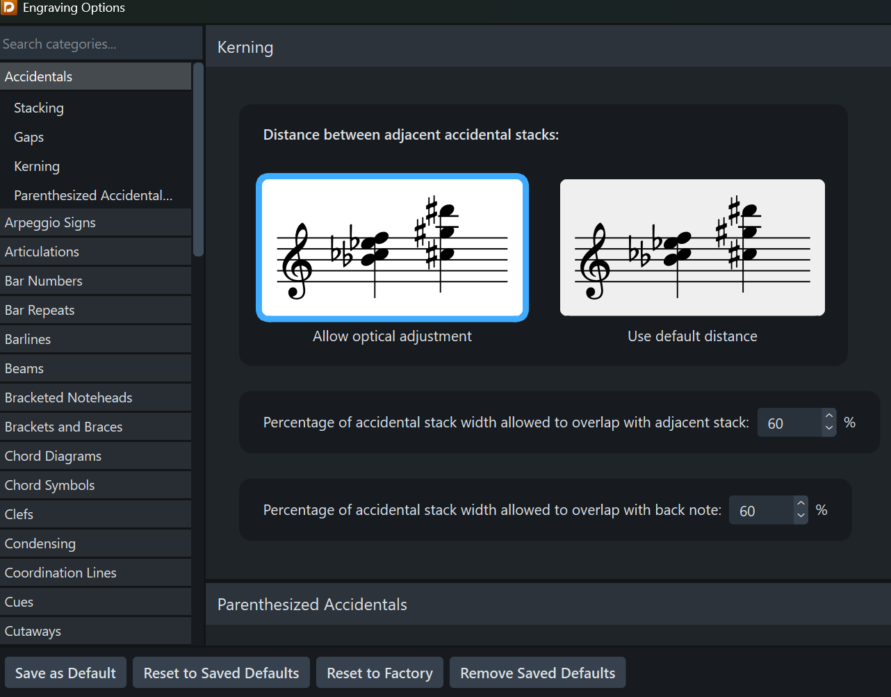
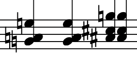
These accidentals are not kerned as much as I would like:
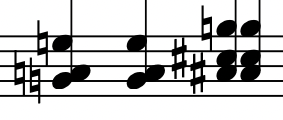
and I would prefer:
Is there a setting that I need to change?
These accidentals are not kerned as much as I would like:
and I would prefer:
Is there a setting that I need to change?
Thanks, @charles_piano Yes I have.
Do you get the same result for these two chords with your settings?
I got this on a default new project
It looks good. I had to flip the stems manually, as “down” is the default.
Thanks @charles_piano and @Mats_Frendahl They both look good. I just realized that I may have changed the font of the my accidentals and that may be affecting the kerning. Are you both using Bravura?
Bravura here, yes.
Bravura here too. I stick with the default (Bravura, Times, …). After 30+ years, I’ve found that these result in the best sleep.
I’m using Bravura but mix in things from Finale Maestro and a couple of others. That does get me into trouble occasionally. This is the first time I’ve noted problems with accidentals, which I will have to live with for this project. Any way, thank you both for taking the time. It did help.
I don’t scorn Times New Roman either, Mats_Frendahl. To me, Times New Roman Bold looks the closest to the font used for tempo indications in much older engraving. And it makes an excellent font for footnotes.
Wish I could give you both credit for a solution.