I’ve been working with Dorico’s Library Manager recently while setting up a personal house style. It’s a powerful feature andI’m finding it genuinely useful. I wanted to share an observation about how differences are presented in one specific situation, and suggest a modest possible improvement.
Assumptions (correct me if I’m misunderstanding anything):
- The main purpose of the Library Manager is to help answer the question “what significant settings have changed here?” and, where appropriate, to help me act on those changes.
- When I change the SMuFL music font, Dorico recomputes a large number of internal engraving metrics (notehead geometry, symbol dimensions, wiggled-trill-line offsets, and so on.).
- These internal and derived values are stored within the project, and therefore show up in Library Manager comparisons.
What I’m seeing in practice:
- After switching the SMuFL font and accepting the font’s preferred engraving metrics, Library Manager now shows hundreds of differences relative to the comparison source — a sea of red.
- This makes it much harder to spot the one important, intentional change (“I changed the music font”), and instead raises questions like “did I accidentally change all of this?”, “have I misunderstood how this is supposed to work?”, or even “is this a bug?”.
- Because these derived values are presented in exactly the same way as genuine, user-facing settings, it’s not obvious that copying them from the comparison source would be pointless (or worse, counterproductive).
So it seems to me that — assuming the above is correct — the current presentation of these differences is slightly at odds with Library Manager’s goal of helping users understand what actually changed.
Possible improvement:
When showing differences, Library Manager could:
- hide internal derived values altogether, or
- at least present them differently from user-editable settings (for example by greying them out., grouping them together, or marking them as “derived”), and not offer to copy them.
Even a small visual distinction here would massively reduce noise and uncertainty when comparing libraries.
Regards,
Jonathon Bell
Can you give an example of an internal derived value which is not user-settable? My impression was that everything in the Library Manager is user-settable, even if some of those settings can also be changed in bulk by changing music fonts.
And while it’s not the most convenient workflow, one way of dealing with this might be to make a copy of your comparison source project and change the font there as well. That way, both your source and destination will have the same font-related metrics, and they won’t show up as differences.
Thanks for the reply.
Examples include:
- Multi-segment wiggled trill line offsets
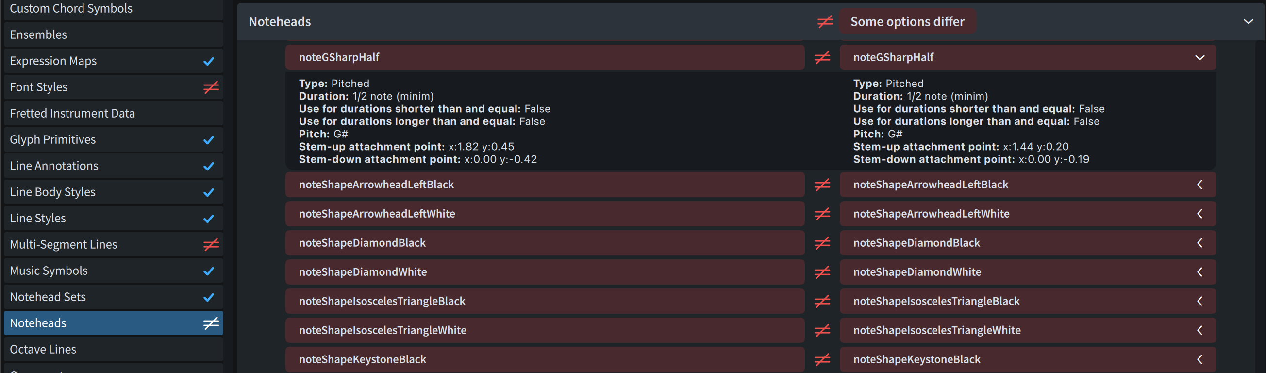
- many elements of the Noteheads collection (e.g. "noteABlack | Stem-up attachment point | x ")
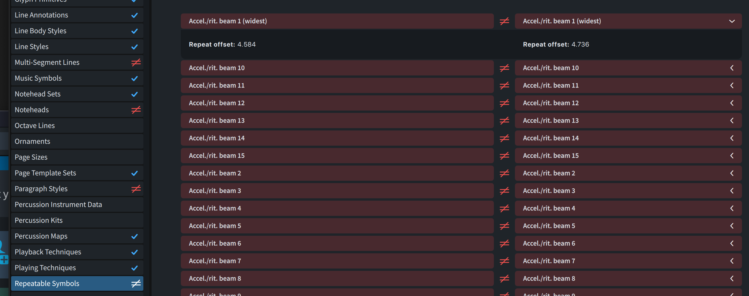
- all elements of the Repeatable Symbols collection (e.g. “Access./rit. beam (widest) | Repeat offset”)
Your suggestion to make a copy of the comparison source project and change the music fonts there is a good one. I’ll give this a try , though I don’t think this will help when comparing against the factory default settings or user library
To create these screenshots:
- Launch Dorico
- File | New
- Library | Music Fonts… to choose Petaluma
- Library | Library Manager…
Well, the Repeatable Symbols values appear to all be in Library > Repeatable Symbols, and the notehead values are accessible through Library > Notehead Sets. (These are the Petaluma values.)
I’m not sure about the wiggled trill line offsets, but maybe someone else has an idea.
Thank you @asherber — in particular, for correcting a mistaken assumption on my part. I now see that the settings that are recomputed as a result of changing the music font are in fact all user-facing in the sense that they surface somewhere in dialogs off the Library menu. I’ve learned something there.
What still isn’t clear to me, though, is how one is meant to copy this full set of affected settings into the User Library in practice.
For dialogs like Engraving Options…, this is straightforward: each provides a single Save as Default button that exports the relevant options en masse, and once that’s done those differences no longer appear when comparing against the User Library.
However, for other areas — for example Notehead Sets, Repeatable Symbols, and Lines — I don’t see an equivalent “commit everything in this category” mechanism. These dialogs appear to require saving each individual item as a default and, as we have seen when the music font changes, this can require tracking down and saving hundreds of somewhat esoteric settings. I feel like I must be missing something here; surely this can’t be the intended workflow for capturing a house style in the User Library?
Related to that, for the subset of settings in this latter group that I have managed to track down and save to the User Library, I still see them flagged in red in Library Manager comparisons. When expanding the details, the values on both sides now appear identical. I’m wondering whether this relates to an observation you made made in another thread — namely that some settings may not be fully materialized or serialized until they’re actually used.
So I may simply be going about this in the wrong way. My overall objective is fairly simple:
-
create a house style based on a music font other than Bravura
-
store it in the User Library so that
a) existing projects can be cleanly compared against it using Library Manager, and
b) new projects created via File > New (i.e. without a template) pick up those settings automatically
How do other Dorico users typically achieve this in practice?
Cheers,
Jonathon