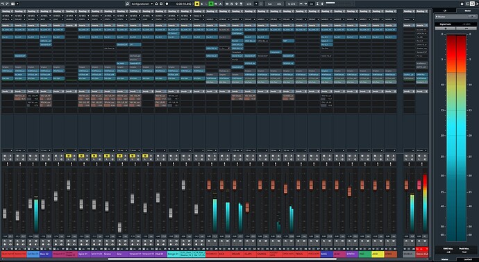
I read here and in various forums that the fonts in Cubase 13 are supposedly barely readable and too small, especially in the mixer. This can be easily changed because the font size adapts to the slot / cell size:

Alternatively, you can do this with the common keyboard shortcuts:
g = dec. width
h = inc. width
CMD+g = dec. height
CMD+h = inc. height
This is how an unreadable mixer quickly becomes a readable one:
Before:
After:
Notice: This option has not only been available since Cubase 13, and I am aware that this “trick” is not new to many users and has already been mentioned here in the forum. But due to the sometimes very emotional discussion about the new look of Cubase 13 (I’m not entirely happy with it either), it shouldn’t hurt to point out these setting options again - especially for new users.
Many things (of course not all!) that are criticized in Cubase 13 are not hard coded and can also be adjusted in the program settings. Hence: RTFM ![]()

