@estevancarlos Big thumbs up here for the clear and concise text and colours you have used.
Keep up the great work - I’d love to see these plans adopted by Steinberg.
@estevancarlos Big thumbs up here for the clear and concise text and colours you have used.
Keep up the great work - I’d love to see these plans adopted by Steinberg.
Thanks for posting your work. Very much like your mock-up for these reasons:-
I’d prefer it if you’d made it more of a ‘fair game’ by mocking-up the same views of the two side-by-side (i.e. the C13 pic with the same number of channels, same width/zoom, same fader/meter area height etc…).
The rest, I have read that SB have indeed now taken on board that they will need to adjust things to improve the ‘readability’ of the new design. I take it that includes ‘toning down’ the brightness of the (bold) white font throughout a tad, for example. I’m guessing this will help ease things for A LOT of peoples concerns.
As such, I like the look of the ‘flat’ buttons (M, S, L, R, W, etc), and the dB scale markings behind fader and in the meter. Overall, I think I could soon get used to the changes in their design choices, going forward. I’m quite ready to embrace a Cubase UI/UX ‘refresh’ after staring at C11/12 for several years now… ![]()
HOWEVER - this is me only looking at the screenshots; when I eventually update and have it all actually in front of my eyes, on my monitor, and interacting with the darn thing, I may have a different opinion again…!! ![]()
![]()
![]()
![]()
It’s a legacy commercial theme which is no longer supported but I have enabled a dark mode switcher. I hope it works for you.
Personally I’d prefer everything look like it did in the SX versions - practical, clear, intuitive and designed with common sense in mind.
Up until now I’ve been pretty much a lone sheep in my opinion on modern themes but on the positive side it seems people are catching up to this nonsense and how problematic it all is. We may not agree on aesthetics and colour but at least (it seems) we’re all beginning to agree that the flat and blended pastel colours on everything, along with tiny dark text on dark backgrounds and no distinct separation between anything is no longer working.
Maybe it is my eyesight but all of the problems everyone is talking about in this thread has been a problem for me ever since the flat dark theme obsession started. None of this has ever stopped me working, but it makes the work so undesirable that sometimes I can’t be bothered. If I’m doing something simple I just fire up SX2 and do it in there, seriously I find it all that bad that if I don’t need a modern feature then I still use the ancient version. None of this is about me being stuck in the past. I’m impatient, I work fast and anything that slows me down is a negative.
I also prefer a light theme but this is impossible in any of the versions going back to about version 5? Can’t quite remember? People say we can still have light themes but in reality we can’t - everything is a trade off because too many colours are linked, change one colour and many other things change with it.
And then the other madness of things like using colours that make no sense. For example, on/off bypass etc. We all know what red and green represent. We can all take a good guess when something is highlighted (on) or dull (off/bybass). When this gets changed for things like bright blue/yellow or orange or whatever, we then have to guess. Seriously, what’s the point? It looks pretty, so what! I just want to look at things and know when they are enabled or disabled without having to memorise unusual or uncommon colouring indicators or look things up everytime I use something.
I know I’m unusual, I prefer designs from the 90s because they make sense. We’re all entitled to opinion but just a few simple customisable options could make most of us be able to find a suitable compromise. I don’t believe any coder that says this is difficult or can’t be done - it’s just laziness and obsession with trend.
Don’t wanna be rude, but the C13 one looks easier on the eye than yours color wise (imho). Your font is obviously bigger, which sure helps, but thats about it for me.
Imho there is no need for a complete redesign. Just a slightly different/bigger font.
@Tj99 I would suggest a ‘softer’ font approach. ‘Bigger’ would cause others with smaller screeens a whole new raft of issues.
We sure as heck aren’t all going to agree, so more options for personlisation would be the way forward IMHO.
I’m hoping for more customisation options in a point release.
As it is, Cubase 13 is quite unpleasant to use - very crude, garish and hard to understand.
I’ve softened the mixer colours, which has improved things.
Funny how we are all different. I find Protools to have an impossible to use interface. For me it looks like I’m using a free CD Burner from the 2000s. I have a real problem working with it, and never like it’s interface.
That’s why I ended up in Cubase in the first place!
Indeed. When I read that I thought immediately “man, how I hate the look of PT”. I think it would not be pleasant to work with it for me. But I haven’t upgraded to 13 yet.
Well put. ![]()
PTs interface was the reason I nearly didn’t try it out in the first place.
I think my design has some issues. One is that it’s intentionally showing lower contrast text for some of the words. Some people don’t prefer this. I also suspect that the subtle shadow I placed behind the text is a bit flawed and needs improvement.
Regarding the other redesigned elements, I was attempting to fix things relating to contrast and visual hierarchy. Some of it is admittedly not related to readability.
In the new edition of Sound on Sound they review Cubase 13. Most of the article is about the new UI…and they love it!!
PT’s GUI is great in one specific regard: strong consistency. I do think it looks “ugly” in a way but dang it, it has it’s own consistent, internal logic. This is really important to UX (user experience) because it allows users to more easily intuit and guess how to use the software.
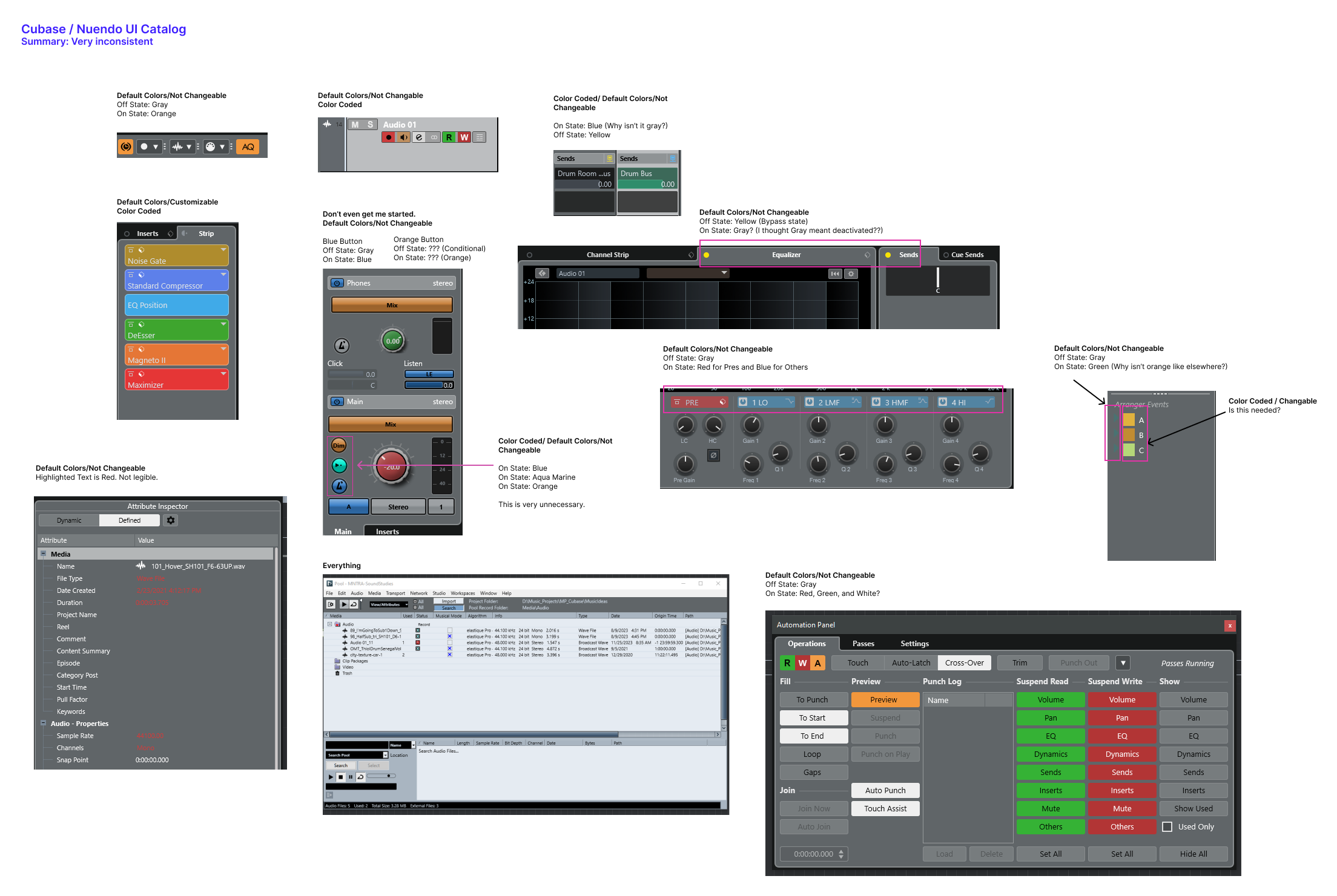
Consistency is Key
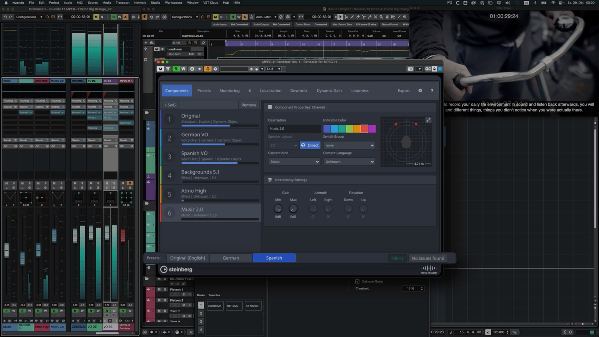
Cubase/Nuendo unfortunately suffers from inconsistency and I’m not confident Steinberg considers this a serious issue. One thing that bothered me with their new v13 Nuendo release is that they added another inconsistent UI to their software for MPEG H.
This MPEG H window looks fine (in fact, it looks good) but it doesn’t follow the system established by the DAW. Adding all of these exceptions to the rule creates a broken system that requires more comprehension on the part of the user. It also makes Steinberg’s job more difficult if they intend to fix it in the future.
MPEG H
.
Not Perfect but Also Very Clear
Going back to Pro Tools, consistency is key for them. Some of us, including me, may not be crazy about the style but we should all realize that creating a clear design system helps users.
.
The Problem with Inconsistency
Cubendo has no clear internal logic. In other words, there are many exceptions to the rule. At times orange is used as the on-state color of components. Sometimes it’s yellow. Sometimes it’s blue. At times a color is highlighted as red to indicate importance (?) and other times it’s green instead. Sometimes you can color code information and then other times it’s fixed.
This increases the amount of effort required to learn the interface.
.
Summary
In addition to expressing concern about the design of the interface, let’s acknowledge that even a consistent design system would also help things move forward.
They love it or the specific reviewer loves it? It’s important to understand that many people are discussing readability. Readability is not universal. It’s also about accessibility. I can read the new UI fine for now. However, I may not able to in the future. Others currently face eye strain when trying to read the UI.
I think it’s fine if the Sound on Sound reviewer likes the new UI but unless they did a real analysis, I don’t think that’s terribly important.
I’m betting that the MPEG H window is actually a plugin. If you look at how that window looks in other DAWs, like Pro Tools for example, you’ll see it’s pretty consistent. And if that’s the case then it stands to reason that there’s no bigger reason for Steinberg to spend resources on redesigning that than it should any other plugin.
When it comes to some of your objections I agree, but some things aren’t inconsistent even though they may seem like it. For example, in the channel window the yellow is bypass but it’s wrong to think of the grey as “on”, because the function / switch / button isn’t to turn the EQ section “on”, it’s literally to “bypass” it. So it is the bypass switch that the light is indicating the status of. That makes it “mostly” consistent with the send status.
When it comes to “sends” the problem with comparing is that the indicator actually has three modes:
All are off or unassigned(Grey),
Some are On (blue), and
All are bypassed (Yellow)
So as far as I can see “grey” seems consistent. Having other colors for other functions doesn’t really bother me all that much. Automation Read vs Write being green and red makes sense to me, at least red being write since that’s similar to Rec.
When it comes to some windows like for example the Pool I think this is something we likely should think about similarly to how Microsoft is doing it in Windows 10/11. They basically had a huge chunk of code with tons of windows and are steadily moving things around to better locations, and gradually that then changes your user experience. So more and more features in Windows end up in a window with a more modern GUI. Here in Cubase/Nuendo we just got the key commands window overhauled so it now looks more in line with the rest of the user interface. The question to ask is just how much effort SB should put into doing things like “porting” the Pool window to a more consistent GUI. After all, that effort takes resources away from any and all other things we might be wishing for.
Same with Control Room. Is it a consistent look? Not entirely, but we also probably don’t spend that much time looking at it, similarly to Pool and Key Commands windows, so maybe it’s just lower on a list of priorities.
Control Room is an interesting one as I imagine it varies hugely on how you use the different functions available.
For me I just use it to switch between main monitors, Avantone mixcube and Headphones (all with different Sonarworks profiles)…just for checking mix.
For me I could just have 3 buttons…the rest is superfluous.
Sure. Very similar for me. Fortunately we have key commands so I just switch using those and also have a show/hide of the CR panel. So it really doesn’t make much difference to me and I’d much rather SB spent resources on other things. Same with the pool window. Ugly as hell but ‘whatever’…
For me it’s more how it’s immediately easy to see everything clearly in PT withou any strain. I should have been more clear about that.
The delineation and clarity of PT’s GUI compared to C13 is night and day if you ask me. I prefer the actual design of Cubase much more…but the strain on the eyes, the inconsistencies, the tiny font sizes in some places, etc. all lose strongly to PT in my opinion.
Again, just to be clear: I’m not talking about the design itself but more the look and appearance of it as far as contrast, color choices, delineation, etc. C12 was pretty damn good for me in this regard.
I agree completely.
I find that enabling the Win10 Night Light feature tames the bright whites enough to make the new GUI at least bearable. I suffer from several vision related issues and I cannot look at the screen for more than a few minutes without Night Light.