The color scheme in version 12 was fantastic.
I tried to find a way to get version 13 back to normal in the settings.
Please help out here, how do we get the version 12 color scheme back?
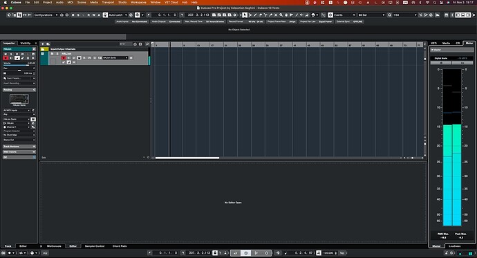
On my MacBook Air Cubase version 13 looks very bad, color vice.
Except for the inspector strip - a complete fail - I actually like the UI a lot.
I feel if everything apart from changing the look had been done we’d all be happy.
Why oh why oh why oh why!
Steve.
Modern means as close as possible as the latest OS. Round corners in modern times are not necessarily a good thing especially for the large amount of devices and screens. The thing they did instead is to make it more readable, and I am referring to the first post here.
AN ASIDE: Enjoy holding down CNTL-SHIFT (win11) and in the main window being able to scroll up and down while seeing the track sizes go larger smaller (HUGELY APPRECIATED)
On the “new looks”
-sigh-
at the top of the track inspector ~> that cubase 12 horrific “steinberg grey/blue” oval-esque play/monitor etc. IS GONE !!! I am SO grateful…
Screen real-estate WAY Way way better in every ‘way’.
The comments above about the flatter bits?
3D.ish, gradient bits are resources and take up a lot in many respects.
We are likely moving towards WAY better resolution flexibility - 4K/1080 all goodness, and a TON MORE.
YES, flat-bits takes getting used to though many of the comments just don’t consider greater and future ramifications.
I’m writing, pointedly, (not my usual vibe) as → we really do want STEINBERG to stay motivated I believe.
The details and improvements in the release are huge in my view.
Imagine a world without CUBASE - and i guess you’ll discover a truer balance as to why doubt/complain.
Do you use other DAWs as well i wonder.
I was a REAPER devotee from 2006 until 2022
After VST LIVE PRO came out (and i wasn’t still imagining I could make REAPER work on stage) - i came to understand that I liked being on the forum of the genius types over at REAPER’s forum --though I wasn’t getting music completed.
I’m writing here as the LOOKs of STEINBERG is on course toward graphic’s future.
NOTE: Greg (at the cubase youtube official real-time tutorials) months back, stated that:
Steinberg is currently working on version 14 and 15 !!!
oh yee of little faith ? – (hahaha - just lightening this all up)
Gradients, 3D when not needed are resource/programming hungry, don’t scale well, inefficient space usage often, and on and on.
I’m not going deep here and the above can of course be said to be flawed due to lack of depth.
Let’s celebrate a dash of what some call a Studio One Look. It’s not the look, it’s how the features work, as you’d agree. I bet a lot of you have checked out Studio One and thought, hmmm, interesting efficient flatness.
We are kinda getting it all with CUBASE 13
I hope we can all trust Steinberg (doing their best) and keep them motivated.
No-one and noth-ing is gonna be perfect - though i truly feel that as big as they are they totally care to keep going. Check out the guy, Daniel and others, on the forum when the shop was down. They absolutely care. And, there’s Greg and his multi-hour LIVE tutorials at Steinberg Youtube Community.
How do you think Steinberg DEVs are gonna feel when they’re getting bashed over what is FOR SURE a better step towards the future. Uhhh, they’re people.
Love conquers all - heh-heh. Yeah, just having a warm moment for how much CUBASE fits me. i NEVER woulda guessed until last year. Yet, I was Steinberg Cubase until 2006.
Gotta run - back to absolutely LOVING CUBASE 13.
A world without CUBASE?
CUBASE being sold to Fender – STEINBERG SOLD type shocker, – AS IN ~> that the conglomerates have been eating up lots of programs theses past few years.
DO YOU CARE ?-)
Cubase 14 Mixer view.

![]()
![]()
![]()
![]()
![]()
I turned those all the way down and the colors are still too bright. Cubase 12 and before I could work all day. Cubase 13 I can’t look at it for more than 5 to 10 minutes because it messes with my visual disability.I almost have to throw up it’s that bad. They need to do an update that allows us to not have the colors pop out so much.
It’s not about “like or not like” some people like me have visual disabilities where bright colors affects my vision for me it makes me sick. Give us an option to brighten or dull the colors especially the bright white fonts. It’s too much.
Pardon me? Microsoft started with those awful sharp corners in Windows 8, then 10, and doesn’t 11 have rounded corners?
Hahahahahahh this is awesome!!!
Now THAT looks modern. ![]()
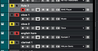
I have to agree, I gave it another go today and the blocky white text is extremely obnoxious as are the bright yellow mute buttons. It rivets you’re entire attention away from the arrangement.
Otherwise I can deal with it - although C12 looks at lot better - The channel EQ looks fine, the Mixer is ok.
Hopefully we can get a feature to turn down the dial on the track colours. It’s one thing to be flat and lifeless and quite another to be flat, lifeless, and extremely annoying.
Otherwise very happy with the actual features.
That’s it, Im busting out the Atari now!
The new UI was a bit of a ‘shock’ to me too. I liked the 12 UI and didnt see the issues with it, but you know, each to his own and all that.
The one thing I do not like is the sends and inserts though… Those empty boxes just look ‘wrong’ to me for some reason, but I’m sure in a couple weeks it will be business as usual once we’re all used to it. Software’s only a day old, give it some time.
And congrats on the new Inspector. I’m glad at least now its plain and simple ‘VOLUME’ and ‘PAN’ instead of the weird graphics, and the buttons are laid out more like the channel strips so there is no confusion about what does what. A lot more user friendly, on my end.
I never had so many replies to a thread I started since I began using the internet in 1996. I kept seeing emails all day long, which I couldn’t check because of work until now, and it’s fascinating how much Steinberg screwed up the GUI because a lot of people here pointed to so many things that are wrong with it, far more than I could see in my first session with it last night.
Some people pointed out that there were still many things that are not resizable, and that begs the question, why do we need such a fat meter on the right? The thing is so pointlessly wide, and there’s no reason for it to be like that. Every graphical element in it can be resized horizontally just fine.
Also, macOS users still don’t have a zoomable GUI like so many other programs do these days. I understand that in Windows if you adjust the DPI you can make it larger, but in macOS that setting doesn’t exist, unless you count changing the resolution as that. But I have two 32" monitors that I could happily use at 2560x1440 if it was for every other program I use, but I need to use it at 2304x1296 because of Cubase.
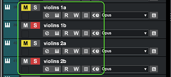
But above all, when I look at the new GUI, this is what stands out at me like… well, imagine a really beautiful classic car, perfect in every way, and somebody painted flames on the sides. Sorry to be persistent, but this, I can’t stand this:
Seriously this part looks like a train wreck more than any other part of the GUI. When looking at the whole thing, most of it doesn’t seem like a drastic change. The toolbar at the top may have some changes, but they are not screaming at you.
The mixer looks very different, but it doesn’t seem to me like an awful cheap program from some free DAW.
But this part is just ugly. It was one of the parts in Cubase with most personality, with that weird industrial font that seemed from like a 90’s software but not cheap, just good taste vintage.
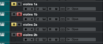
Compare the M, S, R and W between both. Even without the button itself, which looks great in 12 and just flat boring in 13. Maybe the button change would be more tolerable if the font remained the same. But you change a very unique, good looking font into Arial Bold, how can you expect that to look classy? It looks like sh*t!
Even with the awful flat look of the new buttons, if you kept the old font, it would still look way better:
But they did everything they could to just make it look worse. Rounded corners to sharp ones. Buttons with gradients to show depth to flatness. Replacing a cool looking font with plain Arial Bold.
Nobody at Steinberg saw this and thought it was a terrible idea?
Gradients and rounded-corners - sigh- too many points to make about why the choices by the Cubase 13 DEVs is best in my view.
In most cases (exception person above noted) one could simply decide to like how Cubase 13 is now.
it’s clearly a better usage of pixels. This can be argued at a technical level as well.
Remember gradients etc. from website design? “shudder”
Additionally, where ‘flatness’ has been used we’re more efficient in a few area.
Sorry for brevity. I’d prefer not to think too hard as it’s likely to be largely wasted effort.
Did you read and consider fully my write, and other’s writes, above?
PLEASE DON’T TAKE MY SARCASM PERSONALLY ~> oh, hey, i just noticed there’s some other things in Cubase 13 besides the traumatizing “GENERALLY more efficient” looks changes!
BEST WISHES TO ALL
I’ve been through decades of ‘reactions’ to program’s changes via forums disscussion.
I’m trying to be helpful.
PLUS: i bet there’s an update real soon.
AN ASIDE: I used to use the mouse scroll wheel in the mixer to change the track PRE-GAIN.
This no longer works (currently) in 13 – AND, without being upset at all I eventually discovered why ~> the mouse scroll wheel now work on the NEW left-side track channel thing to scroll the section up and down with the mouse wheel, (that contains track PRE-GAIN) and so, FOR NOW, that’s why.
DIDN’T BOTHER ME AT ALL - I understood at least, just enough. NO BIG DEAL.
Entirely subjective!
Just because the big corporation dictates it’s UI style doesn’t mean it is a ‘better’ solution. A lot of these design choices are centered around marketing their products (such as tablets, phones, or phone apps) more than they are actually enhancing the user’s efficiency or pleasure.
What is more readable? So far I’ve seen comments claiming the new Cubase UI is more readable and also far less readable.
I’m in the camp saying tiny fonts, narrow buttons and bars, and color choices are most definitely far LESS readable. So far I’m back to C12 because it is so bad. And usually I go with the flow with whatever Steinberg develops on the UI front all the way back from C7. But this UI design in C13 I consider atrocious. It’s genuinely more difficult to work in C13 for me.
It is interesting though how so many people can approach the same event and come to a different conclusion, no?
I’D BIGTIME-BET THE DEVs ARE LISTENING
hugs!
– as we nervously await the tweaks updates so we can get back to ‘working’ – *-)
ASIDE: my colleague often uses latest Studio One - many many 3rd party plugins are so tiny they’re un-viewable, literally. UAD etc.
I’m fully-geek i suppose, so we’re going to try some Studio-One windows registry hacks and NVIDIA driver tweaks, though,., yeah.
Bring up CUBASE ? ALL PLUGINS LOVELY JUBBLEY.
I am FULLY a STEINBERG FANBOY, with respect-love for REAPER, and my 15+ years of endlessly tweaking it. NOT sarcasm, just fact. I’ve got 8 songs mix ready now, which is a new thing for me. THANK YOU STEINBERG.
The developers apparently didn’t test the display on 1080p and 2k screens:(
They also don’t know that the display of Chinese characters is much worse than that of English letters.
That may be because SB, have decided to use a new Graphics Library for the development of the application and that customizations will come in time (maybe even user-based).
Likely, due to the fact, that this would be the last area SB, would need to “fix”.
That, could be a good thing, e.g., a Bypass button for Instrument Tracks, that is not rooted in the Plug-in, window.
Is that the case now?
His name is Ed ![]()
What are the actual problems?
I hope that comes in the next Nuendo Update !
I am worried about the Project Browser though.


