Cubase 13 Windows: better window handling? Hey I’m old enough to remember Cubase presented a new feature that the menu’s etc where actually in the top most bar of the window instead of having a window chrome - like we do now have again in Cubase 13 and wasting real estate with every dialog screen:
So my guess is this feature roll back has to do with the “better window handling” effort. However I find it kind of strange for instance when I quit Cubase the Hub pops-up and I have to look for every small dialog window that is still open in the background (performance meter, empty vst pane etc) and close that manually before the hub says I’m able to"Quit Cubase". Why can’t Cubase close those empty dialogs itself? What is the improvement here?
It’s madness. They claim it’s more in line with Windows standards.
I’m yet to find any other Windows software that behaves this way.
Doing away with the ridiculous floating menu from the last few versions is one of the reasons I was tempted to upgrade to 13, but after using the trial version I’m not so sure now, they’ve just replaced one bad idea with another. Add to that, even less clarity and separation between everything, it will just drive me insane.
Did they change the codebase in Version 8?
I don’t know much about the technical details but I struggle to see how it needs to be done this way in any codebase.
I don’t know. What I do know is the way they were handling it in the previous version, v12, was a non-standard approach. I’ve used Windows since v 3.1 and I had never (or rarely) seen that approach to Windows (the toolbar area) that was present in v12.
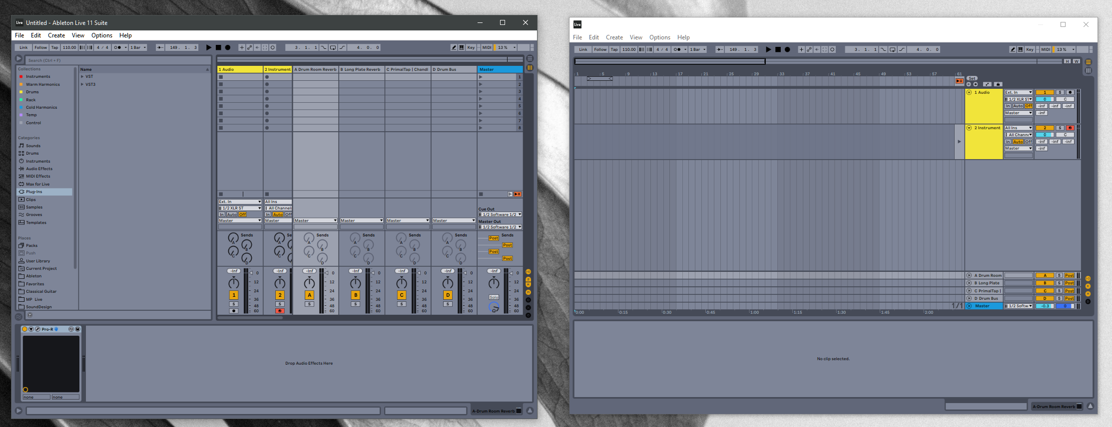
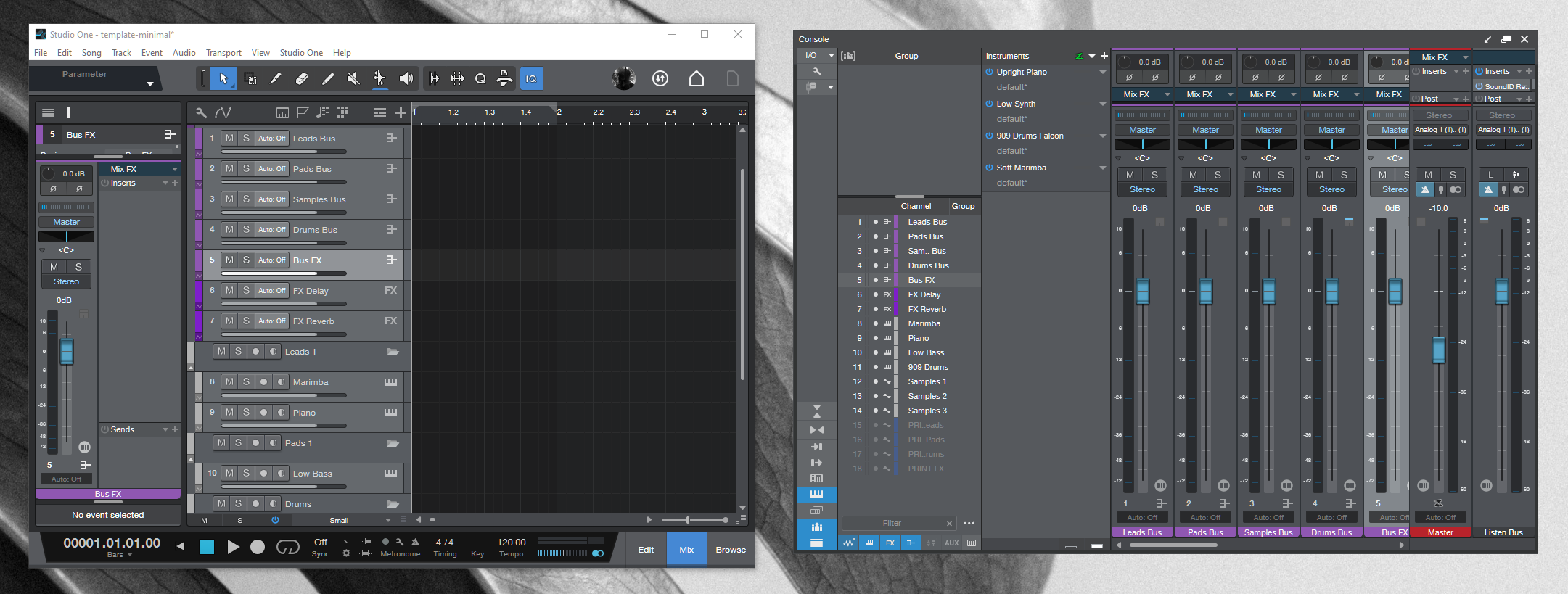
In the release notes, they state that this change is due to standardization. Specifically, I think it’s due their choice to follow the standard. What I see makes sense. This is a standard approach to window handling that I have seen in Windows. It’s not modern though. That may be you’re main issue. It’s not modern at all probably because they’re using an older codebase. If for example, they were using a more up to date codebase, they could do the sort of fancy window handling that takes place in a DAW like Studio One or Ableton.
I dunno. I just don’t get it. I still haven’t seen it done this way anywhere else and it’s frankly annoying. I struggle to believe they can’t make the software shut down with a single click.
I don’t want modern or old, I don’t care about any of that. GUI aside, I just want typical or expected behaviour that we’ve all been used to since Win 95, we just build habits that don’t need breaking.
Frankly, it’s a Windows complaint. I think it’s probably in Steinberg’s best interest to follow standard of the OS.
I’ve done some casual Windows projects using a technology called Max/MSP. It provides standard customizations you can apply to a window. During that process it recognizes the menu as a completely separate section from the frame/chrome. It allows you to remove it.
It provides no option to integrate that menu into the frame above, which is what Steinberg did previously. Steinberg may have created a “hack” solution in order to do that in the previous versions. Sometimes hacks are not the best route.
What Steinberg can consider is this:
They can create a UI in which that white menu bar is hidden (similar to what I did in Max/MSP)
Then they can then build that menu into the UI below. In other words, where we would normally see a toolbar of buttons, they could instead choose to build a menu there, replacing the need of the default OS structure. However, this doesn’t take us back to the previous version.
That’s really it. I don’t like that quality of the Windows OS either but that’s Windows.
But we have to realize that Photoshop is updated dozens of times a year. I’m not sure if this is a “hacky” solution or if they’re building on top of a codebase where this is still within Windows standards. However, I think Steinberg is taking a careful approach to this. One day, they may be able to create a solution that is more modern.
I prefer the new windows handling in Cubase 13 vs Cubase 12.
But one bug:
Windows 11/Cubase does not remember the size and position of windows on a project correctly when I shut Cubase and re-open. Specifically - I use the built-in WIn 11 snap functionality to use half my screen for my track window and then snap my mixer to the other half - all good. BUT when I re-open the project the windows have resized so that the lowest part is hidden by the windows task bar.
Not a deal breaker - but I have to re-snap the windows every time I open a project.
In terms of other comments - sure Adobe UI is great and consistent across applications. They have implemented Dark Mode very well. As an overall UI though, there is nothing very clever about e.g. Adobe Audition - and I find Adobe Premiere to be quite clunky. Photoshop is succesful because it has pretty much stayed the same over time.
Microsoft Office is getting cleaner and cleaner with each iteration particularly Office 365 - so I guess this is pretty much the Microsoft Gold Standard for UI design?
I just find it a bit weird that we’ve gone from the ability to bypass the Hub, to the hub apparently becoming the parent window of Cubase.
I’m not finding this a show-stopper and I think I understand the attempt to solve the floating header approach. I just don’t understand the reasoning for the “solution”.
Note: I’m not addressing the other window issues, just the fact that the Hub seems so important as to make it “mandatory”.
Hey I did not mean to start a fire here, the new way will grow on me just like the curious floating menu did. It is just when you first save and close your project file (CTL+W) first AND THEN try to quit Cubase with some windows open you will end up in a strange shutting down scenario. Well, usually Cubase needs to be shutdown just once at the end of the day.