It’s difficult to push the contrast separation too far before it just starts to look weird.
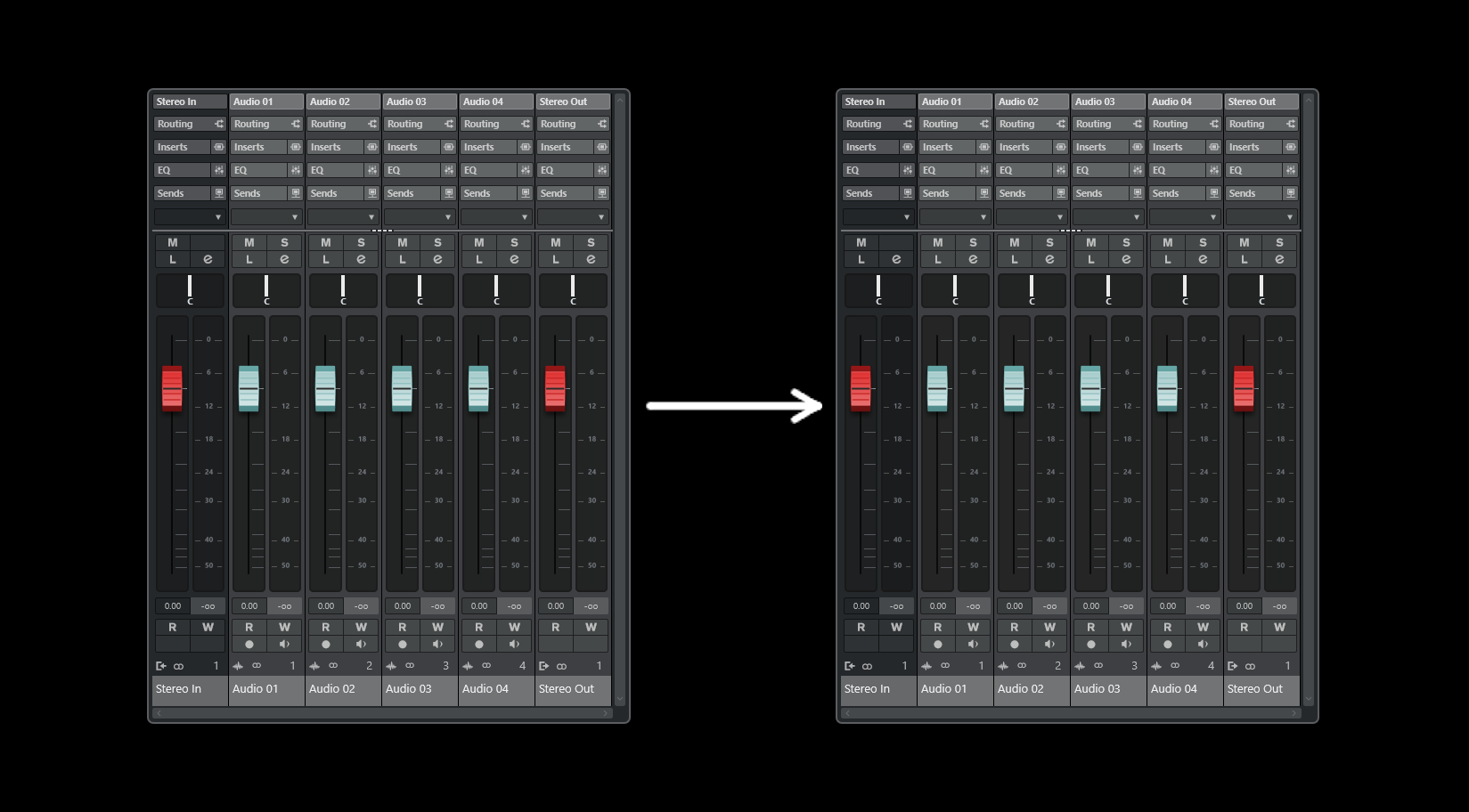
Here’s a more aggressive version:
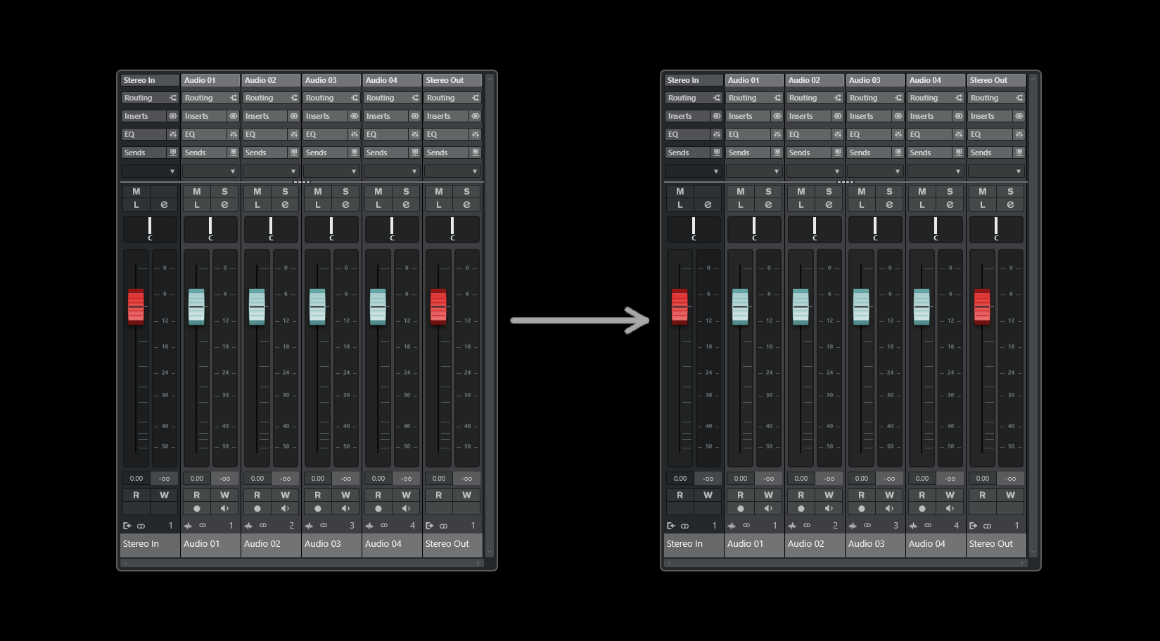
Medium version:
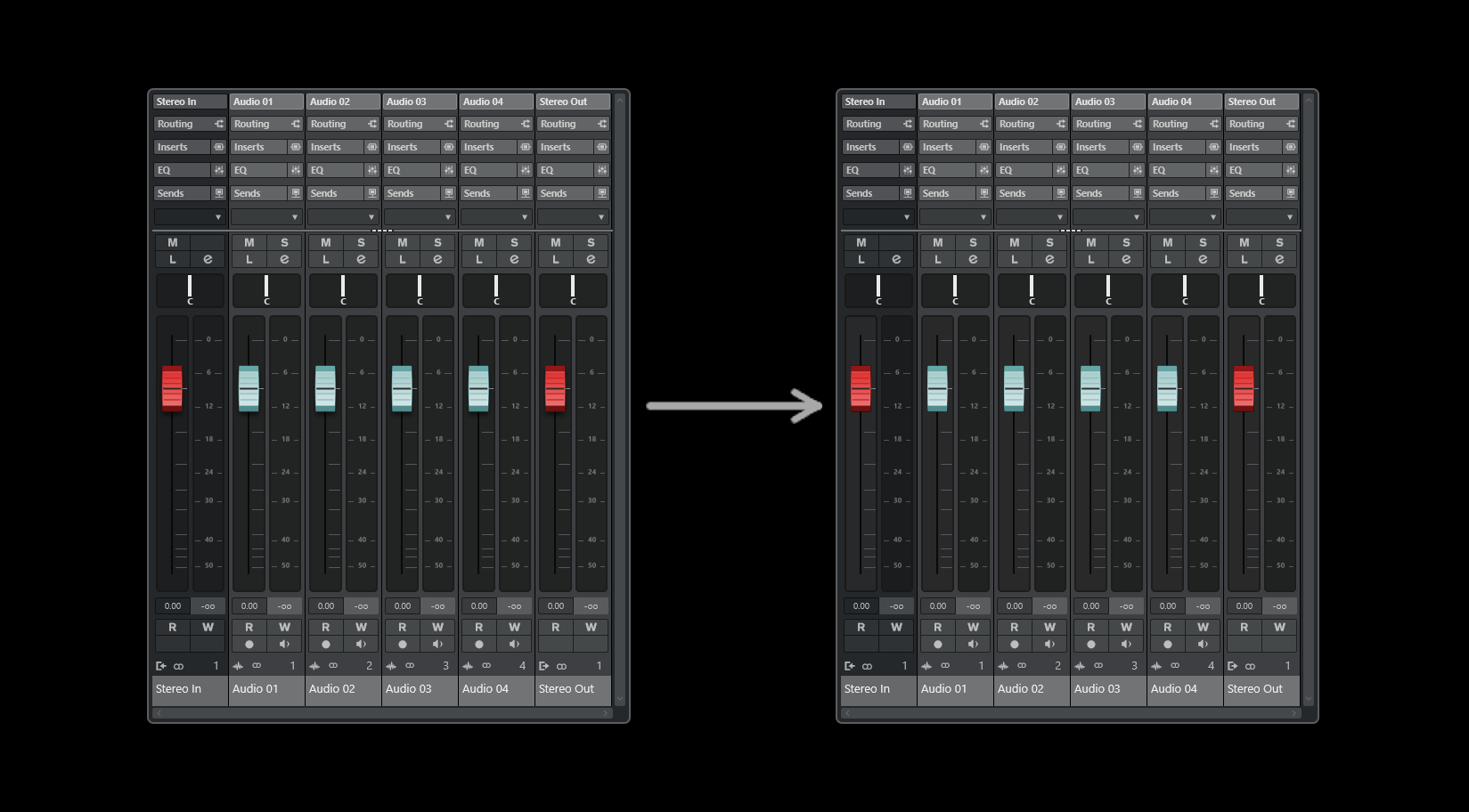
Subtle version.
The main point being is that some kind of separation is needed.