Are you able to provide any technical insight into the possibility of upgrading GUI components to vector graphics instead of raster graphics ? is this technically possible ?
Fader and meter looking identical is a no go for me.
It completely messes up the readability.
I just looked at the pictures of how Logic Peo Mixer looks like and it’s so much easier to look at and to distinguish channels. In Cubase it’s the opposite.
2 Likes
Ooops, sorry, didn’t catch it! ![]()
Merry Christmas!
1 Like
There’s no visual separation between elements, and when there is is in the wrong place (the fader lane and metering, for example, shouldn’t be visually separated. Also the fonts are smaller than they should, with little contrast. Most of all, glancing at the full mixer, there’s no imediacy in grasping different sections, etc.
4 Likes
I am already making a new little prototype mockup of Mix Console. It takes time because I also have to take plenty of breaks from it, otherwise it’s hard to notice things that could be improved.
It’s a fine balance between: 1). What was good in the past 2). Respecting some of Steinberg’s current design intentions and 3). What I’d prefer myself.
8 Likes
Hello ED and thank you for speaking out. This is what I meant that at least someone “from the inside” gives us some light, but please, let’s not wait for C15 for these changes.
4 Likes
4 Likes
More, please, like C12 for me is the best MixConsole,ever.
1 Like
It’s difficult to push the contrast separation too far before it just starts to look weird.
Here’s a more aggressive version:
Medium version:
Subtle version.
The main point being is that some kind of separation is needed.
5 Likes
If you can’t, I would understand. but the more loaded the bottom of the meter, the better for me (just my personal case.) or the clearer the rest.
Can you post a screen shot to demonstrate ?
Judging by the speed at which they post new examples, I’m sure @wavefunktion could deliver a complete UI overhaul in a week. No pressure though. ![]()
The designs are amazing and it’s exactly what I had in mind when it came to improve contrast and separation.
1 Like

Don’t mean to hijack this thread, but it does have me thinking…
Which version (let’s say since SX) had the best interface?
Back in the day of SX, the ‘gloss’ look was all the rage - elements that looked like light was shining across them. Since then, the pendulum is swinging away from that and UIs are getting flatter and flatter (anybody remember all the rage with the reflective images Apple used all over it’s website).
Full support for User Customisation ! Let us decide color scheme, font sizes.
Further than colours I’d like to add my own buttons & functions to load things faster (place your fav track presets, macros etc…)
WORKFLOW matters more than stuffing in a couple of new plugins.
The post :
The suggestion :
4 Likes
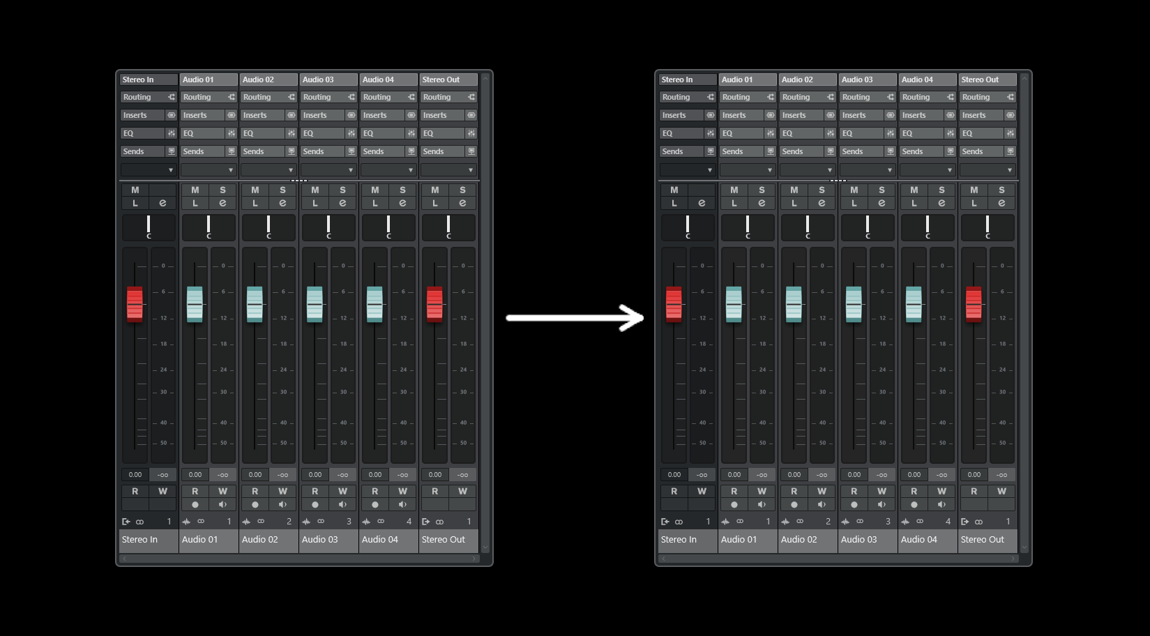
First draft, just to get something done. The interface is pretty complex, so it’s not an easy task to balance out the colors and everything else. The column on the left is a selected track and I tried to make it pop from the ones on the right (the unselected), while still keeping the text readable.
Any feedback would be nice, so I can keep tweaking. My own feedback so far would be this: Perhaps there is too much white text, which is “in your face”. And maybe the unselected tracks could have brighter outlines.

And here are the original pics from the OP.
C12:

C14:

Also, I could do the lower part of the Mix Console later (with the faders and various buttons), but it would be easier to do lower part, if we could decide on the color of the upper part.
EDIT: Just tweaked the colors a little. Not sure how it is now.

4 Likes
Totally agree, Cubase 14 is uglier and the control room is horrible, in my opinion
Coloured icons would be nice, instead of these outlines. Like in the old days, ah, when I was just a lad…
4 Likes
Coloured icons would be a nice optional setting to have in the preferences.
2 Likes
Perfect.