Maybe an option to show/hide the faders in the Setup Mixer (or whatever it’s called) menu. The menu whereby you can show/hide the Inserts or Sends or Routing etc.
3 Likes
Yes I agree, in a different forum thread due to how the lower zone MixConsole has been redesigned in Cubase 14, users have already been discussing the idea of implementing a “Faders” checkbox option into the MixConsole’s “Set Up Window Layout” settings that would completely remove the faders if so desired.
Having the ability to switch between faders and knobs is a separate concept.
Updated knob design (added db meters), is it an improvement or not ? (All credit goes to D-Struct)

4 Likes
Why? Adding this visual “separation” makes the MixConsole look like it has zebra stripes. It’s way better without it, IMO.
Simple solution. Steinberg to implement more specific customization options in the “user interface” preferences. I don’t want to have to change the entire colour scheme of the Cubase application just to get some slight contrast separation throughout some specific areas of the application such as MixConsole, Control Room, Toolbar, Inspector View…
2 Likes
Another idea I had for some time but forgot to mention. We talked about having customizable interface that you can set up yourself in regard to appearance, style, hiding and showing of buttons, knobs and faders, depending on your workflow and preferences.
What if Steinberg created a WYSIWYG setup wizard, similar to the Midi Remote, where you can customize your own Control Room or Mix Console, for instance. So you could drag and drop where you want different controllers (buttons or things you can slide/turn) to be, resize them, and you could choose what kind of controllers you want (values, knobs, faders) for particular parameters. And the same could be with the meters (like the volume meter).
A lot of our disagreements could be solved, as well, because there could be several ways to control a parameter, and we could all individually decide what that particular parameter looks like and what type of parameter it is (fader, knob, number). I’m not saying it’s an easy task for them to solve. But I bet it could satisfy a lot of different customers with a lot of different preferences in regard to the GUI.
And if someone prefers their GUI to stay the default, vanilla way, there could also be an option for that.
2 Likes
I personally think this is a much better option.
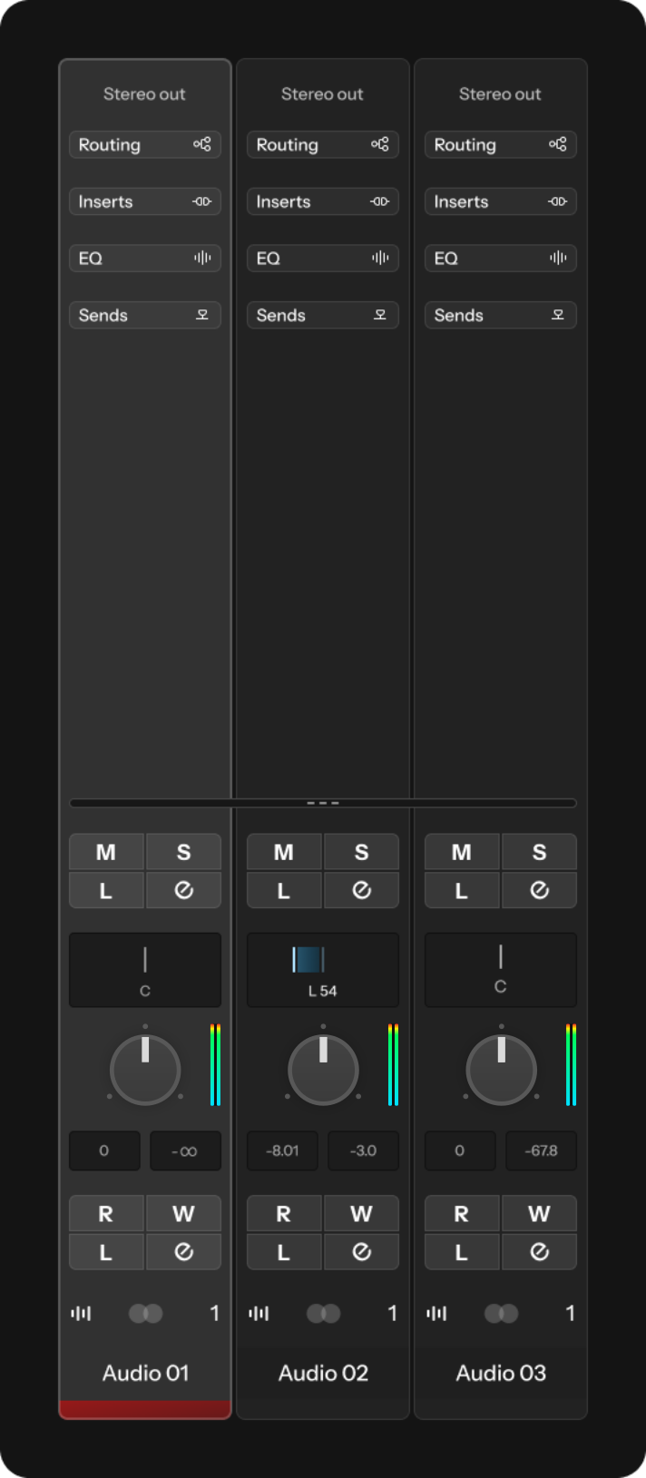
Also, the knob looks like it would be a pan control. Especially with the top/center marking.
I agree, unless you could, as I mentioned in my previous post, customize the appearance of individual parameters. For instance, there could be different types of knobs. One of them could be a knob that actually looks like it’s for controlling volume, like this:

Yes ofcourse I support that concept, that would be amazing. However I don’t know how difficult that would be in terms of coding.
Another feature that would be nice would be to have a modular toolbar where you can assign any function within Cubase onto a togglable button and add it onto the toolbars wherever you want. Similar to how Bitwig allows certain functions to be pinned to the toolbar but with the added ability to also skin the icons yourself.
1 Like
I think I understand your idea, but I am not 100% sure. Could you perhaps create a simple, rough mockup of that modular toolbar, so I can understand it better?
If I understand it correctly, you want a collection of clickable icons that you can customize and set to different functions in Cubase? So you can drag and drop their placement, their order and such?
If that is the case, there should be a “save icon preset” feature. And the ability to lock the entire thing, so that you won’t accidentally delete or move something.
The ability to pin shortcuts, hot keys, macros, functions etc. into a clickable button that is placed onto the toolbars so that you can customize your toolbars with whatever you desire.
2 Likes
So when you press that button, a new custom “toolbar” is shown with all the things (shortcuts, hotkeys, macros, functions, etc.) that you set up, yourself?
Bitwig has a lot of functions with pre designed icons that you can “pin” which will then show up as a button on the toolbar: So you can customize your toolbars with your most used functions for workflow efficiency.

1 Like
Most major software has this feature. Never really understood why Cubase doesn’t.
3 Likes
It seems like there are two types of people, those who want endless UI customization options and those who just need a few basic settings plus, perhaps, Light and Dark modes.
The latter is the Apple philosophy, and the former is the PC/Android approach. Anyone who has any design sense prefers the Apple way. That’s because Apple knows how to design interfaces. They do it right from the beginning and thus don’t need to support a gazillion customization options, or worse, skins which without fail look dreadful.
I used to be in the “give me complete control over the look and feel of my interface” camp and would use things like Stardock’s Object Desktop on my PC to try to make Windows look better. What a complete waste of time. The solution was for Microsoft to abandon the hideous “Aero Glass” UI and move to something flatter like Windows 10/11. Trying to customize something (Aero) that is hopelessly broken is futile.
I can understand someone saying that Steinberg needs to work on the look and feel of Cubase. But supporting more and more customization options is a total waste of development resources. Just design something that works for 90% of people and let the other 10% use something else if the basic customization options are not sufficient.
Seriously, if the Cubase Pro 14 UI doesn’t work for you, then use Reaper. You can customize that to your heart’s content. It will still look horrible. But at least you will be in total control of the awfulness.
3 Likes
Love all of your suggestions. I do hope that they pay attention - they should get you on board!
1 Like
Absolutely - I’d love to work with this GUI!
3 Likes
By all means, go for it!
1 Like
Is wanting readable text and the ability to change colours and contrast for some more specific elements of the GUI too much to ask for ? I just want to be able to adjust a few elements without having to make major changes to the overall colour scheme.
We are only discussing endless customization because users here on the forum such as D-Struct can come up with a superior conceptual graphic art concept in just a few hours than Steinberg has done in several years.
How can you be so certain that the Cubase GUI developers are also part of the core Cubase development ? Maybe that’s the very issue, maybe Steinberg should consider outsourcing professional GUI designers to develop conceptual art concepts for Cubase that they can review, choose and build upon.
At the end of the day I do agree that Cubase is getting better over time “more or less” but when we are getting unreadable text and a control room that looks like it took 5 minutes to create simply isn’t good enough.
So again all that i’m personally asking for is:
- Readable text
- Text that scales and aligns correctly when being resized
- More colour and contrast control over more elements of the overall Cubase GUI
- More colour and contrast control on highlighted / selected elements
Switching to Reaper isn’t a solution, Steinberg fixing their GUI and user interface customization options is the solution.
7 Likes
Yes I personally skipped 13 and have been demoing 14 but as much as I like the new features (a lot) I just can’t spend money on a product that I use every day in which I CAN’T SEE the labels and elements properly.
It’s a no buy for me again SB. If you fix this (obviously) amature design issue I will be back on board 1000%. Until then I’m not interested in squinting at the screen and fumbling my way through the interface.
4 Likes
But none of this requires additional customization options which just add bloat to the program and requires additional development resources that could be put to better use.
If enough users have issues with the readability of the text, text scaling, contrast between visual elements, etc. then one would assume that Steinberg will listen to their customers and address these issues. I’m sure there is a happy medium that will satisfy 95% of users.
That’s the solution. But allowing users to customize practically every aspect of the UI just leads to visual abominations.
I remember one of the Sound on Sound reviewers praising new UI customization features added to an earlier version of Cubase – I can’t remember which. He had used this hideous brown color for most of the UI as evidence of what was possible with the new customization features. He was serious, btw. What a hoot.
Am I suggesting that we save users from themselves? Yes, I am. That might be arrogant. But it’s the Apple way. Just look at the home screen on most Android phones. It’s a usability nightmare because most users have no idea what they are doing. Leave that to the professionals, I say.
If I were Steinberg, I wouldn’t want prospective customers coming into a studio, for instance, and seeing a fugly version of Cubase running on the studio’s computer because some engineer ruined the look and feel of the program by going crazy with the UI customization options. That would be the worst sort of advertising and give people reasons NOT to buy Cubase.
2 Likes