Yes it does require additional customization options because of the limited options that are available in the user interface preferences. That’s literally the whole point…
Steinberg has a tendency of not listening to its users or the community, hence feature requests that have been around for decades on the forum (good ones with a lot of community interest).
Why do you keep referencing Apple products ?
I can already make Cubase look fugly with the current user interface preferences.
Just sounds like you’re not listening or are unable to comprehend anything that anyone is saying here.
Because in terms of design, Apple products are mostly best in class. Other companies, including Steinberg, should aspire to similar heights.
Moreover, Apple’s more minimalist design philosophy is certainly appropriate to the conversation. The fact that I need to point this out indicates you don’t understand design or what most users want from their products. There is a reason Apple is a three trillion dollar company. They deliver exceptional user experiences. You know, the thing that actually matters in any product.
Adding more customization options that will only serve to clutter up an already over-engineered product in order to appeal to 1% of users while wasting precious development resources is a recipe for failure. Fortunately, Steinberg seems smart enough to not go down that path. There are certain customers you shouldn’t listen to.
You do realize that iOS has become more and more customizable in every iteration? Besides, Cubase is not a product for the masses. I feel you’re comparing oranges to apples (no pun intended).
Back in the Steve Jobs era, Apple was always more than willing to jettison technologies and standards whose time had passed, whether that be USB in favor of the serial port, CD-ROM storage in favor of floppy discs, Thunderbolt and USB 2.0 in favor of Firewire, Streaming and Cloud storage in favor of DVDs, Thunderbolt in favor of PCIe slots, and on and on.
So it’s surprising it took Apple so long to replace their clearly inferior Lightning connector with USB-C. Oh well, better late than never.
The latest Thunderbolt 5 standard is minimalism at its finest. That truly is one connector to rule them all.
Yes, I live on this planet. So things like that tend not to go unnoticed. But still, iOS is nowhere near as customizable as Android which is one of the reasons why Android is so inferior. Have you looked at the average person’s Android home screen? It’s something you can’t unsee.
That’s what people want to turn Cubase into. One giant ugly Android home screen. One can only hope that Steinberg doesn’t listen to people who have even less taste than brains.
Why is it the same people who want to ruin the look and feel of Cubase seem to be the same people clamoring for Steinberg to add useless clip launching features to Cubase? I suppose one bad idea follows another.
Budawg, I agree with much of what you say regarding Cubase interface design. I myself don’t really need a clip launcher and isn’t that already in MediaBay anyway? I much prefer tools over toy features but I am afraid marketing shiny toys may be the way of the future.
For some reason, a very vocal minority of people on this forum seem to want to turn Cubase into some combination of Live and Bitwig Studio. I would rather have Steinberg add an entire control panel just for UI customization options than see a clip launcher window in Cubase. THAT would be a monumental waste of development resources!
Agreed - Cubase needs to get the basics right as product. The user experience today is unpredictable and doesn’t follow design and usability best practices. With investments into improving the foundations of the UI framework, they could then do a refresh of existing customization options like device panels and potentially open that up to some interesting features for users and the broader community.
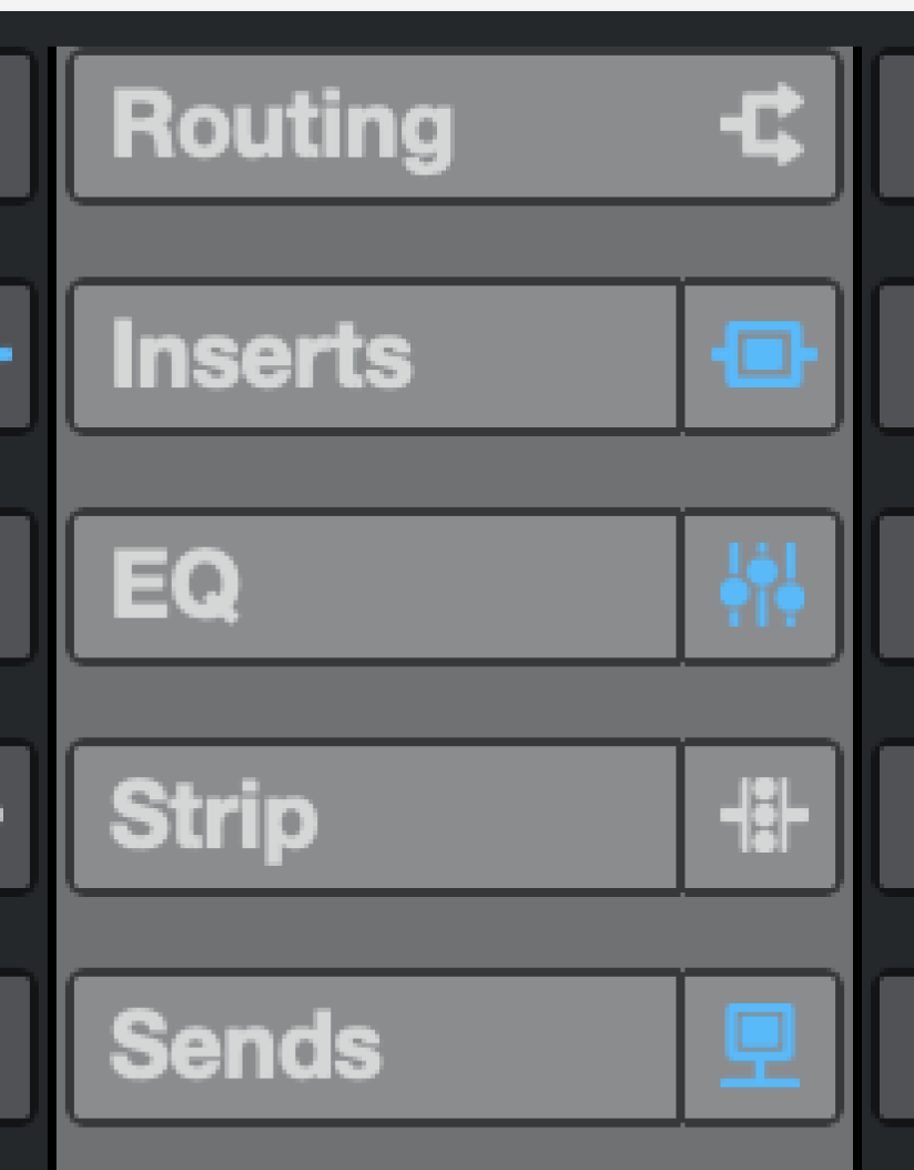
The anti-aliasing does look absolutely awful in your screenshot. I’m using an M1 Max MacBook Pro (with its “Retina” display) and a couple of 5K Samsung Viewfinity S9 monitors and everything looks pretty crisp to me. But I haven’t looked closely at the font used in the MixConsole insert/send slots. I’ll do that and report back.
EDIT: I just looked at the send/insert fonts on both my M1 MacBook Pro and my Viewfinity S9 displays, and everything looks sharp to me. Well, the font might look a tad “soft,” but not objectionably so. Here’s a screenshot:
I used to harp on Steinberg constantly for the inconsistent, disjointed Cubase UI. I think at one point there were 5 (?) different size scrollbars, several of which used a different design from the others. Stuff like that annoyed me because it was pure laziness on the part of Steinberg to not harmonize the UI.
But over the last 4 or 5 versions of Cubase, I think Steinberg has made great strides in improving the consistency of the Cubase UI. I rarely see these weird holdover modal windows that look like they are straight out of the 1980s. Almost all of these have been updated, except most bizarrely the Audio Pool window that looks positively archaic even in v14.
There are of course still some weird, non-standard UI elements in Cubase. But at least I can tell that these are conscious choices that offer some benefits over traditional approaches.
I would never go back to using an earlier version of Cubase for no other reason than I think the UI is now much improved (even if some people have issues with the readability of text and the visual contrast of some UI components). Other than Logic, I think Cubase is the best looking DAW on the market.
Funnily, your reworked mixer console channel is exactly how it is natively in C8.5 I still use. Except for the dark mode that makes my eyes bleed. I always favor a light global medium grey if light grey isn’t an option.
The GUI doesn’t either follow standards for ergonomics.
Yeah I use both, and while things do look a bit better on a Retina or 5K display due to pixel doubling there are objective issues with the font choice, styling and size.
I still see a ton of UI coherence and information density issues with Cubase that make it objectively difficult to use and be creative with. There is so much cognitive load to open a project and having the inspector view open.
I can think of at least 3 DAWs which are better executed from a UI and design system perspective. I’m still waiting for Steinberg to get the basics right again before I can make it my daily driver.
This is great! Feels way more usable. There could be a touch of dimming fonts for other channels to help create focus for the selected state.
Bonus points for an updated set of icons that make the interior details more discernible, the arrow points and the inside shape of the pre icon are getting lost.
I’m working on a mothership post for a solution / implementation concept for colour customization and scalability. Might take a few days though . Stay tuned.