I’m guessing this is directed at me. Your comments clearly demonstrate how most forum users (here and elsewhere) don’t bother to actually read (let alone understand) other members’ posts before reacting.
I have been harping on Steinberg to improve the Cubase UI for nearly 25 (!) years now. That has been my number one complaint that entire time. Although it has taken a quarter of a century, Steinberg have finally gotten Cubase in a reasonably useable state, slightly fuzzy text on some systems aside.
Asking for support for endless color customization options, and worse, support for idiotic skins is utterly misguided and a complete waste of development resources. Just make the default interface appealing and useable to 95% of users (as Apple has done with Logic) and let the other 5% of nitpickers (who will never be satisfied) use Reaper. That is the only sane path forward. Fortunately, Steinberg seem to have the good sense to understand this.
Cubase already has a fairly decent list of user interface colour customization preferences. I just want Steinberg to elaborate on this concept a little bit more by adding few more additional options to a few more specific areas throughout the application. They already have a bunch of code examples there to reference so I would imagine that it wouldn’t be too difficult or resource intensive to implement. All it requires is assigning the HSV RBG colour picker box to a few more areas throughout the Cubase application.
You say you’ve been harping on Steinberg for 25 years about the UI, and now you’re harping on the community about the UI… I would love to see you create your own forum thread with all of your own personal Cubase feature requests because you’re adding nothing of value in this thread. More colour customization options wouldn’t even affect you anyway !
Isn’t it funny how different people can be?
For nearly 25 years I never had a strong opinion one way or the other about the GUI in Cubase up until v13 came along.
Of course none of those things are. The problem is that while you guys are creating a really long thread about the GUI there are a million other threads covering things like VCA bugs, automation optimization or functionality changes, AAF import improvement, mix ‘engine’ changes such as merging group/VCA and folder track functionality, and on and on and on.
To a lot of people “readable text” is a no-brainer. If you can’t read what you’re working on you can’t work on it. “colour customization” however is not obvious. I would put that way down on the list of wishes. I typically don’t care. I have other things that actually get in the way of me making money off of Nuendo so they obviously are more important to a working engineer. And same with control room. I don’t care how it looks. It’s a control room. I use key commands to trigger functionality and I don’t spend much time looking at it.
That’s why it’s “complicated”. It’s not about the individual things, it’s about development priorities.
That’s perfectly reasonable. I’m not expecting it to be implemented today or tomorrow, i’m just participating in a forum thread. But how about if we can get the text fixed before version 15…
I also have about 30 different other feature requests more along the lines of your examples. It’s not like this is my most important feature request either.
Couldn’t agree more with this. Although personally, I’m one of the few people that prefers skeuomorphic design because I find it dramatically helps with visual separation and cognitive mapping.
Either way, for those of us who use Cubendo professionally, our projects can get very complex (my template is 2800 tracks) and we need to move around quickly and stay in flow state as much as possible. Anything that causes friction in the UI has a massive impact on this. For this reason and the better performance on Mac, I’ve stayed with N12 for now.
Most adults have learned how to engage with people with whom they disagree. Children, on the other hand, tell others to “go away” when they hear things they don’t have the emotional maturity to tolerate. Is any of this resonating?
No it’s not. It’s fine for you to disagree on this topic but you’re purposely being abrasive and clogging up this thread with arguments that are adding 0 value to the subject. Just say that you don’t agree with this topic and be done with it. You’re going to end up getting this thread locked because of your behaviour. People are trying to have discussions on GUI here, not random arbitrary rants about apple and android, telling everyone to switch to reaper and replying to everyones posts with a derogative demeanour just for the sake of it. You’re just going to fight with everyones posts here until the thread gets locked, that’s the issue…I’m not going to reply to anymore of your nonsensical posts.
That’s the thing. If the text in Cubase was truly unreadable to the point where people couldn’t get their work done, then something would obviously be done about it. But the text isn’t even remotely “unreadable.” Well, sure. If you blow the text up to 500% of its original size, the anti-aliasing will of course be visible. But unless you are looking for something to complain about, this is mostly a non-issue.
If I compare Cubase 14 Pro to Logic 11.1 and Studio One Pro 6 on my 14" M1 Max MacBook Pro display and on one of my 27" Samsung Viewfinity s9 5K displays, I can’t see any noticeable difference in the “bluriness” (or lack thereof) of the text between the programs. If anything, the text in Logic looks a bit fuzzier. Of course, each program is probably using its own fonts so they are not directly comparable. But still, it’s not like when I switch to Cubase I am shocked and say to myself, “This is horrible! I can’t read ANYTHING on screen.”
My big issues with the Cubase GUI in the past were that it was 1) ugly and uninspiring and 2) a disjointed mess of different styles and design patterns (contributing to the ugliness). But most of that has been addressed. Sure, it only took 25 years. But hey, better late than never.
At this point I would prefer that Steinberg focus on workflow improvements and features that have real musical utility/value such as the new pattern sequencer (and to a lesser extent the drum synthesis features in the new drum machine which I hope will get rolled into Groove Agent 6). That’s why I was thrilled when Steinberg announced Cubase 14. I feel like this is an excellent release.
The one feature I was hoping would be included in Cubase 14 is an updated / more advanced “Arpache Pro” arpeggiator MIDI plugin. For better or worse, that was not included. Of course, when I saw the nearly 200 feature requests for Cubase 15 Pro in a separate thread and discovered that not a single person requested a more advanced arpeggiator, I shrugged my shoulders and said to myself, “Well, it looks like I will be using the freeware BlueARP arpeggiator plugin for the foreseeable future.” I didn’t start a separate thread and make out like the world had come to an end just because my pet issue was not addressed.
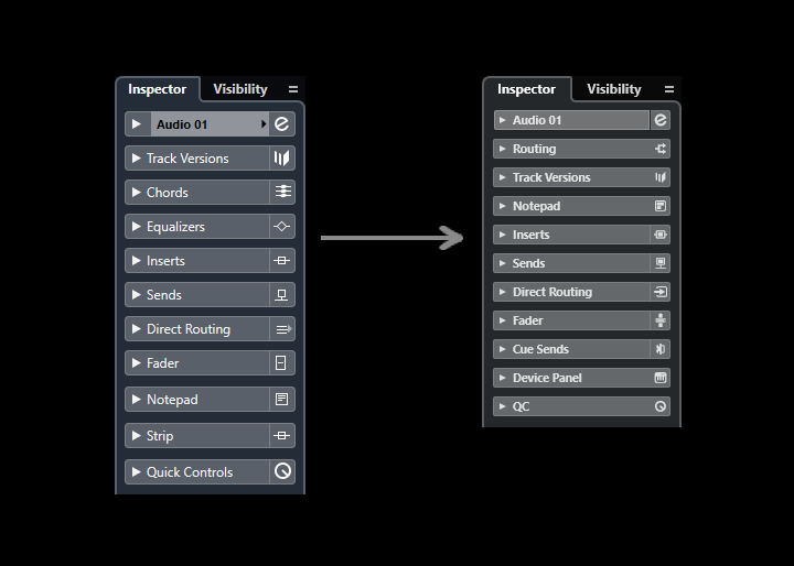
I believe it was from Cubase v13 that we have seen a reduction in size in GUI elements such as the Track Inspector View, Editor Inspector Views and MixConsole. Do you think the reduction in size was a good improvement or not ? Did reducing the size of these elements resolve any pre-existing issues ?
I personally think that GUI elements should be investigated and experimented with to be as large as possible to make full use of the space allocated. I personally would prefer to do a bit more scrolling as a trade off for larger GUI elements. I’m currently working on some scalability implementation concepts but i’m not sure when I will complete that and present it.
Who thinks that the Track Inspector changes was an improvement ?
I personally think that it was not an improvement. The previous track inspector text was much sharper, more readable, larger text size, had better contrast separation, icons were more distinctive, tabs felt like a good size.
TBH, I like the one on the left. It’s a lot clearer than the one on the right. That being said, I don’t mind the reduction in size.
I also find it odd that on the left, there’s a line separating the inspector component name and the icon but on the right, the line is only present for a few of them.
I agree. Interesting observation with the lines, I never noticed that before. I can see what they were going for with the new design but I don’t think the execution is quite right.
In regards to the new track inspector view (the one on the right), when you put your face right up close to the monitor the text looks sharp and clear, but at a normal sitting distance it comes across as blurry due to how small it is. Steinberg needs to enlarge it until it looks sharp and clear at a normal sitting distance. Only then might I prefer it over the one on the left.
Now there’s just sooooo much proper dark black. Black on black, means it’s hard to see the edge of one window over another. Surely there should e some ind of border or different shades of grey? Opening HaLion or Groove Agent there’s no edge to find, so very easy to click in the wrong place and hide the plug-in…
Second that.
Not only Steinberg plugins, but also 3rd party plugins like Fabfilter Pro Q4. It all becomes one big fancy black blur when it comes to grap/detect borders. But maybe that’s just me.