With the new GUI I find myself constantly straining to read tiny text or looking to find the right button among similarly looking flat grey mess.
I used to enjoy working with Cubase, not anymore, the new GUI made it a tiring and stressful chore.
14 Likes
I’ve gotten used to the new GUI since C13, and I also agree with the sentiments about font size and contrast. The times when I need to go to an older project on C12 show how C14 is better in some ways and worse in others (mostly contrast/legibility).
Being able to see fonts clearly and legibly needs to be top of the priority list for GUI revisions. Many of them are too small and/or unclear in the cases described initially in this thread. No GUI is ever perfect for every user, but with this addressed it would make C14 a much better experience as far as always being able to see fonts/descriptions/etc…
4 Likes
The new Update 14.0.10 Arrange window looks to busy. I liked the Orignal 14 view. Visually the new version with highlighted borders takes my attention away from the center of the Arrange window. It brightens up everything around it. The darker view drew my focus to the tracks and not all the bells and whistles outside of it, not a fan. Is there a way to revert back to the original view, a choice between the two? I thought Cubase 14 orginal release was the best looking Cubase of all time. The need for brightened borders makes the look more clinical. A choice would be excellent!
2 Likes
Steinberg never really give you choice in that regard… If I had the choice, I would like the C12 GUI back, which was objectively more readable and didn’t have glaring design issues and loss of functionality in the mix console…
10 Likes
There is a very long thread about how godawful C13 looks and from I gathered there is basically two kinds of people. The ones that point out the flaws or document them in pictures and the people that say “I like the new look”.
In my opinion the current designers are incompetent, as they seem to not understand the basic rules of how to design a graphic interface so it is easy to read and to find things. The fact that I am salty about the design change in C13 doesn’t really change much about the plenty of evidence and feedback that has been given on the forum about why it is badly designed, just like in this thread.
Unfortunately, as someone has pointed out, Steinberg are in a feature creep situation where they are trying to desperately squeeze new content in every iteration, without focusing on fixing the plenty of issues or adding of features that the community is asking for. It’s a constant progression with a dead line of one year. This is also unfortunately common in other software products.
In this endeavour to continously reinvent their product and to stay relevant, while trying to appeal to “everyone”, they are spreading themselves thinner and thinner. It’s a bit of everything, here and there.
It feels like as if someone told them they’re the “boomer DAW” and now they’re trying to lure in the “new customers” with their boring, “modern” and two-dimensional look and plenty of new plugins that are basically already covered by other dedicated plugin developers. (Steinberg have some really good ones, though)
In that context, the DAW and its new UI looks just like that: a compromise. Keeping the old customers, but also trying to be hip. It’s neither fully modern, nor has left its original design roots. It’s just shifting into the direction the others DAW are in, because “we don’t wanna lose the EDM and hip hop crowd”. It looks rushed, not fully thought through and is less functional than before. ![]()
14 Likes
I know what you mean. This is the general vibe that I get from these forums. There seem to be a lot of people who tend to agree with most of Steinberg’s choices. And it can be hard to have a rational conversation with them. And as a result it all becomes one big echo chamber, where new ideas are not welcome, which is kind of ironic, since Steinberg introduces a lot of new ideas all the time.
I’m wondering if some of these users are some of Steinberg’s own employees disguised as “regular users”, trying to “silence” the public a little.
Regarding Steinberg’s development and marketing cycle. That is another thing, that I meant about the feature creep. They want to stay on top of the game and be competitive in regard to adding as many new features as possible as their new selling propositions (marketing term) to give people a reason to upgrade to the newest version and to lure new people into their ecosystem, because… (this is meant as an exaggerated joke, but still)… those old boomers are dying, so who cares what théy think.
It sure sounds more exciting when they announce that the newest version of Cubase includes these new features, panels and plugins, rather than:
“Cubase X fixes a lot of bugs and gives the users more freedom by adding new options for customizing their own workflow and interface appearance.”
Steinberg made plenty of good choices, so I don’t want to sound too “black and white”, though.
Yes, it sounds to me like a vicious cycle. It’s a cycle that will continue unless they actually start listening to the users.
Try watching a video called:
“The Decline Of Generalists” by Timothy Cain (the original creator of Fallout games). I know he talks about gaming industry, but the same principles apply here, as well.
It seems like people who are hired for a specific job are specialized for this task, but they have trouble seeing it all in context, and they probably don’t care enough about the end result (or the big picture), because it’s just a job to them, where they do the absolute minimum that is required from them to get the next paycheck.
I seems like Steinberg have developers working on the software who don’t even use the software as a passion and probably don’t even have any interest in music or sound design. And this might explain why a lot of users seem dissatisfied with Steinberg’s interface choices.
And just to put on my conspiracy-nut-tin-foil-hat on one last time. And this is not pertaining to Steinberg only, because I’ve noticed this in other organizations, as well.
The features that are most requested by other users. One would think that those most requested features should be on the top of the priority list. But it seems to me like they are just golden nuggets for the company to keep for later. When the sales finally start declining, then they can finally start cashing in some of those golden nuggets and finally add features that have been requested (or begged for) for years. And in the meantime let’s just keep adding those new plugins that no one has asked for. This last sentence was sarcastic, by the way.
Well, looking on the bright side, at least the menu bar has improved in C14, for me at least. I always hated white interface.
And just to conclude. I don’t want to sound like I’m constantly bashing on Steinberg. Cubase is my favourite DAW, and I will continue using it. And I sure hope that they will start listening more to us, instead of continuing the path of ignoring public opinion in favor of maximizing the profits.
Of course, I want Steinberg to thrive and to make the best version of Cubase ever (hopefully, some day). But for that to happen they have to accept the bitter truth once and while.
6 Likes
I agree, the GUI sux. It’s borderline not usable. I went back to logic while I wait for them to fix this
6 Likes
Shoot, you got me. Now that my cover is blown - my combat name is The Silencer. ![]()
I do not agree with everything you write, nevertheless, you make some valid observations which are up for discussion. Please accept that people might disagree - that’s how a vital discourse works ![]()
4 Likes
I am just trying to raise awareness, because I want Steinberg to stay on top, so they can keep producing quality software for us. If I did not care, I would just be silent and switch DAW. And many people probably do just that.
I know that my methods of expressing myself might seem exaggerated and maybe even “offensive” to some people. But as Jordan Peterson said: “In order to be able to think, you have to risk being offensive.”
Otherwise we’ll just pat each other on the back all the time and avoid all forms of critical thinking.
6 Likes
(Almost) all of this would go away if C15 was made skinable. One can wish. To be fair, they did include my #1 request, modulators. Next up, skinning?
3 Likes
Good idea. They have nothing to lose from this - on the contrary.
I know this might sound silly, comparing a DAW to video games, but please hear me out. Let’s take Minecraft or Warcraft 3 (original), for instance. One of the main reasons why they became so successful, was because you could do a lot of custom things with them.
You could mod Minecraft and you could create custom maps in WC3.
You still had to pay for the main game, but you got a lot of freedom to customize your own experience.
And the developers were constantly in touch with the community, so they could improve upon the main product, gradually, based on community feedback.
Minecraft is today the best selling game ever. And DotA (custom WC3 map) is now Dota2, which is owned by Valve, and it makes a lot of money.
So, games and silliness aside - should Steinberg make a highly customisable and skinable GUI, it would allow us to customize our own experience, when creating music. It’s a win-win for everyone.
2 Likes
Steinberg Cubase Pro v15 - GUI preview development
Huge improvements have been made to the overall GUI of Cubase. Artistic, tasteful, beautiful, modern, futuristic, innovative, phenomenal, aesthetic excellence, a significant milestone since the release of Steinberg Cubase in 1989.
Lets take a moment to reflect on where we started and just how far we have come:
Steinberg Cubase v1 - 1989

Steinberg Cubase Pro v15 - 2025
7 Likes
Oh man
![]()
It’s like one of those clocks where you can’t see the numbers but they are perceived as “fancy”
4 Likes
1989 vs 2025 - hillarious, although a tat exaggerated ![]()
I think @Aleque made a valid point by thinking outside of the box when it comes to the potential of a highly custumisable GUI. Although it might pull away ressources from focussing on bug fixes and apparent issues (essential for a Pro DAW!) at first - at the end of the day it can bring a lot to the table. Sure, it is not as easy to implement as it might seem - but I agree that there is a lot of potential.
1 Like
YES, THIS IS really SO BAD. IT ALWAYS HAPPENS.
WHY DO YOU NOT FIX IT - WHEN? IN CUBASE 19?
THIS SHOULD BE FIXED IMMEDIATELY!
4 Likes
It’s such a subjective thing - the interface for Ableton is the reason I never switched when many electronic producers were jumping ship. The only word I can think of is “uninspiring.” C13 had some serious issues but they were resolved for me, I actually like the C14 look better than 12 now. C12 seems tacky looking in comparison.
5 Likes
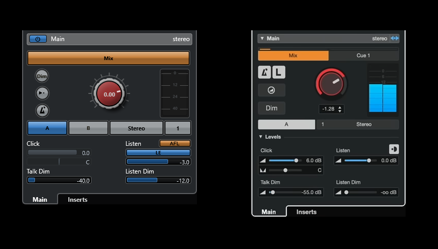
As I wrote in my first post - it is not about “the looks”. It is about a regression in usability (and features!) from C12 to C13/14. I could live with some new colors, flat design and whatnot if the design was consistent, well thought out and improved usability. Instead, as I’ve shown, usability decreased because of smaller font sizes, less contrast (like white fonts on a light background - simply a rookie mistake) and less optical separation.
This might not be relevant to you if you have perfect eyesight, but for anyone (like me) who is rather short-sighted and on top of that is fighting with deteriorating presbyopia, it is a real problem. C14 is really cumbersome and tiring to work with, unless I switch to 1920*1080, which kinda defeats the purpose of my QHD monitor…
6 Likes
BTW, I opened a (relatively nicely worded) support ticket with Steinberg to explain my problems with the new UI. Again, I focused on contrast and legibility of texts and labels, not the “looks” per se. Maybe others can do the same to show that we wish for improvements in usability ![]()
I’d be happy if they only reversed the decrease in font size everywhere, that would help.
6 Likes
I just did the same. Anyone else who wants Cubase GUI to improve over time, please consider doing the same. Otherwise this topic will fade into obscurity and nothing will be done.
3 Likes