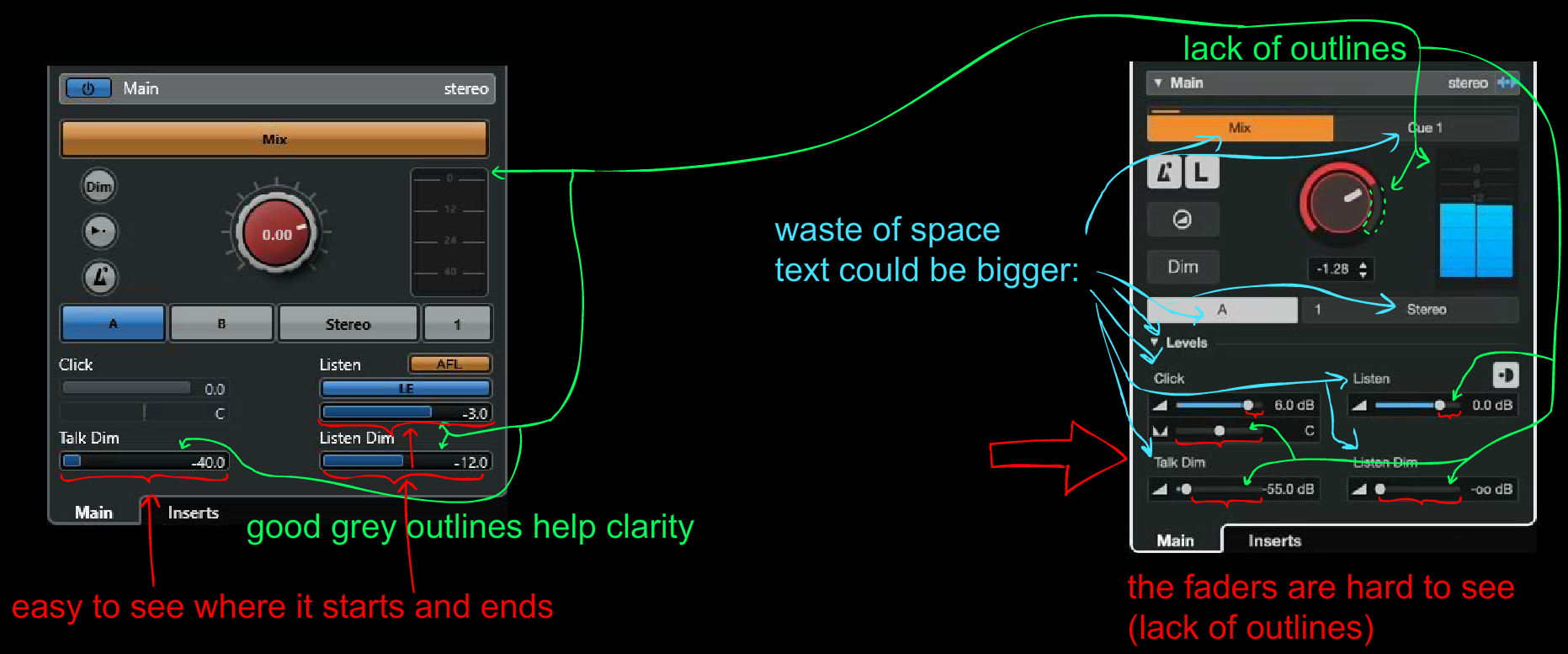
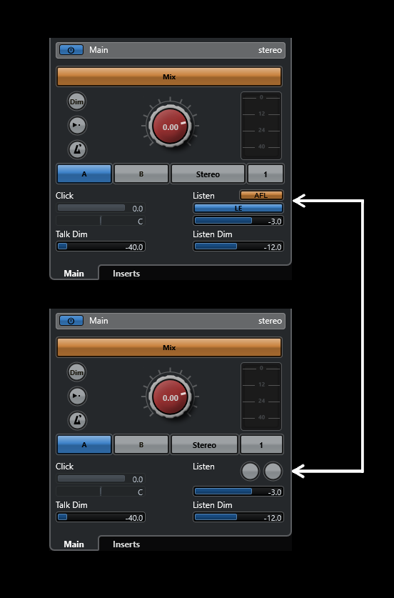
It’s hard to say. There are pros and cons in both, I guess. But the one on the left is more clear, overall, imo. Control Room Level knob looks pretty nice and streamline on the right, though, imo.
If SB could introduce an option to choose between the two, that could be the best solution, I think. And not only with Control Room, but also with other GUI elements that have been drastically changed throughout the versions.
There is just one little problem. What if the newest version of a GUI has one or more features that the older interface lacks? Then they have to update the old GUI to include the new features, too.
I edited your screenshots to add my personal opinion. It looks messy but it beats writing walls of text, explaining what I mean:
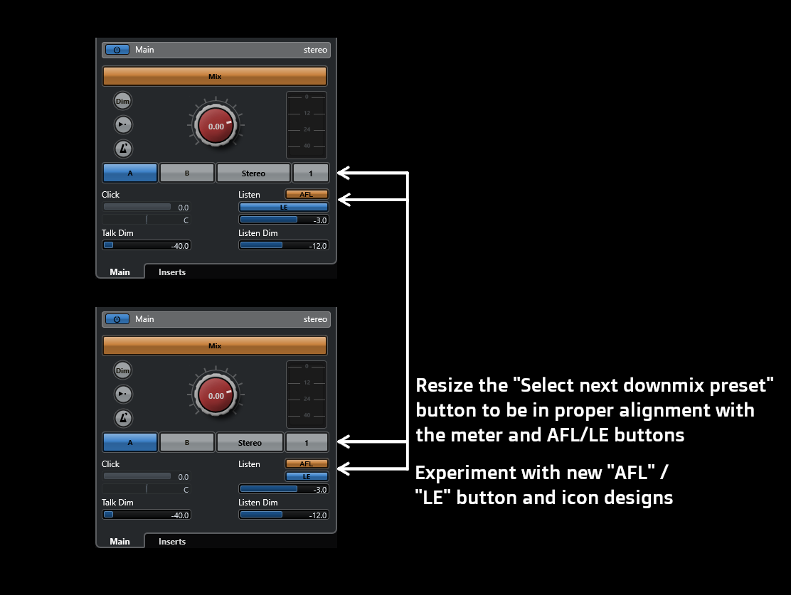
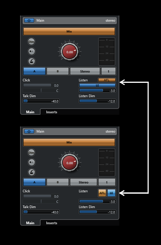
The only thing that I personally don’t like so much on the previous control room GUI is the “AFL” and “LE” buttons. I think there is some room there to experiment with some new icons / buttons. Other than that I think that the previous control room GUI is superior in every other way.
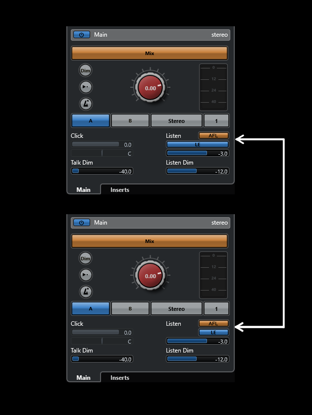
Here’s an example of if the LE button was made the same width as the AFL button could have cleaned it up a little bit more:
My point being is that when redesigning the GUI you have to be elegant with the changes. Typically it’s an accumulation of the small adjustments that make all the difference. The new Cubase v14 control room GUI is a complete mess in my opinion, there is no good foundation to build upon.
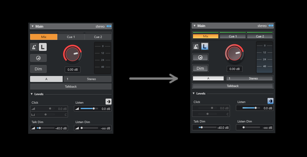
I’m no graphic design expert, but this is my interpretation of how the Cubase v14 Control Room should be looking like. What do you guys think about it ?
Nice job ! It is indeed clearer, with more contrast, as there is a slight 3D character of the whole thing that reappears in a rather well balanced way. Two observations, though :
I would have inversed the vertical tint gradient of your basically colored in grey buttons.
I would also have kept the ‘volume’ symbols on the left of each fader.
The last thing I would do is to make the buttons slightly larger to make up for the space lost by inserting borders, but you get the idea. That would require for this section of the control room to be slightly taller vertically, but I think that compromise would be justified.
The current GUI design of the Cubase v14 Control Room would have NEVER passed my quality control if I was working at Steinberg…
I understand that nowadays the screens that are used in the studio and at home differ a lot, ranging from Tablet 12" sizes to multiple 47" Touch screens. (Me using 2 x 27" in 2540 x 1440). Also your users range from people who have worked on real hardware consoles to pure digital gamification kids. There are even people who use different DAWs. And GUIs need to develop as everything else. But:
There are rules of ergonomy (sizes, contrast, focus,…) that should not be sacrificed to mimick competitor styles outof context. To a lot of changes there is unclear to me, how your users can profit from it.
Yes that sharpness looks great. I’m unable to do that with my graphic design skills limitations, but I fully support your idea there
It’s really sad that we can come up with these conceptual GUI designs within a few hours, but Steinberg can’t deliver within 1 year…I hate to say it but whoever is in charge of the GUI design at Steinberg really needs to be replaced.
Like it! Primarily because I’m not so much a fan of the pure flat design that creeps into every GUI in the recent years.
Sure there are many cases where flat design can be beneficial. But i.m.o. 3D elements, some skeumorphism, sharpness can make UI elements, device parts, device sections and devices themselves more distinguishable, usable, inspiring to use.
That said, I like the look of Cubase 14 as a whole very much, especially compared to other daws.
I do. I really like the new CR look.
I actually like the new look Cubase altogether.
Maybe more personal GUI editing options (Especially the text fonts and sizes) are the only way they can keep the majority happy.