weiTPY
October 4, 2025, 2:53pm
1
Hi,
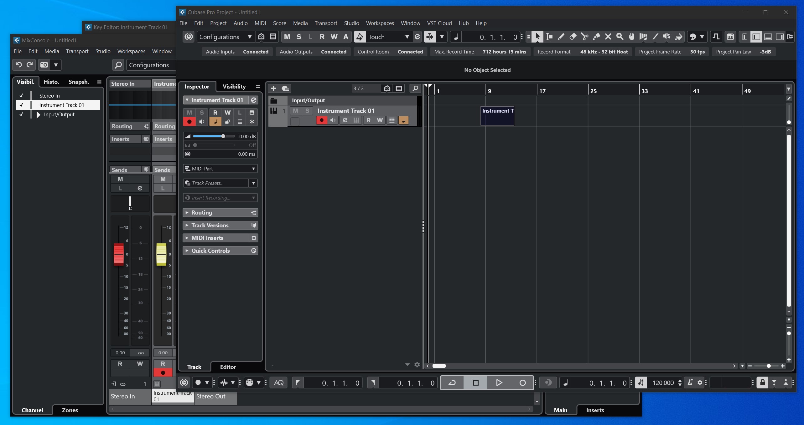
I just installed Cubase 14 and the color scheme is very black and dark.
Appreciate if you can help me with these:
1. The top Menu Bar for Project/Editor/Mixconsole windows are all black. Is there a way to color it white?
(See attached photo 1)
(I see some Youtube C14 reviewers, their top Menu Bar is white/lighter in color)
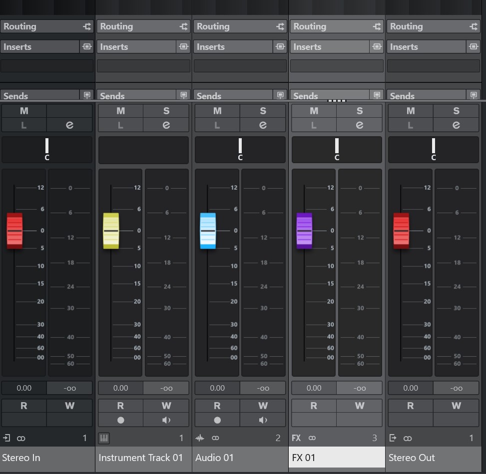
2. My faders look fuzzy/blur (like double-vision), esp the top and bottom edges.
Is there a way to fix this?
(See attached photo 2)
Does anybody find that C14 overall is very black and dark compared to earlier versions, or is it just me?
I tried playing with the Preferences and Project Color Scheme but doesn’t help.
I’m using the color scheme I set as Default from C12, into C14.
I’m also opening a current project from C12 into C14.
I’m using PC, Windows 10.
Thanks in advance for any help or advice.
Photo 1
Photo 2
Hi,
I’m sorry, I don’t see anything blurred on your screenshots.
What kind of graphic card do you use? Do you rescale on the system level (Windows).
The top menu bar can be changed by changing the Windows colour scheme.
weiTPY
October 5, 2025, 2:47pm
5
Yes, you’re right.
Go to Personalization > Colors > Choose your default app mode > Light.
Then choose an Accent color > check the box for Title bars and windows borders.
Here’s what it looks like:
Unfortunately, no white color and only applies to the current window you’re working on.
Mac & PC also seems to have different layout for Menu bar, and Mac seems to looks nicer to me.
Guess I’ll just have to live with it.
1 Like
weiTPY
October 5, 2025, 2:54pm
6
Yes, I did rescale to 140%.
On C12, faders look more 3D and has a shadow underneath it.
I enlarge to take a closer look at the faders in C14.Cubase 14 GUI design regressions
Guess I’ll leave it at that as it’s a design by Steinberg that can’t be changed. Sad though.
Thanks for replying.