Hi AndyL,
glad to hear you got it solved! ![]()
I was talking about the restore function inside Cubasis LE but didn’t explain it properly.
Best
Ricardo
Hi AndyL,
glad to hear you got it solved! ![]()
I was talking about the restore function inside Cubasis LE but didn’t explain it properly.
Best
Ricardo
Finally, Steinberg has embraced the dreaded iOS 7 flat UI that was introduced by an inexperienced “industrial” designer at Apple replacing the iOS 6 UI for no good reason. iOS 6 was warm, rich with a personality and a feel to it. Flat UI doesn’t have a “personality” or separation of sections unless you look closely - you cannot feel the buttons/knobs/etc (like a “HARDWARE” instrument) when you tap/twist/swipe them. If everything on the screen is on the same level and nothing sticks out, there is no separation of sections or feel of controls. Also, iOS 7 introduced buttons & text links that is a mess. An action item inside an app should always be a tappable button (unless it is a web page). Who cares what iOS flat UI standards are which are flawed anyway? You should stick with the established 3D UI standards - like you did boldly and admirably up until recently. No one ever complained against your previous 3D UI - people actually admired it profusely. It doesn’t matter if Cubasis did not receive an Apple Design Award because all the thousands of your users give Cubasis “the” BEST DESIGN AWARD, two THUMBS-UP and a RE-SOUNDING applause to the previous 3D UI. We don’t mind if Cubasis does not get an Apple award - it’s IMPLIED.
Your new UI has THICK, large, BRIGHT white labels and LARGE text/icons/knobs which are distracting and NOISY (it almost looks like the ugly Auria). The text colors, icon sizes, etc in the 1.x version were PERFECT, SUBTLE, MOST ELEGANT and PLEASANT to the eyes - like a DREAM - with soft/dull blue colors and “PROPORTIONATE” size text labels, icons, knobs, etc. The v1.x UI was slate colored with a cool blue tint to it. Please bring back the old colors and sizes. Effects panels in v2 have no name in Edit mode such as “chorus”, “noisegate”, etc on the bottom right as in v1 (where on the left it says “steinberg”) which was cool. Also bring back the 3D toolbars on the top and center which had personality and separation of sections. Thanks for all the hard work in bringing new features, bug fixes and offering v2 for free to v1 users and offering it on sale at 50% to new users. This complaint is only against the new flat UI which you introduced in v2 and messed up the UI which is hard to look at and not fun to use. Even GarageBand doesn’t have thick, bright, large text labels/icons/knobs/etc.
The old 3D UI in v1.x was EASY and FUN to use but you have taken out the ease and fun factors by introducing flat UI and all the noise in v2. Please, please, please - bring back the 3D UI, “ROUNDED CORNERS”, SOFT COLORS, sizes, toolbars, icons, knobs, pads, mixer, effects, panels, etc. of 1.x version. That’s all we ask. Or at least, conduct a POLL and you would be surprised how COOL, PLEASANT and ELEGANT the 3D UI of v1.x was and how much your users loved and adored it. A flat UI may be acceptable to some extent for a “productivity tool” such as a Word Processor but not for a Music Production app - which in the real world is a 3D object. A flat UI does not apply to every kind of app. The flat UI in v2 actually UGLIFIED Cubasis and makes it look RETRO ![]()
I’m a UI/UX Specialist with over 30 years of experience in designing serious business apps and know design concepts.
Thanks much for listening!
–
Shekar Reddy
Homepage - PowerObject!
Plus - http://plus.google.com/+ShekarReddyC (more music)
Music - Music - PowerObject!
Thanks for the FREE upgrade to version 2 and the price cuts for the FXs. It was very nice and well appreciated
Just a big thank you for the update, so easy to use it just works for me for the first time on iOS I’m writing a tune in one app with no problems, iaa working, au working, all new features working, first tune written within 3 hours of opening the app, everything just works love it, well done guys!
I am having problems downloading C2 on my iPad mini 2… is the upgrade from 1.9 not compatible any more? What can I do?
Cubasis 2 is a free update for existing customers, same for the Cubasis LE 2 full feature set available as in-app purchase from within Cubasis LE.
Cubasis 2
Cubasis 2 should appear in the App Store application on your iPad, a simple tap should start the update.
Cubasis LE 2 Full Feature Set IAP
If you’re a Cubasis 2 LE user who has bought the full feature set in-app purchase, please go to the in-app shop of Cubasis LE to restore your purchase. Cubasis LE will then be updated to the similar feature set of Cubasis 2.
Hope that helps.
Best,
Lars
Hi Shaker,
Thanks for your message.
Cubasis 2 shows up with a carefully redesigned user interface and the majority of our users seems to like it so far as we do ourselves. Please spend some time with Cubasis 2 and I’m sure the new user interface will be of same ease of use as the previous one.
Best,
Lars
Thanks for the nice comment, we appreciate that you like the new Cubasis 2 update!
Best,
Lars
Hi all,
The Cubasis 2 update receives great interest and overwhelming feedback in the forum of our friends at Audiobus.
Please make sure to visit the space:
Best,
Lars
Yes, it was a good surprise. Big thanks for the free upgrade to version 2!
Hi Lars,
I’ve spent a considerable amount of time with v2 before posting my message.
The new features are AWESOME!
Bug fixes are SIMPLY GREAT!
Ease of use is SUPERB!
Workflow is POWERFUL!
Pricing is FAIR!
Cubasis is second to NONE!
Steinberg RULES!!
Users on this forum, Audiobus forum and YouTube liked the new features/bug-fixes but NONE of them have talked about the UI except for one post where the user is appreciating the bug-fix about the zoom issue that v1 had in the Arranger. Users will take any app as long as it offers the features and workflow they are looking for and most of them will not complain about UI/UX.
I was only comparing the UI part of Cubasis 2.x with 1.x - particularly - 3D, soft background/text colors and rounded rectangles which made Cubasis 1.x so unique, ELEGANT and “easier” on the eyes. The background color in v2 is changed from Dark Slate to Dark Charcoal and the labels, etc were changed from Soft-Blue to BRIGHT white. Also the 3D/shadows and rounded rectangles were removed from title bars, tool bars, some icons, selected events, etc.
Here is the screenshot from v1 with 3D, Dark Slate BG color, Soft Blue labels, rounded rectangles, etc which is SOOTHING and ELEGANT:
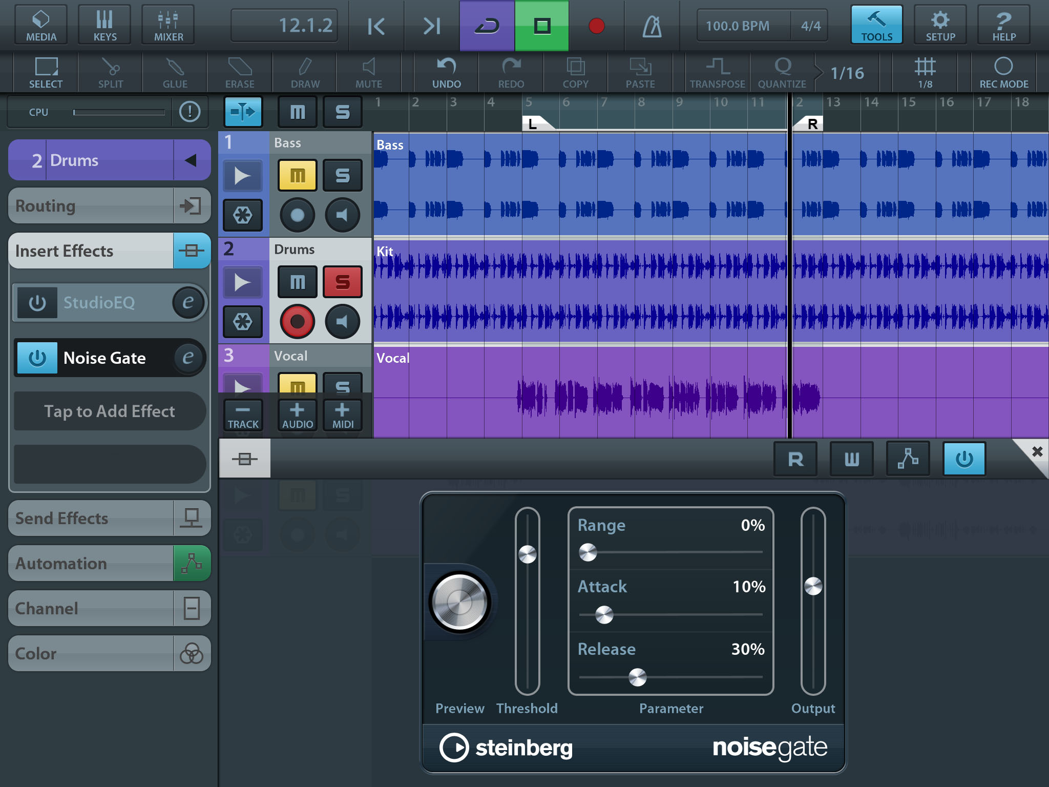
NOTE: The toolbars on the top are in 3D raised with bottom shadows like real objects showing clear separation between the sections and very FUN to use.
Also, the title-bar of the effect is 3D that “sticks out” and offers a visual separation between sections.
For a close comparison, I’ve whipped up a similar screenshot in v2 which is flat with square controls, Dark Charcoal BG color and BRIGHT white labels:
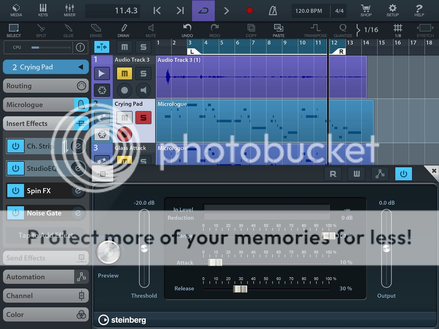
NOTE: The toolbars on the top are flat and Dark with no bottom shadows and almost blending with the section below it.
The toolbar for the effect is flat with no clear separation between sections.
The Effect Name (“noisegate”) in the footer-bar is missing for most of the effects. However, most of the effects in v2 still have Soft Blue text labels (from v1) which is COOL.
If you open the screenshots in above 2 URL’s in 2 separate browser windows and switch between them, you can clearly notice that v2 screenshot is BRIGHT, NOISY and HARD on the eyes compared to v1 screenshot which is SOOTHING, ELEGANT and EASY on the eyes (which adds to the UX factor).
Keyboard in v1 with 3D toolbar above it:

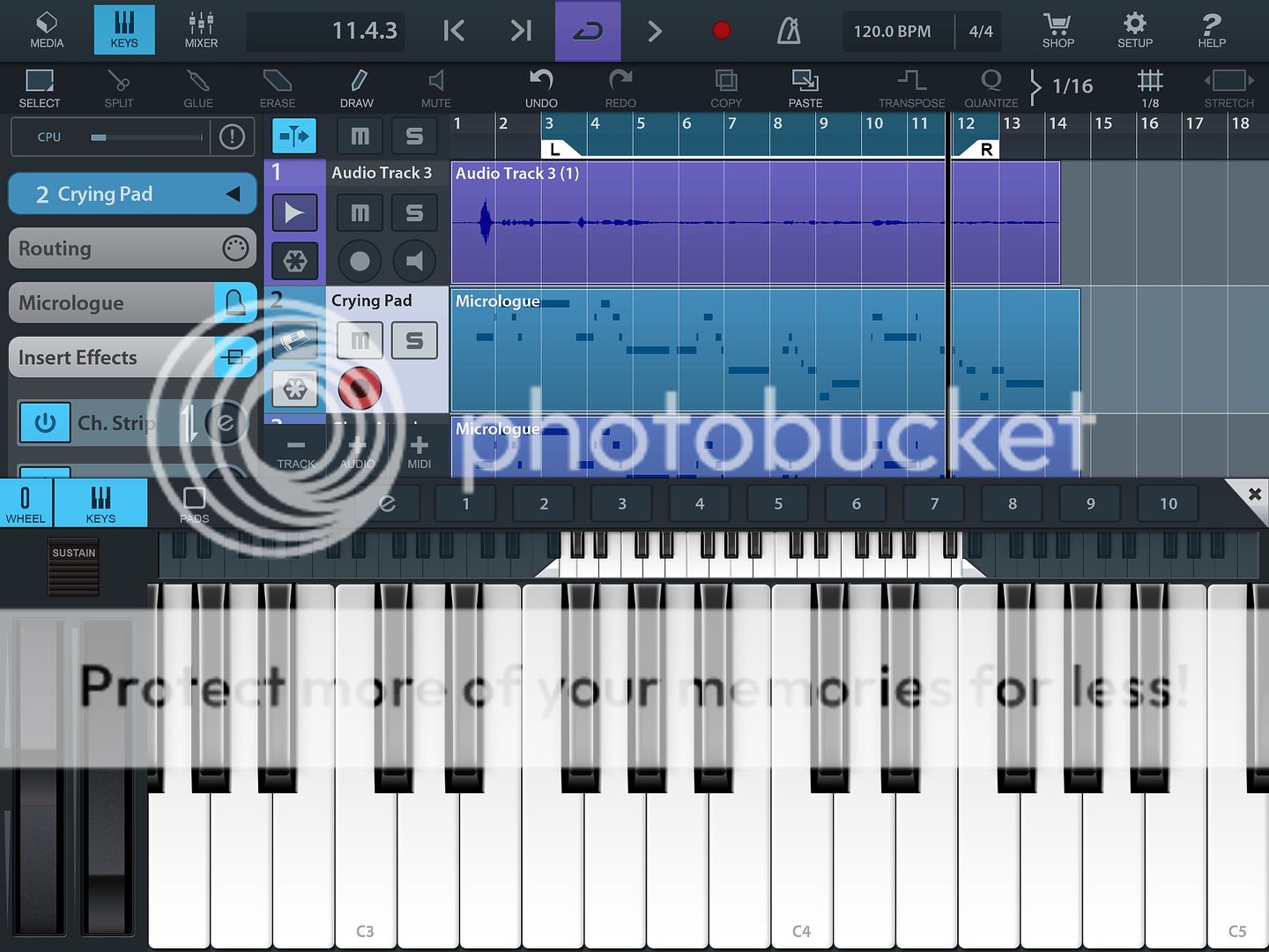
Keyboard in v2 with flat toolbar above it:
Here are a few more screenshots from v1:
https://macprovid.vo.llnwd.net/o43/hub/media/1093/11880/MIDI.jpg
(3D selected event and selected icon)
(rounded rectangle highlighted toolbar icons and 3D buttons in Mixer)
NOTE: In v1, the zero-position marker in the Mixer is thicker for a “visual cue”. In v2, all markers are of equal thickness.
A flat UI may be acceptable for a “productivity tool” such as a Word Processor but not for a Music Production app - which in the real world is a 3D object. In my opinion, there was nothing wrong with the ELEGANT v1 UI and there was NO need to revamp/change it in v2. Cubasis 2 looks inconsistent now with some controls/panels in 3D and some flat.
You could setup a Poll (along with v1 and v2 screenshots above), invite votes and and study user feedback.
CONFIG SETTING (recommended)
Cubase desktop app has an extensive color configuration module:

However, we do not need such complicated settings in Cubasis. Just background color, text color, 3D and rounded corners - or simply - one setting dropdown with these items:
Classic (v1)
Modern (v2)
The above setting should switch the UI and users will get a KICK out of the interface! It’s a BIG BANG from a small setting and minor code changes (similar to the new Background Color setting for the Arranger)!! Also, you get to RETAIN all the hard work you put into designing the v1 UI and continue to offer it as a preference setting without losing it. Further, you could gather ANALYTICS and insights into which UI (classic/modern) is most used by your users from their Settings.
HTH. Regret for the long message.
Please forward these suggestions/ideas to your IT team.
Thanks much!
Shekar
I have to admit I agree with Shekar, after comparing them side-by-side, the Classic (v1) GUI is more attractive and easier on the eyes.
I really appreciate all the new features and bug fixes that have gone into v2, but I don’t understand why any cosmetic changes were made to an already excellent UI.
Meanwhile I’m depressed that full MIDI controller implementation didn’t make the cut, this is really the only new feature I was hoping for in v2. I have a Korg Microkontrol waiting on my Cubasis workstation cart and I want to use the sliders for real-time control of the mixer, and the encoders for tweaking the effects/instruments (I would pay $10 upgrade fee JUST for this one feature, I’m a software developer so I know this is a large chunk of work)
I have a high-powered laptop with full versions of Cubase and FL studio that I have pretty much abandoned in favour of using Cubasis for all my music production, I hope Steinberg realizes that this is the future for many of us that don’t want to be tied to big clunky laptop and don’t need massive amounts of processing power for our projects.
I have been using Cubasis exclusively for all my work for 3-4 months and couldn’t be happier (except for the full MIDI controller support)
Keep up the good work Lars and Cubasis Team!
642Carl
Hi Shekar,
Thanks for your message once again.
We’re glad to hear you are happy with most of the feature additions of Cubasis 2!
While we are convinced about Cubasis 2’s user interface refresh and we think most of our users like it, we’re aware that it is not possible to match everybody’s taste - nobody can.
Since the user interface redesign has been completed with the release of Cubasis 2, the team will focus on other topics. It is not planned to offer skins or optional user interface redesigns at this moment.
Best,
Lars
Tanks for the kind feedback, 642Carl!
While MIDI controller support is on our long list for future updates, I’m not able to give you a release date for it as of yet.
Thanks,
Lars
I concur with Shekar and Carl with respect to noise in the new interface. Can the nice folks at Steinberg at least turn the bright white text (especially the bar numbers in the arranger) into dull white or dull blue as before? That should be a quick fix and should take a couple of minutes.
Still no ableton link or receive midi clock? That’s really not in sync ![]()
Hi Lars,
We understand you have a small team, priorities, etc. Here is what we would suggest as quick, MINOR/COSMETIC changes to make it look cooler, easier on the eyes and fun to use:
The 2nd toolbar on the top has no shadow on its bottom (or it has one but got buried in it’s dark background color). Please make the background color of the 2nd toolbar to match the background color of the 1st toolbar so the shadows are visible and make the toolbars pop out as 3D (similar to the 1st toolbar).
The toolbar/titlebar on the FX panels, Media panel, Keyboard panel, Setup panel, Shop panel, etc are dark and flat. Make their background color the same as the top toolbar’s background color so they pop out as 3D.
As Matt suggested, the Bar numbers in the Arranger, Piano Roll editor, Automation editor can be made dull white as they are too bright, noisy, distracting and hard on the eyes.
The above are just 3 quick COLOR changes for toolbar/bar-number involving no coding and should not take much time and still get a big bang out of it. At least 2 other people have agreed on these UI issues and none have commented liking the new interface (only new features). Hope you would make the above MINIMAL changes.
BUG 1: On iPad Air 2 with the latest iOS 10.0.2, I see Cubasis 2 crashing a LOT when I go to Control Panel, change the volume and return to Cubasis 2.
BUG 2: With any FX panel open, when I tap the Keys toolbar icon, the Keyboard replaces the FX panel instead of moving the FX panel to the top (similar to Micrologue panel) while opening the Keyboard panel on the bottom to play one-off notes along with FX without actually recording the automation. I was expecting to tap keys and play FX at the same time (free-play) but the FX panel gets replaced by Keyboard panel. The only way to use FX in Cubasis is by “recording” the automation. On my Roland JD-Xi, I can turn the Filter, Delay, etc knobs while playing the keys without actually recording the automation and was expecting Cubasis to allow such functionality by moving the FX panel to the top while the Keyboard panel is open so both panels are accessible simultaneously.
Hello,
I’m in the process of creating a song (Instrumental (13 tracks, which I’m not yet finish making) + Vocals) in cubasis. I want to use the spin-fx (as part of my creative workflow) on the mix bus to mashup the instrumental(Bass, drums, piano, etc) without the vocals being affected by the spin-fx. How can I achieve this?
Thanks,
H.B.
Hi H.B.,
Cubasis does not support busses as of yet (feature is on our list for future updates).
Spin FX can be assigned as insert, send or master effect.
Best,
Lars
Hi,
Regarding Bug 1:
If possible, please provide me with an exact step by step description how to reproduce the crash.
That way we’re able to give the issue a repro and evaluate a possible fix.
Re.: Bug 2:
The behaviour is intended as of now, might be changed at a later point.
Best,
Lars