From Dorico Pro 3.5 To Affinity Publisher Tips Needed

It does. I spent 15+ years as a professional graphic designer, and while is was 20 years ago or so, things haven’t changed that much.

Generally speaking, with 4 color press the inks are CMYK (K=black). When you print something that is all black on a CMKY printer, it is using all the inks to generate that black color. When a higher end printer utilizes a 5th color - just black - it is doing so mostly to save money, so you can replace just the black ink well, instead of also having to replace the Cyan, Magenta and Yellow (and black) ink wells too. Plus, it can usually deliver better results as you don’t have to worry about alignment with all the 4 print heads hitting the paper at the same time, and there’s 1 ink hitting the paper as opposed to 4, so cleaner results.

We would produce out catalogs on a 6 color press: CMYK plus an ink well for a spot color - usually a Pantone Silver or gold that was difficult to produce with CMYK. The 6th was usually a varnish, so we could hit the photos with a varnish layer to really make it pop off the page.

I didn’t work with non-english languages, so I don’t know about using a plate for that, but it makes sense.

this commercial press was so fast, if we spotted a mistake and had to stop the press, it would produce 100-300 copies between hitting the stop button and the press actually stopping. Maddening, because we got charged for all overs. I hated to do press checks, not only because they were usually 2am in the morning, but also the pressure of something going wrong - surely there was a misspelled word -at best - or a wrong price at worst.

As Ben mentioned above, most black and white printing or 1 color, is done on a much smaller press with just, one color. That usually is black, but could be any color you wanted. Pre-press/Pre-Flight software today should be able to convert CMYK or RGB to a spot color without much hassle. Back when I was doing this, we would print each “color” out separately to make sure things were on the right plate. I don’t think you have to do that much anymore, but it has been a long time since I was in a commercial press facility.

Cheers!
kc

1 Like

I used to work in Illustrated Book publishing production, and the text black would be on a separate plate from the illustration black. You would then make up a 20,000 unit print run with 5,000 French language, 5,000 German, and 10,000 English, etc, and change the plate mid-run.

Occasionally, I would have to go and do colour correction on press: ensuring that the press minder was putting enough ink down on the paper (or not too much).

But that’s offset litho: these days ‘digital presses’, which are really glorified laser printers, are doing a lot more of the work.

1 Like

Cannot you insert additional pages directly into your Dorico score, without disturbing the layout of the music you already have?

Not if you have page overrides.

facinating. We never had to do a multi-lingual version of the catalog, so I haven’t run across that way of working, but that is pretty cool way to do it.

Yeah, the good old days of litho/offset press runs. Sorry to derail the thread for just a bit more, but my dad was a printer. Only job he ever had. Started mopping the floors at 15 and retired from the same company 45 years later. He would not only mix his own colors on a artists pallet, but also set the type using the old hot type method - melt the lead and all. He used to carry around a bunch of the lead bars in the back of his truck in the winter time for traction.

Thanks for the info - again, sorry to derail the thread and I will keep to the original topic now.

1 Like

@david-p hello,

If you have many pages with overrides adding of a single page could turn the whole work into absolute mess…
So, it’s far painless to do this in Affinity Publisher, or Adobe In Design, especially when it comes to pages that contain only text, without any music.

2 Likes

I might be wrong, but even without overrides, it can be painful. For instance, if you move staves in Engrave mode>vertical spacing submode, using the little round handles, it won’t create overrides. But the changes are linked to the page, not the music. If you moved smthg on page 5 and add a first page, your new page 5 (which was 4 before adding the page) will have itsvstaves moved, and not page 6. That can be really messy. Until the devs provide a good solution, external app seems to be the answer.

1 Like

I agree. This is one of the Achilles’ heel’s of Dorico.

1 Like

Well, probably at some point the guys will improve this area of Dorico?! :slight_smile:

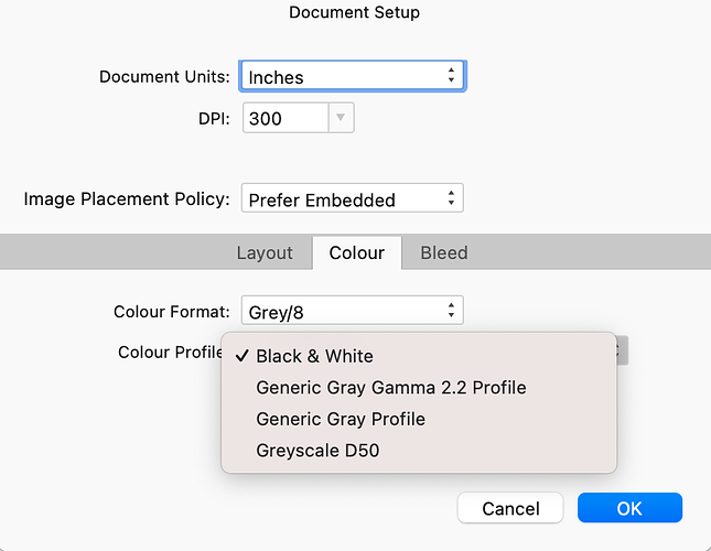
This is strange: “Black & White” is not listed as an option for me, neither in the Document Setup window nor in Preferences > Grayscale color profile. (I’m on version 1.10.1.)

My available options are as in the screenshot below.

In any case, I don’t recall where I read that PDFs submitted to print shops have to be exported as CMYK. EDIT: Apparently that’s not correct. I simply need to make sure the blacks in the PDF are 100% K.

Today I used the online checker to check separations of the text in my document; previously I’d only checked the notation.

Black text was showing up as 4-color. I fixed it in body text, but couldn’t change it in the TOC until I edited the “Base” text style by changing “text fill” color to “CMYK” and setting that to 100% K.

Then I exported the PDF with color space set to “As document” in the “more” section of the export dialog (with Document setup now set to Grayscale D50).

Now all text separates as 100% K in the online checker. Hopefully this is what the shops need.

EDIT: It also separates as 100% K in the latest version of Acrobat DC.

Note that when I selected “CMYK” in PDF Export settings, all the text I added in Publisher came out as 4-color. I went back and made sure that all Text Styles were set to 100%K, but they still got converted to 4-color upon export.

Changing back to “As document” resolved this. I have no idea how/why this works, but it works.

Publisher-Document-Setup

You have to choose the grey 8 bit to have the black and white option appear. My guess is you’ve selected the 16 bit option.

Nope. I’ve always had it set to 8 bit!

Huh. How odd:


Are you up-to-date? I’m running 1.10.1

Also, I don’t know if this could affect it, but in preferences you can set the following option:

I have version 1.10.1 and I don’t find the Colour Format ‘Grey/8’ or the Colour Profile ‘Black & White’ options either. Would it be possible for you to upload a document with your settings to see what happens when I open it up?

28th in OT (B) copy.zip (1.7 MB)
I didn’t save this as a package; just the .apub file itself, and there are restricted fonts in it, so sorry if it looks all wonky when you open it. At least the general settings should load.

See my post above - I already said I’m in 1.10.1 and that it’s missing in Preferences too.

Thanks for the file! It does show Black & White in both locations when that file is open.

But when I close your file and open mine, B&W is still missing. EDIT: see update below.

Right. But perhaps opening my document would reveal something. There’s absolutely no reason I should have this setting and you don’t. At the bare minimum, it would be revealing if the settings I have set are not retained and switch to something else on your machine.

You replied while I was editing - see my previous post.

Fascinating. I have no idea how I’ve managed this. I swear it was just always an option for me. I will say that I’ve been replicating the same file week to week and changing its contents… perhaps the B&W option was removed in the recent major update and my files are grandfathered in, so to speak.

I opened your file and saved it as a template. Now when I create a new file I have the missing options, but with qualifications. If I open your file and create a template and then create a new document the options in question persist. If I quit Affinity Publisher, relaunch the program, and create a fresh document, the options in question are gone.